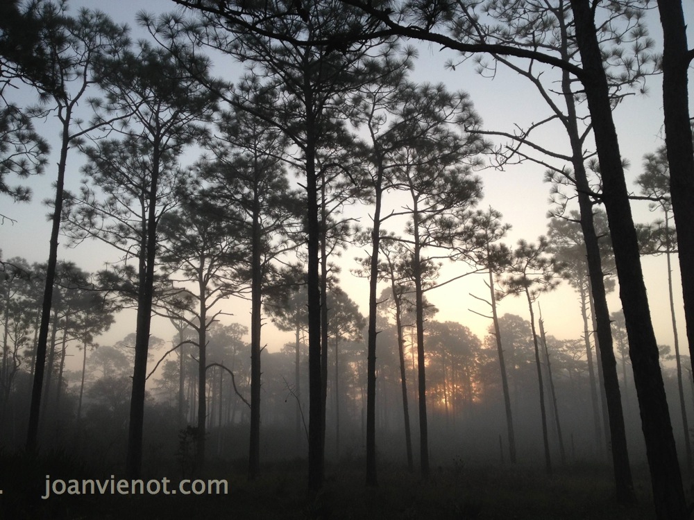
Yesterday I went hiking shortly after sunrise with my friend Jane Burns, who is a fine art photographer. The sun was rising between the foggy tree trunks, just above the brush, as we hiked the groomed trail through the state forest just north of Grayton Beach State Park. Jane and I both pulled our cameras out of our packs, to capture the first light. We continued to have jaw-dropping views at every turn of the trail. It was the “golden hour” following sunrise, when shadows are long and the light is warm and diffused. A light fog exaggerated the effect, rendering every scene an ethereal fairy-scape. The first photo above was taken during those first minutes on the trail.
.
The light changed quickly as the sun came up, and the fog began lifting. Wonderful atmospheric effects played over the landscape as the cooler, shaded areas maintained a misty quality, and open areas became more clear. Normally I carry my bigger camera, but since we were going to hike 8 or 9 miles, I opted to bring only my iPhone 5S. Halfway into the hike, Jane showed me the High Definition function, where the camera shoots two versions, one normal, and one HDR. The higher quality is obvious on some even when viewed on the camera’s small screen.
As the morning progressed, the fall light became crisper, and the colors became more vibrant. Dew remained in the shady areas, and in one section, a carpet of bejeweled, glittering moss underfoot. Both Jane and I tried to photograph the shimmering drops on the moss, but the camera didn’t pick them up. A tightly focused video would have been beautiful.
I stopped taking so many pictures after the first hour or so. The light was still beautiful, the sky a crystal clear blue and the colors so typical of autumn. I still felt like I was walking through a scenic calendar. But I was so very spoiled by the wealth of imagery during that first hour, the golden hour, that I just enjoyed the views for the rest of the hike.
Most of my images are available for purchase. Contact me if you are interested. — Joan Vienot
A local group focused on environmental and growth issues in the mostly rural community where I live, in Santa Rosa Beach, Florida, is called South Walton Community Council. Missioned especially with protection of our fabulously beautiful, pristine environment, relative to development and community growth issues, SWCC also puts on a Back-to-Nature Festival every fall. Last year for the first time, Hidden Lantern Gallery partnered with SWCC to produce a juried art show called Scenes of South Walton, comprised of art inspire by the local natural setting.
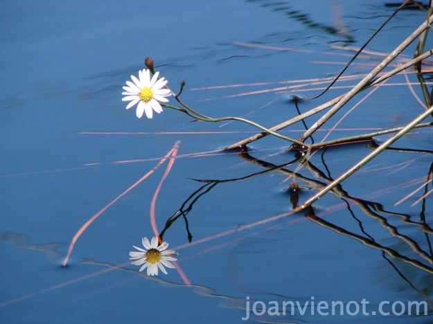
Aster Reflected
I decided to enter a few of my photographs this year, and I was pleased to receive notice that my work had been accepted. I usually shoot photography for fun, for Facebook, and because I love the process of capturing images. If you’ve been keeping up with my blog, you know that I also shoot for Leslie Kolovich of The Stand Up Paddle Radio Show, but working for her is so much fun I hardly call it work.
Being a visual artist, of course, line, shape, size, position, color, texture, and density, all of the elements of composition, and repetition, harmony, and unity, the principles of composition, factor into my artistic evaluation of any of my photographs. Ultimately, though, my chief interest in my own photography, is the play of light over the forms. I rarely do much with post-processing, primarily enjoying the act of shooting the photo much more than the infinite tweaking that can happen after the image is on the computer.
Tree Frog
To my pleasant surprise, one of my pieces was selected for Honorable Mention. There were works by 12 other artists and photographers, all of whom I consider my superiors in craftsmanship, experience, and sheer expression. But my pieces do have impact, and the piece I submitted that received the Honorable Mention, “Aster Reflected“, also has enough of an abstract element to be just a little confusing. It is a photo of an aster hanging out over the creek, and perfectly reflected in the creek. Actually, the reflection is a more distinct image of the flower than the actual flower, which is over-exposed. The confusion comes from there being such a perfect reflection of the aster, stems, and leaves, in contrast to some pine straw and debris that is just floating on the surface without any reflection. When you look at it, you have to stop to figure out why there isn’t a double image of everything, how there could be just a single image, unreflected, mixed in with all the double imagery of the reflections.
Water Lily
The juror, KC Williams, didn’t mention the composition when she talked about my photograph, but instead discussed how it clearly represented an image that could be found in South Walton. She actually talked quite a bit about each piece she that she had chosen, and also about the superb craftsmanship and artistic expression of all of the works in the show, but when mine was announced, I was smiling too wide to be able to listen.
Most of my images are available for purchase. Contact me if you are interested. — Joan Vienot
Juror KC Williams is Director of the Galleries at Northwest Florida State College in Niceville, and she along with the Director of the South Walton Center of NWFSC, Julie Terrell, facilitate the exhibition of Cultural Arts Alliance members works through the A+Art Committee, on which I serve as co-chairman.
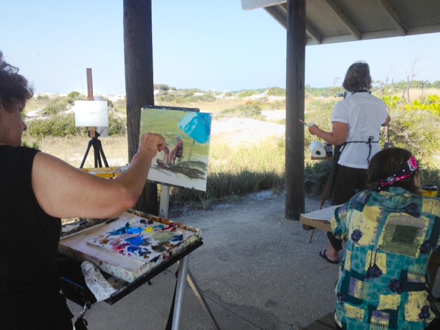
On Saturday I joined at least 16 other painters at Grayton Beach State Park, in Grayton Beach, Florida, to participate in the local effort for the Oil Painters of America 8th annual Great Paintout. It was my first try at plein air oil painting in perhaps as much as 30 years, but something I have been intending to do for a long time. I have occasionally painted outdoors using watercolors or sketched with pencil or ink, but the last time I remember painting the landscape with oils, plein air, was while on a camping vacation in St. Augustine, Florida, in 1978. That day, so long ago, was memorable for being so hot and buggy. By contrast, Saturday was the perfect day for plein air painting, being shaded by the park pavilion, and virtually bug-free.
So what’s the big deal about plein air painting, you may wonder. En plein air is French for “in open air”, a phrase used to describe painting an outdoors scene “from life”, while actually looking at it, in the often changing light and weather conditions. It requires intense concentration and awareness, and is much more challenging than painting from a photographic reference in a studio. It appeals to me in much the same way that figure drawing appeals to me, because time is a limiting factor, so one must work fairly quickly, finishing or very nearly finishing the painting in one session. For that reason, and because I felt so out of practice, I chose to paint on small 8″ x 10″ canvas boards. I managed to make a passable effort on two boards.
To a certain extent, this was a trial run for me, to see how my equipment worked, and to start remembering how to paint. I used just 3 brushes — two to paint with and a third one to sign my name, and a palette knife to scratch out some bush branches. The brush I used for most of both paintings was a Winsor-Newton #6 round, sable, I think. It worked better than the stiff bristle brushes I used a month ago in my first effort at returning to oils, in the workshop I blogged about on September 9. My new Coulter System easel and palette/box that I purchased last summer worked like a charm. I used my 35-year old Grumbacher “Pre-tested” and Rembrandt oil paints from my days doing demonstrations as a high school art teacher. My oil painting medium is about that old too, and while the paints are still good, I’m pretty sure the medium is degraded. The paintings I did Saturday are dry today, one day later, but the painting I did a month ago in the workshop, in which I used more medium, is still a little sticky.
The sand dunes at Grayton Beach are made of sand is so fine that it crunches underfoot like dry snow, and it even looks like snow in the bright sunlight, thanks to the clear crystals of quartz that make up the majority of its composition. The scrubby oak bushes and half-buried scrub pines round over the tops of the dunes, shaped away from the Gulf of Mexico by the salty seabreeze. Palmetto bushes and dune marsh grasses dot the lower dunes, fringed this time of year by various yellow wildflowers that some of us locals refer to collectively as goldenrod. I never got around to painting as much as I would like to have, never adding in the finer details of shadows and sea oats. I might go back in and put in those details, but the photos I have posted here are exactly as I finished on Saturday morning.
After we painted for about 3 hours, we all got together and looked at each others’ works, and we ooo’d and ah’d before giving feedback. It was an excellent critique, with the masters of the craft commenting on areas of paintings that worked well, and areas that were challenging, and even discussing compositional tricks, like pointing out places where something in a painting might need to recede, made difficult by being light in value. (Typically, light shapes and colors tend to advance, and darker forms recede, in a picture plane. That can be overcome by muting or graying the lighter colors, shapes tending to become less bright as they recede, the way that we see things.) Everyone was kind to me, not being critical at all, but I admit that I gave fair warning, protecting my vulnerability by explaining that I had just returned to oil painting again about a month ago, and that this was my 2nd effort in 30 years. That was a fairly clear request to cut me some slack, I think. The regular plein air painters go out every Wednesday, so if I start coming regularly, I’m sure they will feel more free to make helpful comments, and I will not be so scared to hear them.
Shane McDonald
Some of the artists who were there have their work online:
And I wish I had the names and websites of the others there — if you read my blog and know the others, please email me with their names, and I’ll include them.
Most of my images are available for purchase. Contact me if you are interested. — Joan Vienot
I think of lighting as being one of three primary types: silhouette, which has the most impact if the shape is recognizable by its external contour; high contrast, which treats all of the lighted areas as one light value, and treats all of the shadowed areas as one dark value, or perhaps using only 3 or 4 values; and the last type of lighting, full gradual shading ranging from white through the entire value scale to black, which sometimes is referred to as chiaroscuro, exmplified by the image found in the Art Studio Chalkboard website.
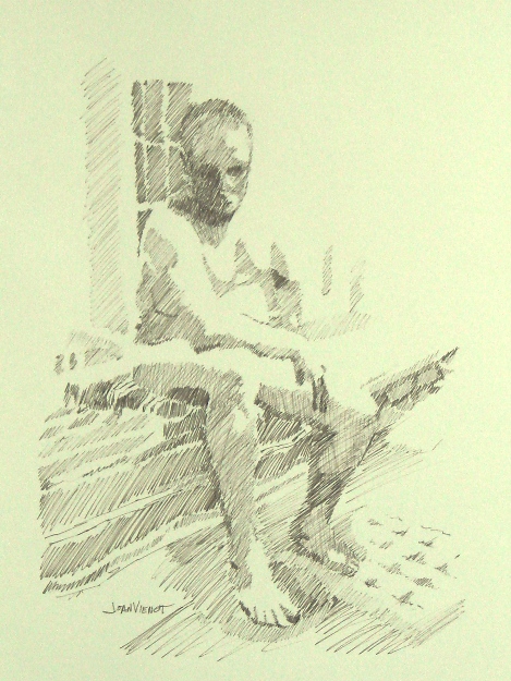
I rarely work on a figure drawing after I get back to my home studio, except to correct a glaring mistake, or to clean up a smudge here or there. But two weeks ago, the model gave us a beautiful pose, and I was unhappy with the drawing I made during the figure drawing session. So I took a new sheet of paper, and redrew the pose using brown ink, showing only the primary two or three values, and leaving a lot of the edges undefined where light was hitting them. This treatment gives the drawing a completely different feeling.
The pose interested me because the model was leaning down with his elbow and forearm on one knee, which foreshortened his torso.
Most of my images are available for purchase. Contact me if you are interested. — Joan Vienot
I need to warm-up for a little while before my efforts at figure drawing start to flow naturally. During the initial warm-up period, I try to capture the general directional line of the model, and a few of the light and dark patterns, or perhaps some of the essential contours or textures. Often it feels like I am drawing a stick figure, just trying to get the general angles and proportions correct. I draw fast, because our warm-up drawings start with 30-second or 1-minute or two-minute poses. The model often takes slightly off-balance or less comfortable poses during the warm-up period, knowing that he or she doesn’t have to hold them for long. I find that effort on the part of the model inspiring, and it motivates me to try harder. I usually use the broad side of a chalky medium for the warm-up drawings, sometimes even drawing with white nupastel, which helps me to see where the light is striking the model, though white alone usually doesn’t photograph well enough to post here in my blog. I draw with minimal concern for accuracy, sometimes merely trying to switch gears, from the left-brained thinking about my day-job as I drove to the session, to the right-brain activity of figure drawing. Drawing is first of all a physical activity, so like an athlete, an artist needs to work at it a little in order to coordinate the hand with the eye, and a period of warm-up drawings helps with that.
As you can see by the examples below, warm-up gestures have strange lines, curves going the wrong direction, places that get overdeveloped, and other places not drawn at all, wrong proportions, and yet an undeniable essence of the figure. These are warm-up gestures of the same pose from this past week’s figure drawing session at Studio b: one by me, one by Nancy Nichols Williams, and one by Steve Wagner.
Joan Vienot
Nancy Williams
Steve Wagner
I enjoy the time spent warming-up, but 2-minutes is always too short. But then too, 5 minutes is too short, and so is 20 minutes, and come to think of it, rarely is a pose long enough for me to feel like I actually finished! The next drawings include another of my warm-up gestures, and then two longer drawings, perhaps 20-minutes or 30 minutes. I left early from this session, exhausted from teaching all day, the 2nd of a 2½ day crash-course that I teach at a nearby college, certifying swimming pool operators to meet health department requirements.
Most of my images are available for purchase. Contact me if you are interested. — Joan Vienot
It was interesting to draw in a new location last week. Studio b. has moved to a nearby community, and the room was filled with unsorted moving boxes, furniture, and art. The ordered disarray appealed to me. The ambience at the new location is much warmer, with rich woods instead of cold plaster and tile, and with plentiful windows which let in light from every angle. I was in heaven during the warm-up drawings, the low sun adding warm tones. The model chose her own poses during the shorter warm-up sets. Light from the multiple sources put complex highlights and subtle double shadows on the model’s skin. As usual, most of the short poses were standing poses or twisting poses, perhaps even a little off-balance, which would be too hard to hold for any duration. The longer poses were as always, more stable as a matter of compassion for the model.
For the final pose, the model sat on the stairway to the second floor, where the single light source simplified the shadow patterns. I sat at the base of the stairs where I could see her from that unusual vantage point. What interested me the most was the exposed underside of her chin and her upturned nose. The foreshortening had to be kept subtle even though it felt extreme, with her arm being larger because of its proximity to me.
I am happy with the end result in every respect except for one — it doesn’t look very much like the actual model! Generally speaking, when drawing a portrait I count it a success if the positions of the eyes, nose, and mouth seem parallel. Maybe if I practiced portraiture more often, I would be able to capture the likeness better.
It’s a challenge to create something someone might want to hang in their home. It seems like the drawing either needs to wow the viewer with technical craftsmanship or else it needs to be someone they know or to remind them of someone they know. In the end, I draw for my own pleasure and compulsion, trying to simplify what I see, to capture the essential character of the person or the expression I interpreted without concern for whether someone else will like it.
At left is a photo of me making the drawing posted above.
The room was quiet as we drew at Studio b. this week. The model was extraordinary, performing poses during our one-minute and three-minute warm-up period that would have taxed an accomplished yogi. We warmed up with gesture drawings for about half an hour, before drawing a few 10 and 20 minute poses, and then finally a 45 minute pose. I’ve been enjoying a combination of white nupastel with black graphite for a while now, but in my final drawing I opted for a blue pencil with the white nupastel, at left. The form was very simple from my vantage point, for the most part being only a silhouette with very little modeling. Her shoulder blade was prominent, and there was a highlight on the muscle edging her spine, so I put a little more emphasis on her hair and the fabric she was lying on, to provide textural contrast.
The night before, I had listened to Amber Rubarth performing there at Studio b., in the courtyard below our figure drawing room. Her music was still playing in my head as I drew. I videotaped a few of her songs, but I don’t yet know how to upload them from my whiz-bang new iPhone, so here’s a link to a previous performance by Amber: http://www.youtube.com/watch?v=5Mn9VtIFM0g.
I made a mistake on the drawing pictured at right, something I know I should never do. I had torn a corner of the page off, to give to another artist who wanted to order the kind of paper I was using. Then I kept that paper, to draw on. I’d been carrying it around for several weeks, and last night I decided to draw on it, without trimming off the torn corner. I used the rest of the borders as my boundaries, treating the torn corner as if it wasn’t torn. Now that the drawing is completed, I see that I would have to mat out or trim off that torn corner, and with it, lose other essential parts of the drawing. Since there is excess paper on another side, I think a good framer might be able to patch it, but the patch would show, upon close inspection. So I have priced it as a sketch, even though the drawing turned out exactly as I wanted it. Lesson learned, hopefully — If a corner is missing, always trim the paper to square up that corner before using it.
If you are interested in having any of my drawings or sketches, contact me on the contact form through this website.
“Reclining Arched Back” is available from my site! Click the painting for information on adding it to your collection.“Standing” is available in my store. Click the painting and to purchase for your collection now!
Last week I didn’t draw, except for my practice at home. Instead I watched and listened to a lot of live music at the 30A Songwriters Festival, which I blogged about in my last post. And last Friday I attended a yoga presentation on the Root Chakra, the first in a 7-week series, a subject which is all new to me. Then on Tuesday a friend and I got together and brought each other up to date, all good. And Wednesday, a whole bunch of artists I hadn’t seen for a while were at figure drawing, at the regular weekly session at Studio b., which was exhilarating.
So whether a positive result of my fledgling efforts to allow more energy to flow through the Root Chakra, or good old-fashioned open communication with a dear friend, or listening to so much good music, I felt very confident in my artistic expression this week. I found myself very quickly lost in the process of executing each pose. When I lose myself is when I enjoy it the most and feel the most successful at capturing what to me is the basic emotive and visual essence of the pose, whether I am focused on the light, or mass, or shapes, texture, or line.
Our model struggled with the standing pose at top left. Supporting herself on one leg with a locked knee, she wasn’t able to hold it for as long as she had intended. Nevertheless, even with the pose a little shorter than expected, I felt completely comfortable with the end result, leaving portions of the drawing a little sketchy. In fact I think I am enjoying that more and more, developing only the more important area of each pose, although I need to be careful not to always leave the feet undeveloped, because that might be suspected laziness. Feet are difficult to draw.
The drawing at upper right is the only drawing I was unsure about, when I was finished, because her right elbow creates a triangular shape above the woman’s throat. Effective composition requires the artist to be judicious, to leave out visual description which merely confuses. So I worked on this drawing when I got home, removing the elbow shape entirely, and then drawing it back in. Sometimes it is that little quirk of confusion that requires the viewer to puzzle for a moment, and engage a bit more, holding his attention for a bit longer. And in this day and age of instant communication, holding someone’s attention is like gold to an artist.
Speaking of attention, to those of you who wade through my blogs each week, from the bottom of my heart, thank you! You don’t even have to say anything, though I love it if you do — I feed off your collective support. May we all give support to each other for our efforts at creative expression, whatever the avenue!
Most of my images are available for purchase. Contact me if you are interested. — Joan Vienot
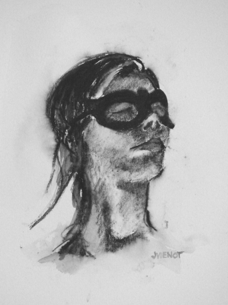
Our model this week at Studio b.‘s regular weekly figure drawing session stood on a ladder during the warm-up drawings and the shorter warm-up poses, and she also posed up on a table. Usually our model is on a short platform or even on the floor, so this change in perspective was a rare treat. I enjoyed the challenge of drawing from a lower vantage point. Every shape was different from how we normally see our model. To add to the challenge, we positioned a floodlight to light her from below.
The model brought a hat, a mask, and a necklace to give us some accents.
I used some different media to loosen up from the intense figure drawing workshop Heather Clements taught last Saturday at Studio b. I had not sketched since Saturday, and I felt like I had really tightened up, hence my decision to use less familiar media, to force myself to “let go”. Interesztingly, I think my most successful piece of the evening was one of these looser pieces, using water-soluble Aquarelle pencil on hot press watercolor paper, the study of the model wearing the mask, above left. It is small, only 4½” x 6″.
I throw away almost all of my warm-up drawings. Colleen Duffley, owner of Studio b., suggested saving more gestures, explaining to me that some people have more appreciation for anonymous gestures than for finished drawings of a model they don’t know. This poses a dilemma. I do so many warm-up drawings, or gestures, that I always use an inferior grade of paper, for the sake of economy. Newsprint and manilla paper costs just pennies, as opposed to good paper which can run from $1.65 to $3.50 per sheet, and upwards. So the few times that a warm-up drawing turns out to be a keeper, its value is compromised because of the poor quality of paper. It can be redrawn on archival paper, but that is a challenging task because the immediacy of expression, the passion, will be difficult to recreate. So I decided to bring a tablet of 18 x 24 Canson Cream that I had bought a good 6 months ago, and I did all of my warm-up drawings on good paper. I missed the rough texture, or “tooth” of the manilla and gray bogus papers I usually warm up on — the tablet of good paper is very smooth.
Below left is one of my warm-up drawings, a 5 minute pose, and the other two are longer poses on Stonehenge and Rives.
Most of my images are available for purchase. Contact me if you are interested. — Joan Vienot
You would think that when you go to the same activity, week in and week out, that it would become predictable, and perhaps even boring.
Not so with figure drawing, especially at Studio b. We had the same exceptional model for the 2nd week, who clearly was invested in our work, being aware of how her poses might come across, and considering the mood they might evoke. Studio b. owner Colleen Duffley said the model was even practicing a few poses before we got there, and during breaks, she asked the artists what sort of pose they would like next. Of course for me, every pose is a challenge, so I am just happy to be there and almost any pose is good! Generally, if a pose is not well-lit or is uninteresting from one vantage point, there is enough room to move to another location where I can see better or the composition is better.
For our final pose of the evening, the model got into the water of the pool. Lit by the underwater lights, the portion of her figure beneath the water was a chalky blue-green, and extremely distorted. The part of the figure above the water was almost a silhouette, it was so dark. This is the first time I have drawn a figure in water, so I really had to study it. The water’s distortion greatly shortened and widened the part of the figure closest to the surface of the water from my vantage. Each artist had a different distortion. What struck me the most were the amazing colors, so although I rarely draw in color, this pose begged for it.
Heather Clements produced an amazing pencil drawing from the 50 minute pose — hopefully she will include it in her blog. Also it can be seen on Studio b.’s facebook page.
Below are two other poses from this model this week, which I drew with graphite and Nupastel on Stonehenge paper, one paper gray and the other faun.
Most of my images are available for purchase. Contact me if you are interested. — Joan Vienot


")
 It’s a challenge to create something someone might want to hang in their home. It seems like the drawing either needs to wow the viewer with technical craftsmanship or else it needs to be someone they know or to remind them of someone they know. In the end, I draw for my own pleasure and compulsion, trying to simplify what I see, to capture the essential character of the person or the expression I interpreted without concern for whether someone else will like it.