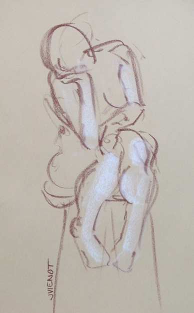
 It was interesting to draw in a new location last week. Studio b. has moved to a nearby community, and the room was filled with unsorted moving boxes, furniture, and art. The ordered disarray appealed to me. The ambience at the new location is much warmer, with rich woods instead of cold plaster and tile, and with plentiful windows which let in light from every angle. I was in heaven during the warm-up drawings, the low sun adding warm tones. The model chose her own poses during the shorter warm-up sets. Light from the multiple sources put complex highlights and subtle double shadows on the model’s skin. As usual, most of the short poses were standing poses or twisting poses, perhaps even a little off-balance, which would be too hard to hold for any duration. The longer poses were as always, more stable as a matter of compassion for the model.
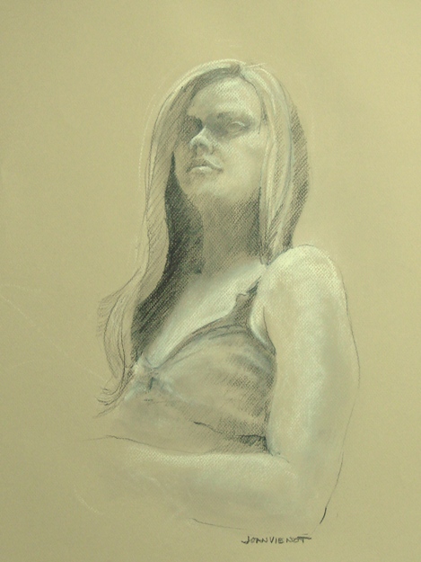
For the final pose, the model sat on the stairway to the second floor, where the single light source simplified the shadow patterns. I sat at the base of the stairs where I could see her from that unusual vantage point. What interested me the most was the exposed underside of her chin and her upturned nose. The foreshortening had to be kept subtle even though it felt extreme, with her arm being larger because of its proximity to me.
I am happy with the end result in every respect except for one — it doesn’t look very much like the actual model! Generally speaking, when drawing a portrait I count it a success if the positions of the eyes, nose, and mouth seem parallel. Maybe if I practiced portraiture more often, I would be able to capture the likeness better.
 It’s a challenge to create something someone might want to hang in their home. It seems like the drawing either needs to wow the viewer with technical craftsmanship or else it needs to be someone they know or to remind them of someone they know. In the end, I draw for my own pleasure and compulsion, trying to simplify what I see, to capture the essential character of the person or the expression I interpreted without concern for whether someone else will like it.
At left is a photo of me making the drawing posted above.
I am excited to announce that a few pieces of my art will be hanging in the lobby/reception area of the South Walton Center of Northwest Florida State College here in Santa Rosa Beach, Florida. The opening reception will be Friday, April 6, 2012, from 5:00 to 7:00 PM. Titled “A Passion for Art”, the show spotlights the members of the A+Art Committee which serves under the umbrella of the Cultural Arts Alliance of Walton County. The show exhibits works by Charlotte Arnold, Lauren Carvalho, Betty Cork, Miffie Hollyday, Susan Lucas, Mike McCarty, Robin Wiesneth, and me, Joan Vienot. The show will close May 15, 2012.
Most of my images are available for purchase. Contact me if you are interested. — Joan Vienot


