Posted on Leave a comment

Types of Lighting

I am teaching a “Back-to-the-Basics” drawing class for the Cultural Arts Alliance of Walton County.  This week we talked about three different types of lighting:  silhouette, high contrast, and full-values.  For a silhouette to be effective, it is essential that the subject be recognizable by its outer contours, since there is no interior development.  Below are some examples of sillouette.  Please forgive the quality of the photographs — they are meant for illustration only.

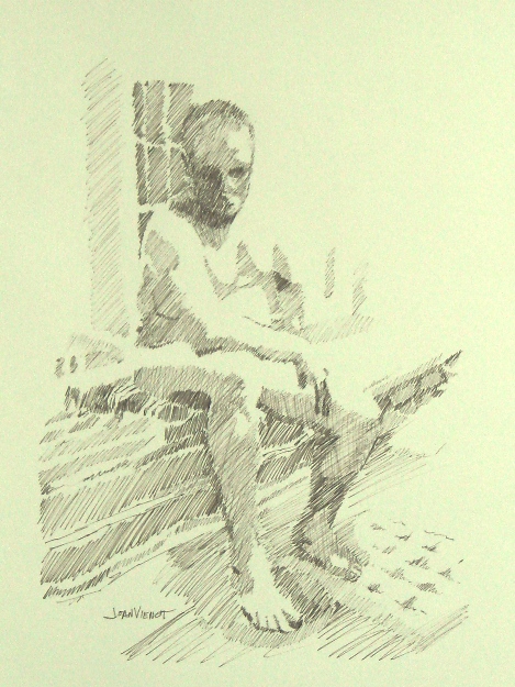
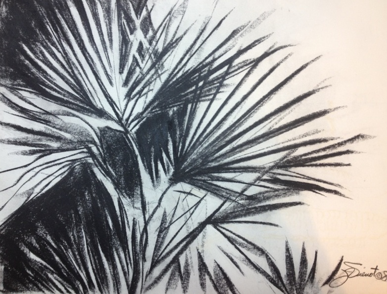
In high contrast, interior development is in only two values.  This allows for a more ambiguous outer contour because the development inside the form identifies the subject.  Below is a drawing done in high contrast.

Full-value development is the type of treatment we are most familiar with, where we can easily identify the subject because the interior development is in a full range of values, like the drawings below:

Many artists will use all three of these methods of describing shape, within the same drawing or painting.  Silhouettes require less attention, and if executed in middle values, can provide wonderful background imagery, effectively breaking up negative space and often repeating forms found in the foreground, as in paintings of flowers for example.  Even when the lighting is shown in full values, often the lighting will simplify into high contrast or silhouette, especially towards the edges of the composition.

Silhouettes can be extremely powerful.  Some of the happiest ooo’s and ahhh’s will be heard when you show a painting of a brightly colored sunset with silhouettes in the foreground.


Posted on Leave a comment

Types of Lighting

I think of lighting as being one of three primary types:  silhouette, which has the most impact if the shape is recognizable by its external contour;  high contrast, which treats all of the lighted areas as one light value, and treats all of the shadowed areas as one dark value, or perhaps using only 3 or 4 values; and the last type of lighting, full gradual shading ranging from white through the entire value scale to black, which sometimes is referred to as chiaroscuro, exmplified by the image found in the Art Studio Chalkboard website.

I rarely work on a figure drawing after I get back to my home studio, except to correct a glaring mistake, or to clean up a smudge here or there.  But two weeks ago, the model gave us a beautiful pose, and I was unhappy with the drawing I made during the figure drawing session.  So I took a new sheet of paper, and redrew the pose using brown ink, showing only the primary two or three values, and leaving a lot of the edges undefined where light was hitting them.  This treatment gives the drawing a completely different feeling.

The pose interested me because the model was leaning down with his elbow and forearm on one knee, which foreshortened his torso.

Most of my images are available for purchase.  Contact me if you are interested. — Joan Vienot

Posted on 2 Comments

Seeing in Black and White

This week in Figure Drawing at Studio b., Heather Clements instructed us to focus on light patterns and shadow patterns.  We worked with strong lighting, toning only the darks, all the same value, and leaving the paper untoned to show the lighted areas.  This high contrast lighting is very powerful, with much of the drawing reading as a silhouette.  Heather directed us to add intermediate values in our later drawings.  She kept a strong light on the model throughout the session.