Posted on Leave a comment

A Wedding, Three Workshops, and Two Paint-Outs

The last 8 weeks have been amazingly busy.

Oil Painting of Brian and Megan Robertson's First Dance
Brian and Megan’s First Dance

In September in my capacity as Joan Vienot Wedding Painter, I painted a commission en plein air

Plein air painting of first dance at wedding, unfinished
Unfinished, en plein air

at a wedding, oils on stretched canvas, 24×20, finishing the details in the studio. The plein air painting captured the basics, but I needed to tie the composition together better in the studio, which made it quite a bit more formal, and I corrected the proportions of the figures. I scumbled the chandelier, which I had greatly exaggerated on purpose because it set the tone for the scene, and I softened the white curtain behind the couple to create a glow around them, with the foliage creating a heart-shape over their heads.

I enjoy painting at weddings. It is a command performance, so I have butterflies when I first start, but they disappear soon after I start painting. Typically I have contact with the bride’s mother or the bride or couple as much as a year ahead of time, which gives me plenty of time to find out their relative heights, the location of the venue, their colors and styles of clothing, their flower colors, etc. I have a page on my website dedicated to weddings and live event painting.

Continue reading A Wedding, Three Workshops, and Two Paint-Outs

Posted on Leave a comment

Plein Air Painting – Practice Pays Off

Oil painting of the mansion at Eden Gardens State Park, behind the reflecting pool and a huge live oak treeLast weekend I painted a community street scene in the studio, using photo references, after attempting it plein air.  The architecture was filled with straight lines, which are a torture for a freehand painter.  I can fudge and fake the branches in a bush, but architectural lines for the most part look right only when placed nearly exactly where they in fact are.  So the painting of the street scene was a serious challenge for me.

But the practice served me well when I painted today, making the straight lines of today’s structure seem like child’s play by comparison.  I was in fact surprised at how quickly I was able to make an effective representation of this mansion at Eden Gardens State Park where the plein air painters met this morning.

The light was peaking in and out of the clouds, and when it peaked out, the building and middle ground lit up with vibrant color and the huge oak in the foreground became a stark silhouette.

Next week I travel to Colorado to visit family and to play in the snow in the mountains.  I will take my  camera and some paints with me.

Posted on Leave a comment

The Setting Sun – Working From Photo References

Oil painting of the Gulf of Mexico at Sunset, with oranges reflected on the emerald green sea
Oil painting of the Gulf of Mexico shoreline, with people silhouetted against the purple and peach-colored sunset
Oil painting of sea oats silhouetted against burnt-orange clouds over the Gulf of Mexico at sunset

Painting a sunset, during a sunset, would be very difficult because the light changes so fast.  But the subject begs to be captured on canvas.  Since the weather was chilly this weekend, and it was warm and cozy inside my studio, I decided to take a few stabs at it using photographs I have on my camera phone.  Photo references are not ideal for making a painting, because the camera does not catch everything the eye can see, and the camera certainly does not capture the sound of the waves, the warmth of the evening sun, the changing patterns of the waves, and the shifting latticework of shadows and light.  So I rely mostly on my sensory memories of the experience, some going right to the core of my own being, reflecting whatever might have been challenging me that day, whether work-issues, relationships, or even the existential questions of existence itself.

I have painted many a sky using watercolor, where the happy accidents often end up being exactly the right shape, color, and mood.  Oil painting is so much more deliberate, that I found myself questioning whatever made me think I could be a painter.  Plein air painting has allowed me to develop a much looser, impressionistic style, so I expected more immediate success with my sunset skies.  It took more time than I thought it would.  I can see that I need to practice more, if the sky is to be the subject and the focus of the painting.

The most elementary and powerful form of defining shapes is through silhouette, which sunsets encourage.  My first attempt does not have any foreground shapes other than the beach itself, and I think the next two are much more interesting because of the silhouettes of the figures in the middle ground of the second one and the sea oats in the last one.


Posted on Leave a comment

Plein Air: Battling With Nature

Oil painting of Tucker Bayou Through the Trees at Eden Gardens State Park

Every geographic area has its plagues, I suppose.  Here in Northwest Florida, our plagues are yellow flies from mid-May through the middle or end of June, and in late summer or fall, dog flies.  I react badly to yellow fly bites, getting a huge hive within minutes.  If I put a good anti-inflammatory cream on the bite right away, I will avert a reaction.  My plein air painting backpack is stocked with a strong repellent, and the best anti-inflammatory salve I can find.  I used both today.

We painted at Eden Gardens State Park, which is just a hop and a skip from my home.  I cajoled my dear friend, Lori Ceier, into coming out and painting with us.  Lori is the producer of my favorite website for local activities, www.waltonoutdoors.com.  Lori claims not to be an artist but I think what she really means is that up ’til now, she has preferred photography to painting.

Oil painting of Tucker Bayou Through the Trees at Eden Gardens State Park

Having recently completed my training as a Reiki Master, and thoroughly convinced of the Law of Attraction, nevertheless, during yellow fly season, I still cover most of my skin with clothing and put repellent on what’s left.  I fared pretty well, until the last half hour when the frustrated flies were fairly spitting their venom.  We all stopped painting soon then, and went to the screened pavilion for our critique.  Lori took a series of Photos showing the progression of my painting, and posted them on her Facebook page for WaltonOutdoors.com.

Plein air critique is interesting.  We each put our paintings up in a row and everyone ooo’s and ahhh’s and then each artist talks about their piece, the challenges they faced, what their intentions were, etc., and then the group might offer a suggestion for this effect or for that one.  If an artist has had enough of that fun, he or she might end the suggestions by saying thank you , y’all have given me a lot of ideas, and then we move on to the next piece.  Generally though, these are what I would call “soft” critiques, in that all of the artists are so encouraging — no one ever tells you that maybe you should take up sculpture or some other art form.

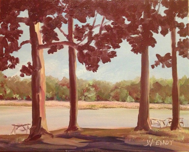
I felt so brave when I was painting, daringly putting a muted purple in the trees in the background, and a bright purple in the shadows in the foreground, and painting the silhouette of the foreground tree leaves a deep red-violet.  But when I look at the painting from any distance, the purples just become dark values, not daring at all!  My intention was to paint the background trees and grasses with brighter colors and more detail, and the foreground with broader brush strokes and less detail.  I think everything turned out more or less as I had hoped, except for the color of the water.  When I put the rich red-violet trees and shadow patterns in the foreground, the water of the bayou in the middle-ground, which I had painted a light pinkish blue, became more muted by comparison, almost a light gray.

In general, I’m pleased with the overall impression of looking out at the bayou through very large trees.  The barely visible picnic tables show the scale of the trees.

———————————

Most of my paintings and images are available for purchase.  Contact me if you are interested. — Joan Vienot

Posted on Leave a comment

Essential Character of a Place: Plein Air Nature Trail

Oil painting of Nature Trail at Grayton Beach State Park

I was privileged to paint plein air beside my artist friend Betty Cork yesterday.  I am the proud owner of one of Betty’s paintings, the bright colors of a path under the oaks of Eden Gardens greeting me when I walk into my business office every weekday.  I met Betty through the Cultural Arts Alliance.  We both drew at the figure drawing sessions at Studio b for 3 years.  And it was she who twisted my arm to be on the A+Art Committee which I now Co-Chair with Robin Wiesneth, showcasing CAA member artists work in the reception area and conference room of the South Walton Center of Northwest Florida State College.

The plein air painters met at Grayton Beach State Park this week.  Most of the painters went to the beach to paint the misty shoreline and emerald waves, but Betty and I hiked a short way up the nature trail and set up to paint under the canopy of scrub oaks. I was looking towards the sun, so that much of the foliage was beautifully backlit, but with the sun in my eyes, it was a bit of a chore seeing the brilliance of the colors.  The gnarly tree trunks were silhouetted against the bright light.

I post on Facebook photos of my work in progress and also the finished piece. I found it interesting that one of the comments on my finished piece was “That is so here!”  I wonder, what is the specific visual imagery that depicts the essential character of a place, making it “here”? In this case, I think it was the combination of the palmetto bushes underneath with the twisting shapes of the scrub oak trees.  The live oaks at the beach are very small, hugging and conforming to the dune line, sheared off at the top by the salty winds. On the bay, the same trees grow into massive giants, with Spanish moss dripping from the acre-wide branches.

One of the constrictions of plein air painting is that you don’t have a lot of time.  Because the scene before me was so chock-full of brush and foliage, my challenge was to simplify it into layers. I painted the background foliage first, so that I wouldn’t have to take the time to try paint the negative space around the foreground shapes afterwards. The gnarly tree trunks came next, and the palmettos in the foreground were last.  Betty suggested to me to put some of the oranges and very bright yellows in the palmetto leaves.  She is an expert with bright color.

Below is the start of my painting, and the finished piece.  Contact me if you are interested in purchasing this piece, with or without frame. — Joan Vienot

Oil painting of Nature Trail at Grayton Beach State Park


Posted on Leave a comment

Types of Lighting

I am teaching a “Back-to-the-Basics” drawing class for the Cultural Arts Alliance of Walton County.  This week we talked about three different types of lighting:  silhouette, high contrast, and full-values.  For a silhouette to be effective, it is essential that the subject be recognizable by its outer contours, since there is no interior development.  Below are some examples of sillouette.  Please forgive the quality of the photographs — they are meant for illustration only.

In high contrast, interior development is in only two values.  This allows for a more ambiguous outer contour because the development inside the form identifies the subject.  Below is a drawing done in high contrast.

Full-value development is the type of treatment we are most familiar with, where we can easily identify the subject because the interior development is in a full range of values, like the drawings below:

Many artists will use all three of these methods of describing shape, within the same drawing or painting.  Silhouettes require less attention, and if executed in middle values, can provide wonderful background imagery, effectively breaking up negative space and often repeating forms found in the foreground, as in paintings of flowers for example.  Even when the lighting is shown in full values, often the lighting will simplify into high contrast or silhouette, especially towards the edges of the composition.

Silhouettes can be extremely powerful.  Some of the happiest ooo’s and ahhh’s will be heard when you show a painting of a brightly colored sunset with silhouettes in the foreground.


Posted on Leave a comment

Types of Lighting

I think of lighting as being one of three primary types:  silhouette, which has the most impact if the shape is recognizable by its external contour;  high contrast, which treats all of the lighted areas as one light value, and treats all of the shadowed areas as one dark value, or perhaps using only 3 or 4 values; and the last type of lighting, full gradual shading ranging from white through the entire value scale to black, which sometimes is referred to as chiaroscuro, exmplified by the image found in the Art Studio Chalkboard website.

I rarely work on a figure drawing after I get back to my home studio, except to correct a glaring mistake, or to clean up a smudge here or there.  But two weeks ago, the model gave us a beautiful pose, and I was unhappy with the drawing I made during the figure drawing session.  So I took a new sheet of paper, and redrew the pose using brown ink, showing only the primary two or three values, and leaving a lot of the edges undefined where light was hitting them.  This treatment gives the drawing a completely different feeling.

The pose interested me because the model was leaning down with his elbow and forearm on one knee, which foreshortened his torso.

Most of my images are available for purchase.  Contact me if you are interested. — Joan Vienot

Posted on Leave a comment

Figure Drawing with Music in my Head

Reclining

The room was quiet as we drew at Studio b. this week.  The model was extraordinary, performing poses during our one-minute and three-minute warm-up period that would have taxed an accomplished yogi.  We warmed up with gesture drawings for about half an hour, before drawing a few 10 and 20 minute poses, and then finally a 45 minute pose.  I’ve been enjoying a combination of white nupastel with black graphite for a while now, but in my final drawing I opted for a blue pencil with the white nupastel, at left.  The form was very simple from my vantage point, for the most part being only a silhouette with very little modeling.  Her shoulder blade was prominent, and there was a highlight on the muscle edging her spine, so I put a little more emphasis on her hair and the fabric she was lying on, to provide textural contrast.

The night before, I had listened to Amber Rubarth performing there at Studio b., in the courtyard below our figure drawing room.  Her music was still playing in my head as I drew.  I videotaped a few of her songs, but I don’t yet know how to upload them from my whiz-bang new iPhone, so here’s a link to a previous performance by Amber:  http://www.youtube.com/watch?v=5Mn9VtIFM0g.

I made a mistake on the drawing pictured at right, something I know I should never do.  I had torn a corner of the page off, to give to another artist who wanted to order the kind of paper I was using.  Then I kept that paper, to draw on.  I’d been carrying it around for several weeks, and last night I decided to draw on it, without trimming off the torn corner.  I used the rest of the borders as my boundaries, treating the torn corner as if it wasn’t torn.  Now that the drawing is completed, I see that I would have to mat out or trim off that torn corner, and with it, lose other essential parts of the drawing.  Since there is excess paper on another side, I think a good framer might be able to patch it, but the patch would show, upon close inspection.  So I have priced it as a sketch, even though the drawing turned out exactly as I wanted it.  Lesson learned, hopefully — If a corner is missing, always trim the paper to square up that corner before using it.

If you are interested in having any of my drawings or sketches, contact me on the contact form through this website.

Posted on 3 Comments

Figure Drawing by the Pool, Another Studio b. Experience

You would think that when you go to the same activity, week in and week out, that it would become predictable, and perhaps even boring.

Not so with figure drawing, especially at Studio b. We had the same exceptional model for the 2nd week, who clearly was invested in our work, being aware of how her poses might come across, and considering the mood they might evoke.  Studio b. owner  Colleen Duffley said the model was even practicing a few poses before we got there, and during breaks, she asked the artists what sort of pose they would like next.  Of course for me, every pose is a challenge, so I am just happy to be there and almost any pose is good!  Generally, if a pose is not well-lit or is uninteresting from one vantage point, there is enough room to move to another location where I can see better or the composition is better.

For our final pose of the evening, the model got into the water of the pool.  Lit by the underwater lights, the portion of her figure beneath the water was a chalky blue-green, and extremely distorted.  The part of the figure above the water was almost a silhouette, it was so dark.  This is the first time I have drawn a figure in water, so I really had to study it.  The water’s distortion greatly shortened and widened the part of the figure closest to the surface of the water from my vantage.  Each artist had a different distortion. What struck me the most were the amazing colors, so although I rarely draw in color, this pose begged for it.

Heather Clements produced an amazing pencil drawing from the 50 minute pose — hopefully she will include it in her blog.  Also it can be seen on Studio b.’s facebook page.

Below are two other poses from this model this week, which I drew with graphite and Nupastel on Stonehenge paper, one paper gray and the other faun.

Most of my images are available for purchase.  Contact me if you are interested. — Joan Vienot

Posted on 2 Comments

Seeing in Black and White

This week in Figure Drawing at Studio b., Heather Clements instructed us to focus on light patterns and shadow patterns.  We worked with strong lighting, toning only the darks, all the same value, and leaving the paper untoned to show the lighted areas.  This high contrast lighting is very powerful, with much of the drawing reading as a silhouette.  Heather directed us to add intermediate values in our later drawings.  She kept a strong light on the model throughout the session.