If you’ve been keeping up with my posts, you know that I am teaching a “Back-to-the-Basics” drawing class for the Cultural Arts Alliance of Walton County. We had a lot of fun this week, experimenting with various drawing media which “wash out” or “bleed” when wet. We used watercolor pencils, Flair pens and Vis-a-Vis pens, Graphtint, Derwent sketching pencils, and Aquarelle china-marking pencils. I gave everyone a small piece of 140-lb hot press watercolor paper, so they could practice with the flat, smoothness of hot press. Most were familiar only with the textured cold press or rough watercolor paper. An example using a Flair pen is at right. The color is not lightfast, so if it were framed, the best thing to do would be to use UV protective glass.
 We reviewed last week’s lesson of 3 types of lighting — silhouette, high contrast, and full-values, and I showed the drawing at left to demonstrate full values with core shadow, cast shadow, reflected light, light reflected into the shadow, and rim light at the very edge of the silhouetted part of the shape. I gave everyone a ping-pong ball, and suggested they practice drawing it over and over, with light coming from a different direction each time. I know that practice will result in development of a great deal of skill in shading.
The primary subject of the lesson for the day was Texture.
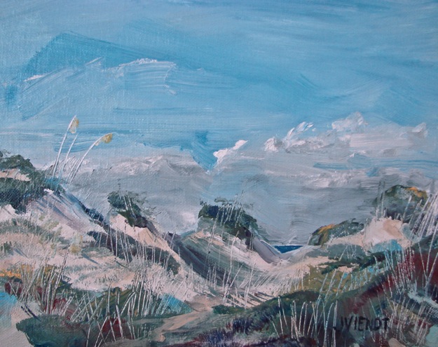
The next image, at right, is a detail off from a drawing I did that shows different textures in the landscape, and I also pointed out that I had dented the paper with a stylus to make lines that stayed white when I shaded across the reverse embossing, for some of the tree trunks and branches.
Pictured below the farmland detail is is a charcoal drawing on Kraft paper, of a huge chunk of charred wood, a texture study I did in college. I did a series of drawings from that charred wood piece, each evolving into something unique, and the next drawing is a part of that series. The textured parts in this drawing took on a more flowing appearance, like hair. The next piece is a stump out on the Intracoastal Waterway, although you would
not necessarily be able to identify that — it was a fun texture study, and you can see that not all of the textures are drawn — where it is smooth, I left the interior space undeveloped.
In the brown drawing of 3 heads, I used an eraser to streak the drawing and create an interesting stylized texture. The subject actually was a smooth mannequin head for displaying hats.
The drawing of the tree shows how the needles are spiky because they are drawn with short, hard strokes, and the tree trunk bark is textured in the lit areas but nearly black on the shadow side. Many of the branches are actually drawn in silhouette or high contrast. This is very different from the texture I used in the drawing of the teddy bear, which is smooth and soft. I wanted it to look cuddly. if I had drawn it with short, straight, hard strokes, it would not have looked as soft and cuddly.
We practiced drawing textures of real objects, using pieces of coral, twigs, a piece of a root, a weathered piece of wood, a seashell, and feathers. We can practice with anything, and we usually find that once we get started, it’s not hard to do. It takes some effort in the beginning, and then once we get the hang of it, we wonder why it seemed difficult. It’s essential to learn how to NOT draw every single bit of the texture, but rather, for the sake of interest, to leave some of it simply implied. Sometimes texture can be indicated just by the external contour.
The last four pictures below are covers of magazines, to illustrate different ways of treating texture. The first one is particularly interesting to me, in that the hair is hardly drawn at all, but just enough of it is drawn that it implies the texture very well.
Below: More examples of different textures