Posted on 3 Comments

An Ideal Day

Oil Painting of Pelican on Providenciales
 .

I have set a goal this year, to make a transition in my life, to live at least two days a week as an artist by the end of this year.  It may happen lot sooner than that.  It all started when I decided to hold myself accountable for not yet having made the leap.  Frankly, I’ve been fearful that I would not be able to support myself with my art, a legitimate concern up until this point, since I have been sporadic in my production of art.  To support my fear, I have used every excuse not to be more prolific, or in many cases, to go days without sketching or painting.  My most frequent excuse is that I do not have time.  Guess what — I do have time — I’ve been less than truthful with myself.  I simply have chosen to use my time for other purposes, instead of for producing art.

I hired a coach, to give me suggestions and feedback for making progress towards my goal.  One of the things she asked me, was what an ideal day would be like for me. I described waking up rested, taking some time for meditation and then working out or paddling or doing some other fitness-oriented activity, followed by a visit to a gallery or some other “artist-date”, and then painting all afternoon, probably plein air painting, followed by a cultural event in the evening, perhaps a play or dance theater or a musical performance.  But then I thought to myself, about a week later, that if I had described that as my ideal day, then why had I not ever had an ideal day, and I realized then and there that I was lying to myself, because I have had unscheduled days before, but have not ever done all the things that would make up an ideal day.

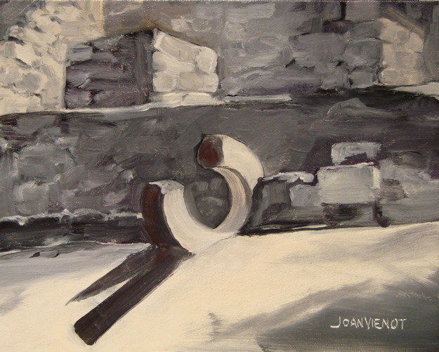
So when one of my best friends called last week and asked another friend and me over for breakfast on Sunday, and I declined because I had other tentative plans, I instead invited her over to my art studio on Saturday because I intended to paint.  She is a writer, so I asked her to bring her paper so she could write while I painted.  She offered to bring breakfast.  Meanwhile, Saturday brought incredibly bad weather with it, and another friend decided to cancel a trip to see a client, and instead came over to my house to wait out the rain and to work on a drawing she was making.  So the morning found the three of us in my studio, painting and talking and solving the world’s problems.  I made a small painting of some young bananas growing on a tree that I had photographed on North Caicos a few weeks ago.  At left is the sequence of development.

I cannot describe the creative spirit that filled the studio while we talked and worked.  I was in awe of the circumstances that brought us all together, and the energy of the dynamics.  Both friends left around midday, and I took another half-hour or so to finish my painting, before going upstairs to get my house ready for the evening activity.  I had invited 6 friends to participate in “The Art of Seeing” class which Ponce de Leon, FL, artist Mary Moses teaches through her gallery, HRMagoo.  I still needed to trim the legs on 3 of my stools so everyone would be comfortable at my art table, and I needed to go to the deli to pick up the supper wraps I would be serving.

Mary brought a friend with her, guitarist/artist/singer/songwriter Sharon Johnson, who played her guitar and sang while the rest of us learned the Art of Seeing.  Mary demonstrated, toning a plywood board with charcoal and then showing us how she picked out shapes and faces from the patterns in the wood grain, and then developed them.  We all dove in, everyone in the group helping each other “find” shapes in their panels, with a good amount of laughter, all inspired, often awed, always positive, and occasionally raunchy, and all in all, a lot of fun.  The time flew, and we all had a great time.

I think I probably could continue to work on my panel, but I am surprised and happy with what I did so I may just call it finished as is.  It is not at all like any art I have ever made before, and it is uniquely my own, in that I drew the shapes and faces that for the most part I alone saw, and in my own way, without pre-planning the composition.  I found a number of faces on my panel, including a few aliens and a horse and two elephants and a covey of birds.  I assign significance and meaning to it which no doubt would alarm my some of my friends and family and perhaps cause them to look askance at me, so I’ll leave that unexplained for now, and settle for letting you do the interpreting and drawing your own meaning from it.  It is below left.

I would say that this day qualified as an ideal day.

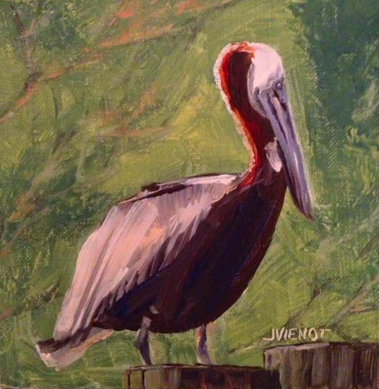
I painted the pelican, below right, a couple of days later, using a reference photo from my vacation on Providenciales in January.

Most of my images are available for purchase.  Contact me if you are interested. — Joan Vienot

Posted on Leave a comment

Drawing Texture

If you’ve been keeping up with my posts, you know that I am teaching a “Back-to-the-Basics” drawing class for the Cultural Arts Alliance of Walton County.  We had a lot of fun this week, experimenting with various drawing media which “wash out” or “bleed” when wet.  We used watercolor pencils, Flair pens and Vis-a-Vis pens, Graphtint, Derwent sketching pencils, and Aquarelle china-marking pencils.  I gave everyone a small piece of 140-lb hot press watercolor paper, so they could practice with the flat, smoothness of hot press.  Most were familiar only with the textured cold press or rough watercolor paper.  An example using a Flair pen is at right.  The color is not lightfast, so if it were framed, the best thing to do would be to use UV protective glass.

We reviewed last week’s lesson of 3 types of lighting — silhouette, high contrast, and full-values, and I showed the drawing at left to demonstrate full values with core shadow, cast shadow, reflected light, light reflected into the shadow, and rim light at the very edge of the silhouetted part of the shape.  I gave everyone a ping-pong ball, and suggested they practice drawing it over and over, with light coming from a different direction each time.  I know that practice will result in development of  a great deal of skill in shading.

The primary subject of the lesson for the day was Texture.

The next image, at right, is a detail off from a drawing I did that shows different textures in the landscape, and I also pointed out that I had dented the paper with a stylus to make lines that stayed white when I shaded across the reverse embossing, for some of the tree trunks and branches.

Pictured below the farmland detail is is a charcoal drawing on Kraft paper, of a huge chunk of charred wood, a texture study I did in college.  I did a series of drawings from that charred wood piece, each evolving into something unique, and the next drawing is a part of that series.  The textured parts in this drawing took on a more flowing appearance, like hair.  The next piece is a stump out on the Intracoastal Waterway, although you would

not necessarily be able to identify that — it was a fun texture study, and you can see that not all of the textures are drawn — where it is smooth, I left the interior space undeveloped.

In the brown drawing of 3 heads, I used an eraser to streak the drawing and create an interesting stylized texture.  The subject actually was a smooth mannequin head for displaying hats.

The drawing of the tree shows how the needles are spiky because they are drawn with short, hard strokes, and the tree trunk bark is textured in the lit areas but nearly black on the shadow side.  Many of the branches are actually drawn in silhouette or high contrast.  This is very different from the texture I used in the drawing of the teddy bear, which is smooth and soft.  I wanted it to look cuddly.  if I had drawn it with short, straight, hard strokes, it would not have looked as soft and cuddly.

We practiced drawing textures of real objects, using pieces of coral, twigs, a piece of a root, a weathered piece of wood, a seashell, and feathers.  We can practice with anything, and we usually find that once we get started, it’s not hard to do.  It takes some effort in the beginning, and then once we get the hang of it, we wonder why it seemed difficult.  It’s essential to learn how to NOT draw every single bit of the texture, but rather, for the sake of interest, to leave some of it simply implied.  Sometimes texture can be indicated just by the external contour.

The last four pictures below are covers of magazines, to illustrate different ways of treating texture.  The first one is particularly interesting to me, in that the hair is hardly drawn at all, but just enough of it is drawn that it implies the texture very well.


Below:  More examples of different textures

Posted on Leave a comment

Types of Lighting

I am teaching a “Back-to-the-Basics” drawing class for the Cultural Arts Alliance of Walton County.  This week we talked about three different types of lighting:  silhouette, high contrast, and full-values.  For a silhouette to be effective, it is essential that the subject be recognizable by its outer contours, since there is no interior development.  Below are some examples of sillouette.  Please forgive the quality of the photographs — they are meant for illustration only.

In high contrast, interior development is in only two values.  This allows for a more ambiguous outer contour because the development inside the form identifies the subject.  Below is a drawing done in high contrast.

Full-value development is the type of treatment we are most familiar with, where we can easily identify the subject because the interior development is in a full range of values, like the drawings below:

Many artists will use all three of these methods of describing shape, within the same drawing or painting.  Silhouettes require less attention, and if executed in middle values, can provide wonderful background imagery, effectively breaking up negative space and often repeating forms found in the foreground, as in paintings of flowers for example.  Even when the lighting is shown in full values, often the lighting will simplify into high contrast or silhouette, especially towards the edges of the composition.

Silhouettes can be extremely powerful.  Some of the happiest ooo’s and ahhh’s will be heard when you show a painting of a brightly colored sunset with silhouettes in the foreground.


Posted on Leave a comment

The Value of Beginner Classes

Like many artists and photographers, much of my creative development has been through sheer determination and white knuckles.  Workshops, classes, courses, and graduate- and post-graduate studies certainly have provided me with a solid grounding in the fundamentals.  But image-making as a whole, whether as craft or as fine art,  is largely learned by just doing it, finding your own comfort zone for composition, color, light, texture, balance, and rhythm.  In the doing, you develop confidence and authority.  Still, there is a lot to be said for reviewing the basics.  Sometimes in reviewing, you are introduced to something entirely new.  Or perhaps it is something you’ve been taught before that you forgot, or that you never understood before.  At the very least, you are a different person today than you were last year, so you see things differently.

Too often, an artist will become very good at their craft, able to produce amazing images, only to find themselves challenged by not being able to execute a detail, or not knowing how to structure an element.  I can’t tell you how many artists have told me that they cannot draw.  Drawing seems to me to be essential to the execution of anything visual.  It doesn’t have to be drawing with a pencil — it might be a drawing with a brush, with wet media.  Perhaps those artists have a limited definition of drawing.  Or perhaps they are more of the instinctive, intuitive school, where the image evolves almost like a performance, without the artist having a preconception.

A painting I did a couple of months ago, shown at right, might be considered a drawing as much as it is a painting.  I painted the canvas-board a dark blue-black color, let it dry, and then painted the tans and blue colors over it.  I created the trees by “drawing” them with a rubber stylus, wiping off the wet paint to expose the dark color underneath.  The related blog is at https://joanvienotart.wpengine.com/landscape/opening-floodgates-4964.

Several accomplished artists are in the Back-to-the Basics Drawing Class that I am teaching for the Cultural Arts Alliance this month.  At first, I was a little intimidated because I know their capabilities, but within just a few minutes of my start,  I found my footing and got on a roll.  Many years ago, I was awarded secondary school teacher certification when I received my Fine Art degree from the University of Northern Colorado.  I taught painting and drawing in a high school in Colorado for 3 years before I moved to Florida.  Since then I have just taught a few adult classes in watercolor painting, and a private drawing course to a student who needed a humanities credit to graduate from high school.  So the Back-to-the-Basics Drawing Class is requiring me to review the basics myself.

Teaching can be exhausting.  Supposedly a good teacher prepares for 2 hours for every one hour in the classroom.  An experienced teacher will be so well-prepared and so practiced that he or she can teach off-the-cuff.  But it’s been so long since I taught that I am having to review everything myself, as well as come up with visual examples of the concepts and techniques I am teaching. In the first class I reviewed elementary perspective (ugh!) for the first hour, and in the second hour I let the class draw, focusing on thumbnail sketches and line quality.  I provided some articles that were difficult to draw, requiring the artists to simplify.

I myself am taking a beginning photography class.  My point-and-shoot camera is so smart that the only decisions I have had to make are compositional decisions.  There is a lot that I do that I don’t have to think about because it is “instinctive”.  And there is the added benefit of using a digital camera with no expense associated with the number of photos I take, so that if necessary, I can take a zillion photos on the high probability that at least one will turn out good.  But I have been finding limitations to the “automatic” settings, so now I am learning about ISO, aperture, and shutter speed.  I have dusted off my tripod, which has hardly been used because it is difficult to deploy from a canoe or stand-up paddleboard, my usual vehicles for nature photography.  The class I am taking is at Northwest Florida State College, at the South Walton Center.  Like many colleges, they offer non-credit adult-education classes for a nominal fee.  My class is taught by Jackie Ward, a professional photographer (www.jacquelinewardimages.com).  This week’s homework was to produce a few images of the same subject, keeping all camera settings the same and varying only the aperture, without too much concern for the excellence of the composition.  I photographed the little metal birds that are fastened onto my porch railing.  The first image below, focusing on the third bird, was shot with a larger aperture, so it has less depth of field than the second, and more bokeh (new fancy photographer’s word, meaning blur).  The bokeh is most obvious in the background trees.  Now I have a new problem:  I don’t have as many options as I would like, so now I need a better camera!

ISO 100 f/3.2

ISO 100 f/8


Most of my images are available for purchase.  Contact me if you are interested. — Joan Vienot

Posted on Leave a comment

Back-to-the-Basics Drawing Course

Hollington Farmland


In February, 2013, I will be offering a “Back to the Basics” Drawing Course at the Bayou Arts Center, in Santa Rosa Beach, FL, for the Cultural Arts Alliance.  The course will be four two-hour classes, on Tuesdays from 1:00 to 3:00pm.  We will practice line quality, “seeing” shape and drawing what we see, and creating textures.  We will practice drawing as preliminary to other art, as well as drawing as the final masterpiece, and we will experiment with several kinds of media.

An otherwise fabulous work of art can be ruined by poor perspective.  So in the first of the four two-hour classes, we will review one-point and two-point perspective, which are useful tools for making representational objects look “right” in our attempt to create the illusion of 3 dimensions on a two-dimensional surface.  Knowledge of perspective will assist us in seeing correctly.

Above is a drawing I made several years ago, showing the weeds near to the viewer to be much larger, relative to the trees and the structures further back in the picture plane.  As objects recede, they should be drawn smaller and there is an orderly way to go about that, which is the tool called perspective.

Below I have posted a simple sketch showing some perspective problems.  You immediately get a sense that there’s something wrong with this picture, and you may or may not notice what it is exactly that bothers you, but you will recognize it and agree that the house on the right looks crooked, and the telephone poles seem too tall as they go over the horizon, and the fence underneath them doesn’t seem right, and the tractor looks too small.


Back-to-the Basics Drawing Course

Register at (850) 622-5970.  The fee is $100 for CAA members, slightly more for non-members.  Below is the suggested supply list.

  • Ebony pencils — jet black, extra smooth (Prismacolor) or similar very soft, black graphite pencil (6B or 8B)
  • A water-soluble pencil, i.e., Derwent Sketching pencil – dark wash, 8B,  or Derwent Graphtint pencil – nice colors are steel blue(06), port (01), shadow blue (05)

  • A water-soluble pen, dark (Vis-a-Vis, or Flair) — blue, black, or brown
  • A white eraser (White Pearl)
  • 12″ ruler — 18″ is even better
  • Watercolor brushes — nothing fancy, anything will do, but if you have one, a #4 rigger/liner/script and #6 pointed round
  • Small water container (Dixie cup is fine)
  • Soft cotton rag for smudging
  • Old sketchbook for note-sketches and for practicing at home
  • Assortment of papers — white, cream, mid-tone, and colors, different textures, nothing terribly expensive, but better than newsprint,whatever you have on hand, and perhaps some watercolor paper or illustration board, 12 x 18 or larger
  • Plus anything else you might want to draw with or on
  • You may want a to bring your drawing board and table easel or stand-up easel, but we can work on the tabletops.
  • Optional supplies the instructor will bring for you to experiment with:
  • Charcoal pencil, paper-wrapped — soft or extra soft (Berol)
  • Woodless pencil, 6B (Grafstone), or graphite sticks
  • Cretacolor Woodless watercolor pencils (Aqua Monolith)
  • Nupastel, white, and some dark colors
  • Stabilo Aquarelle Black 8046 or Red 8040 or Brown 8045
  • Practice paper (cheap, not colorfast):   Smooth newsprint, Textured newsprint, Gray bogus paper

The instructor gets supplies from www.dickblick.com, and standard delivery is usually about 10 days.  But please do not spend a fortune — let’s use the supplies you already have!

Posted on Leave a comment

The Ruins at Coba

I spent a week in Mexico in mid-December.  Ruins from ancient civilizations fascinate me, and the ruins at Coba were no exception.  A boy there drove our big tricycle-tour-carriage to one of the pyramids, Nohoch Mul, one of the few in Mexico that visitors are still allowed to climb.  Nohoch Mul is the tallest pyramid in the Yucatan Peninsula, 138′.  At the top, you can see out over the Mexican jungle to other points breaking the treeline in the distance, which I presume are other pyramids.  There was a structure on the platform at the top, with a short doorway which was screened closed.  The walls inside were black, like many fires had been burned inside.  It felt spooky, and I wondered if sacrifices had been made there — maybe some spirits were still hanging around.

Our tricycle guide took us to some of the other structures, including a round temple-pyramid and a Mayan ballcourt.  After we finished our tour, we realized there was another, smaller ball court, near the entrance to the area.

I found the ballcourts to be particularly fascinating.  I could almost hear the cheering for the teams of players trying to pass a ball through the stone rings in the center of the sloped side-walls.  The game was played recreationally, but also ceremonially when it is thought that the captain of the losing team gave up his head.

One of the rings was broken at the second ball court, and its jagged edges and sharp shadow shapes intrigued me.

As often happens when I am first starting a painting, the initial paint-drawing frustrated me and I almost quit.  There was very little color to the ruins — just the black, white, and gray of the rocks and mortar.  But I didn’t want to make it a black-and-white painting.  Near-black, and gray can be made from many colors.  I wanted the areas lit by the sun to be warm, and the shadows cooler, so I chose an orange tint for the sunny rocks, and I used cobalt violet mixed with orange for the shadowed areas.  Where I needed it to be even cooler, I added a little viridian green.  The broken stone ring was the obvious focal point, being so very different from the planes and shapes of the rest of the structure.  To bring even more attention to it, I added a warmer gray to its shadows, with more orange.  The shadows cast from the ring are in sharp contrast to the sunlit area, as opposed to the shadows from the trees overhead, which have soft edges.

Most of my images are available for purchase.  Contact me if you are interested. — Joan Vienot

Posted on 4 Comments

Laguna de Siete Colores Adventure

After completing the Artist’s Way Workshop led by Joyce Hogue at A.Wickey Gallery, I think I need to start over and really read every word of every chapter of the book.  There were so many times I would read something and think, Oh, yeah, that’s not really about me or my life, when really there is a lot more truth than I was comfortable admitting, descriptions of ways that I sabotage efforts to create art.  Most especially I realized that I am not exactly being truthful when I say I don’t have time to do my art.  I took a good look at how I spend my time, and I noticed that I seem to be able to take off on a 5- or 10-day adventure at the drop of a hat, so it is absolutely untrue that I do not have time — it’s merely that I have not been scheduling time for my art.

So this-coming year, I resolve to expand my definition of myself, this time as an artist, as well as an adventurer.  Oh, I’ve been calling myself an artist my whole life, but when I am honest, I realize that time-after-time-after-time, I have resisted when it comes to actually producing art.  Sometimes it is the inertia of couch-sitting that holds me back, sometimes it is thrill of unknown adventure that I would rather do, sometimes it is the attraction of friendship and companionship, and sometimes the aggravation of bills or work commitments, but I am realizing that just about any excuse not to produce art has resulted in greatly limiting my artistic output.  If I really want for my dream of being a full-time artist to come true, I will need to quit ignoring the call of the paint and to start producing finished works.

At the very least, I will have an additional 3 hours of empty time every week, when I have been attending the 12 sessions of the Artist’s Way Workshop. Last week one of the participants hosted a party for us all, at her house.  Our assignment was to make a small gift using a quote form the Artist’s Way book.  I made and framed a 3×3″ watercolor of an orange, above right, with the quote that “sometimes we shake the apple tree, and the universe delivers oranges.”  This quote is significant to me, in that so many times in my life, I may have had a wish, a dream, or set an intention, and events come to pass which meet and exceed that intention in ways very different from how I had imagined.

I missed class the week before, while I was in Mexico at a retreat called Laguna de Siete Colores, named for Laguna Bacalar, in the southern Yucatan.  I was there to shoot promotional photography for The Stand Up Paddle Radio Show and for Undertoe Mexico Stand Up Paddleboards, the producers of the retreat.  The paintings at left are all oil on canvas panel, and this series is from the sunrise at Tulum, our first morning in Mexico.  Sunrise is always inspirational, and the colors are so warm and bright in the first hour after sunrise, the “golden hour.”  I plan to paint many more from this adventure in Mexico.

My present intention is to review and refresh my skills with painting, since I have only just begun oil painting late this year, after about 30 years of making drawings and watercolor paintings.  My goal is to join up with the local group of plein air painters, who paint every Wednesday morning.  I am limiting my work on these practice paintings to only 2 hours at most, so that I develop a faster and looser style of painting, which is more practical for plein air painting, due to rapidly changing light and weather conditions.

I have found that my brushes are pretty sad, so I have ordered 4 new ones, and also a new tube of titanium white,and new oil painting medium to make my paints more workable and to help them all dry more quickly and with the same degree of gloss.  I’m still pretty stingy with the paint, not mixing big enough batches of each color, which is forcing me to remember which tubes I used and in what quantities in order to get each color.  So far the color mixing has come back to me fairly easily, and I very much appreciate the fact that oil paints dry pretty close to the same color that I mix, as opposed to watercolor paints, which always dry more muted and lighter in value than when they are wet.

I usually post photos of my paintings on Facebook on my Joan Vienot Art page as soon as I finish them.  The tern painting was very popular, selling the same day I posted it.  Contact me if you are interested in any of my paintings.  Since they largely are practice pieces, I am maintaining reasonable pricing.

—————————————

Finished piece: Whispering Statue

Around one month ago, the Artist’s Way workshop assignment was to open a book, and select a two-word phrase, and make a piece of art out of it, or write a poem, or whatever mode of expression we chose.  When George Harrison did this, he wrote the song “While My Guitar Gently Weeps” after seeing the phrase “gently weeps” in the first random book he picked up.  I didn’t actually open the first book I picked up, but instead selected the title of a Nancy Drew mystery, The Whispering Statue.  I selected for my inspiration a piece of concrete yard art in my own yard, a gift from a dear friend, a statue of St. Francis of Assisi.  Below is the progression of the painting.  The statue stands next to my birdbath.  Click on any of the images for a larger view.

Most of my images are available for purchase.  Contact me if you are interested. — Joan Vienot


Posted on Leave a comment

Opening the Floodgates

A good friend of mine is preparing to backpack the Appalachian Trial.  Last month, over the long weekend after Thanksgiving, I accompanied her on her “shakedown” trip where she tested a lot of her new gear and her cooking methodology.  We camped on her mountain property near Mount Pisgah, near Brevard, NC, Jane in her fancy Hennessey Hammock, and me in my REI quarter-dome tent.  Having backpacked through the Smokies and in New Hampshire, I know that much of any backpacking experience is consumed with ordinary survival — food, clothing, and shelter — and this trip was no exception, with nighttime temperatures in the low 20’s (F).  Jane cooked on a lightweight backpacker’s alcohol-fueled stove, and I had my minimalist pan support with dry Esbit fuel, to rehydrate and heat our dehydrated food and make tea.  But we weren’t that far away from town, so even though we were “roughing it”, our evening meals were accompanied by good wine.  Each evening we would go for another walk, as if our mountain trail hikes had not provided enough exercise for the day, and then we would talk in between handfuls of “gorp” for dessert (good old raisins and peanuts) before crawling into our sleeping bags for the night.

The mountain imagery was overwhelming.  Jane is a fine art photographer, so spending time with her doubled the opportunities for the mountain splendor to imprint on my soul.  If there is a simple purpose to producing one’s art or vision, it may simply be to point out the beauty/order/harmony we see and to share it with those who might not have noticed.  I learned a lot about the limitations and capabilities of my iPhone camera.

I came home with my head and heart overflowing with the mountain colors and shapes.  Having only recently begun my return to oil painting, I was surprised to find myself wide awake and compelled to paint at 4:00 the very next morning after we got back.  By compelled, I mean that there was no option not to paint — it felt like a dam would break if I didn’t get an image made.  This happened twice in that week following our adventure, forcing me to focus my sleepy eyes 2 hours earlier than my usual wake-up time.  I painted the 8×10″ canvas panel very quickly, finishing before showering and leaving to be on time for my day job.  Above are my paintings which of course contain the colors and memories of my experience more so than the photographic references below.

Most of my images are available for purchase.  Contact me if you are interested. — Joan Vienot

Photo reference

Photo reference


Posted on Leave a comment

Sean Dietrich

Sean Dietrich, Artist

I own and mange a service business which has progressed to the point where I am now working primarily at a desk in an office, instead of in the field where I first began to love the trade I am in.  The office work is less than satisfying, and I take many short breaks to maintain maximum productivity and to keep from becoming an automaton.  I often run the newsfeed from Facebook in the background behind whatever I am working on.  Sometimes it is hours before I actually look at Facebook, but as fortune would have it, a few weeks ago one of my favorite local artists posted a photo of a freshly completed figure painting, and said something to the effect of “Free to a good home” for the first person to comment.  By the time I saw it, it had been posted for 15 minutes already, and no one had commented yet, so I pounced, “I want it!”  I picked it up that Saturday, and now I am the proud owner of my very own Sean Dietrich painting, the 18 x 24 oil on canvas posted above.

I was attracted to Sean’s work by the loose style of the small studies he had been posting on his Facebook page.  These smaller works were loose and gestural, but had a certain precision of color and form that made it obvious that years of practice preceded the apparent simplicity.  When I met him to pick up my painting, I said to him that his work looked like it only took him twenty minutes but I knew it took about 30 years.  He laughed, and said “True!”

Sean blogs and posts his work at http://seandietrich.com/?page_id=3440.

Posted on 2 Comments

Early Morning Light


Yesterday I went hiking shortly after sunrise with my friend Jane Burns, who is a fine art photographer.  The sun was rising between the foggy tree trunks, just above the brush, as we hiked the groomed trail through the state forest just north of Grayton Beach State Park.  Jane and I both pulled our cameras out of our packs, to capture the first light.  We continued to have jaw-dropping views at every turn of the trail.  It was the “golden hour” following sunrise, when shadows are long and the light is warm and diffused.  A light fog exaggerated the effect, rendering every scene an ethereal fairy-scape.  The first photo above was taken during those first minutes on the trail.
.

The light changed quickly as the sun came up, and the fog began lifting.  Wonderful atmospheric  effects played over the landscape as the cooler, shaded areas maintained a misty quality, and open areas became more clear.  Normally I carry my bigger camera, but since we were going to hike 8 or 9 miles, I opted to bring only my iPhone 5S.  Halfway into the hike, Jane showed me the High Definition function, where the camera shoots two versions, one normal, and one HDR.  The higher quality is obvious on some even when viewed on the camera’s small screen.

As the morning progressed, the fall light became crisper, and the colors became more vibrant.  Dew remained in the shady areas, and in one section, a carpet of bejeweled, glittering moss underfoot.  Both Jane and I tried to photograph the shimmering drops on the moss, but the camera didn’t pick them up.  A tightly focused video would have been beautiful.

I stopped taking so many pictures after the first hour or so.  The light was still beautiful, the sky a crystal clear blue and the colors so typical of autumn.  I still felt like I was walking through a scenic calendar.  But I was so very spoiled by the wealth of imagery during that first hour, the golden hour, that I just enjoyed the views for the rest of the hike.

Most of my images are available for purchase.  Contact me if you are interested. — Joan Vienot

.