Posted on 3 Comments

An Ideal Day

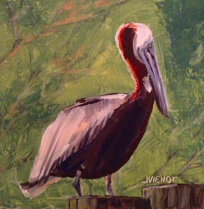
Oil Painting of Pelican on Providenciales
 .

I have set a goal this year, to make a transition in my life, to live at least two days a week as an artist by the end of this year.  It may happen lot sooner than that.  It all started when I decided to hold myself accountable for not yet having made the leap.  Frankly, I’ve been fearful that I would not be able to support myself with my art, a legitimate concern up until this point, since I have been sporadic in my production of art.  To support my fear, I have used every excuse not to be more prolific, or in many cases, to go days without sketching or painting.  My most frequent excuse is that I do not have time.  Guess what — I do have time — I’ve been less than truthful with myself.  I simply have chosen to use my time for other purposes, instead of for producing art.

I hired a coach, to give me suggestions and feedback for making progress towards my goal.  One of the things she asked me, was what an ideal day would be like for me. I described waking up rested, taking some time for meditation and then working out or paddling or doing some other fitness-oriented activity, followed by a visit to a gallery or some other “artist-date”, and then painting all afternoon, probably plein air painting, followed by a cultural event in the evening, perhaps a play or dance theater or a musical performance.  But then I thought to myself, about a week later, that if I had described that as my ideal day, then why had I not ever had an ideal day, and I realized then and there that I was lying to myself, because I have had unscheduled days before, but have not ever done all the things that would make up an ideal day.

So when one of my best friends called last week and asked another friend and me over for breakfast on Sunday, and I declined because I had other tentative plans, I instead invited her over to my art studio on Saturday because I intended to paint.  She is a writer, so I asked her to bring her paper so she could write while I painted.  She offered to bring breakfast.  Meanwhile, Saturday brought incredibly bad weather with it, and another friend decided to cancel a trip to see a client, and instead came over to my house to wait out the rain and to work on a drawing she was making.  So the morning found the three of us in my studio, painting and talking and solving the world’s problems.  I made a small painting of some young bananas growing on a tree that I had photographed on North Caicos a few weeks ago.  At left is the sequence of development.

I cannot describe the creative spirit that filled the studio while we talked and worked.  I was in awe of the circumstances that brought us all together, and the energy of the dynamics.  Both friends left around midday, and I took another half-hour or so to finish my painting, before going upstairs to get my house ready for the evening activity.  I had invited 6 friends to participate in “The Art of Seeing” class which Ponce de Leon, FL, artist Mary Moses teaches through her gallery, HRMagoo.  I still needed to trim the legs on 3 of my stools so everyone would be comfortable at my art table, and I needed to go to the deli to pick up the supper wraps I would be serving.

Mary brought a friend with her, guitarist/artist/singer/songwriter Sharon Johnson, who played her guitar and sang while the rest of us learned the Art of Seeing.  Mary demonstrated, toning a plywood board with charcoal and then showing us how she picked out shapes and faces from the patterns in the wood grain, and then developed them.  We all dove in, everyone in the group helping each other “find” shapes in their panels, with a good amount of laughter, all inspired, often awed, always positive, and occasionally raunchy, and all in all, a lot of fun.  The time flew, and we all had a great time.

I think I probably could continue to work on my panel, but I am surprised and happy with what I did so I may just call it finished as is.  It is not at all like any art I have ever made before, and it is uniquely my own, in that I drew the shapes and faces that for the most part I alone saw, and in my own way, without pre-planning the composition.  I found a number of faces on my panel, including a few aliens and a horse and two elephants and a covey of birds.  I assign significance and meaning to it which no doubt would alarm my some of my friends and family and perhaps cause them to look askance at me, so I’ll leave that unexplained for now, and settle for letting you do the interpreting and drawing your own meaning from it.  It is below left.

I would say that this day qualified as an ideal day.

I painted the pelican, below right, a couple of days later, using a reference photo from my vacation on Providenciales in January.

Most of my images are available for purchase.  Contact me if you are interested. — Joan Vienot

Posted on Leave a comment

Drawing Texture

If you’ve been keeping up with my posts, you know that I am teaching a “Back-to-the-Basics” drawing class for the Cultural Arts Alliance of Walton County.  We had a lot of fun this week, experimenting with various drawing media which “wash out” or “bleed” when wet.  We used watercolor pencils, Flair pens and Vis-a-Vis pens, Graphtint, Derwent sketching pencils, and Aquarelle china-marking pencils.  I gave everyone a small piece of 140-lb hot press watercolor paper, so they could practice with the flat, smoothness of hot press.  Most were familiar only with the textured cold press or rough watercolor paper.  An example using a Flair pen is at right.  The color is not lightfast, so if it were framed, the best thing to do would be to use UV protective glass.

We reviewed last week’s lesson of 3 types of lighting — silhouette, high contrast, and full-values, and I showed the drawing at left to demonstrate full values with core shadow, cast shadow, reflected light, light reflected into the shadow, and rim light at the very edge of the silhouetted part of the shape.  I gave everyone a ping-pong ball, and suggested they practice drawing it over and over, with light coming from a different direction each time.  I know that practice will result in development of  a great deal of skill in shading.

The primary subject of the lesson for the day was Texture.

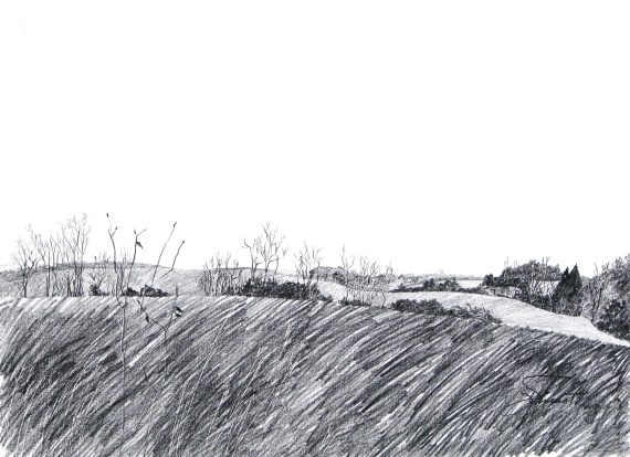
The next image, at right, is a detail off from a drawing I did that shows different textures in the landscape, and I also pointed out that I had dented the paper with a stylus to make lines that stayed white when I shaded across the reverse embossing, for some of the tree trunks and branches.

Pictured below the farmland detail is is a charcoal drawing on Kraft paper, of a huge chunk of charred wood, a texture study I did in college.  I did a series of drawings from that charred wood piece, each evolving into something unique, and the next drawing is a part of that series.  The textured parts in this drawing took on a more flowing appearance, like hair.  The next piece is a stump out on the Intracoastal Waterway, although you would

not necessarily be able to identify that — it was a fun texture study, and you can see that not all of the textures are drawn — where it is smooth, I left the interior space undeveloped.

In the brown drawing of 3 heads, I used an eraser to streak the drawing and create an interesting stylized texture.  The subject actually was a smooth mannequin head for displaying hats.

The drawing of the tree shows how the needles are spiky because they are drawn with short, hard strokes, and the tree trunk bark is textured in the lit areas but nearly black on the shadow side.  Many of the branches are actually drawn in silhouette or high contrast.  This is very different from the texture I used in the drawing of the teddy bear, which is smooth and soft.  I wanted it to look cuddly.  if I had drawn it with short, straight, hard strokes, it would not have looked as soft and cuddly.

We practiced drawing textures of real objects, using pieces of coral, twigs, a piece of a root, a weathered piece of wood, a seashell, and feathers.  We can practice with anything, and we usually find that once we get started, it’s not hard to do.  It takes some effort in the beginning, and then once we get the hang of it, we wonder why it seemed difficult.  It’s essential to learn how to NOT draw every single bit of the texture, but rather, for the sake of interest, to leave some of it simply implied.  Sometimes texture can be indicated just by the external contour.

The last four pictures below are covers of magazines, to illustrate different ways of treating texture.  The first one is particularly interesting to me, in that the hair is hardly drawn at all, but just enough of it is drawn that it implies the texture very well.


Below:  More examples of different textures

Posted on Leave a comment

Back-to-the-Basics Drawing Course

Hollington Farmland


In February, 2013, I will be offering a “Back to the Basics” Drawing Course at the Bayou Arts Center, in Santa Rosa Beach, FL, for the Cultural Arts Alliance.  The course will be four two-hour classes, on Tuesdays from 1:00 to 3:00pm.  We will practice line quality, “seeing” shape and drawing what we see, and creating textures.  We will practice drawing as preliminary to other art, as well as drawing as the final masterpiece, and we will experiment with several kinds of media.

An otherwise fabulous work of art can be ruined by poor perspective.  So in the first of the four two-hour classes, we will review one-point and two-point perspective, which are useful tools for making representational objects look “right” in our attempt to create the illusion of 3 dimensions on a two-dimensional surface.  Knowledge of perspective will assist us in seeing correctly.

Above is a drawing I made several years ago, showing the weeds near to the viewer to be much larger, relative to the trees and the structures further back in the picture plane.  As objects recede, they should be drawn smaller and there is an orderly way to go about that, which is the tool called perspective.

Below I have posted a simple sketch showing some perspective problems.  You immediately get a sense that there’s something wrong with this picture, and you may or may not notice what it is exactly that bothers you, but you will recognize it and agree that the house on the right looks crooked, and the telephone poles seem too tall as they go over the horizon, and the fence underneath them doesn’t seem right, and the tractor looks too small.


Back-to-the Basics Drawing Course

Register at (850) 622-5970.  The fee is $100 for CAA members, slightly more for non-members.  Below is the suggested supply list.

  • Ebony pencils — jet black, extra smooth (Prismacolor) or similar very soft, black graphite pencil (6B or 8B)
  • A water-soluble pencil, i.e., Derwent Sketching pencil – dark wash, 8B,  or Derwent Graphtint pencil – nice colors are steel blue(06), port (01), shadow blue (05)

  • A water-soluble pen, dark (Vis-a-Vis, or Flair) — blue, black, or brown
  • A white eraser (White Pearl)
  • 12″ ruler — 18″ is even better
  • Watercolor brushes — nothing fancy, anything will do, but if you have one, a #4 rigger/liner/script and #6 pointed round
  • Small water container (Dixie cup is fine)
  • Soft cotton rag for smudging
  • Old sketchbook for note-sketches and for practicing at home
  • Assortment of papers — white, cream, mid-tone, and colors, different textures, nothing terribly expensive, but better than newsprint,whatever you have on hand, and perhaps some watercolor paper or illustration board, 12 x 18 or larger
  • Plus anything else you might want to draw with or on
  • You may want a to bring your drawing board and table easel or stand-up easel, but we can work on the tabletops.
  • Optional supplies the instructor will bring for you to experiment with:
  • Charcoal pencil, paper-wrapped — soft or extra soft (Berol)
  • Woodless pencil, 6B (Grafstone), or graphite sticks
  • Cretacolor Woodless watercolor pencils (Aqua Monolith)
  • Nupastel, white, and some dark colors
  • Stabilo Aquarelle Black 8046 or Red 8040 or Brown 8045
  • Practice paper (cheap, not colorfast):   Smooth newsprint, Textured newsprint, Gray bogus paper

The instructor gets supplies from www.dickblick.com, and standard delivery is usually about 10 days.  But please do not spend a fortune — let’s use the supplies you already have!

Posted on Leave a comment

Types of Lighting

I think of lighting as being one of three primary types:  silhouette, which has the most impact if the shape is recognizable by its external contour;  high contrast, which treats all of the lighted areas as one light value, and treats all of the shadowed areas as one dark value, or perhaps using only 3 or 4 values; and the last type of lighting, full gradual shading ranging from white through the entire value scale to black, which sometimes is referred to as chiaroscuro, exmplified by the image found in the Art Studio Chalkboard website.

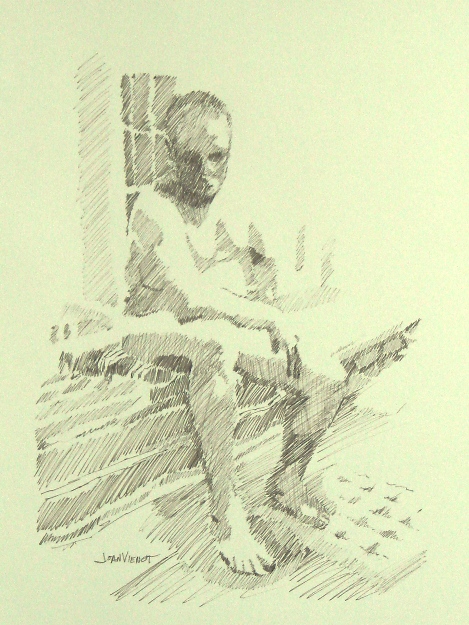
I rarely work on a figure drawing after I get back to my home studio, except to correct a glaring mistake, or to clean up a smudge here or there.  But two weeks ago, the model gave us a beautiful pose, and I was unhappy with the drawing I made during the figure drawing session.  So I took a new sheet of paper, and redrew the pose using brown ink, showing only the primary two or three values, and leaving a lot of the edges undefined where light was hitting them.  This treatment gives the drawing a completely different feeling.

The pose interested me because the model was leaning down with his elbow and forearm on one knee, which foreshortened his torso.

Most of my images are available for purchase.  Contact me if you are interested. — Joan Vienot

Posted on Leave a comment

Figure Drawing with Music in my Head

Reclining

The room was quiet as we drew at Studio b. this week.  The model was extraordinary, performing poses during our one-minute and three-minute warm-up period that would have taxed an accomplished yogi.  We warmed up with gesture drawings for about half an hour, before drawing a few 10 and 20 minute poses, and then finally a 45 minute pose.  I’ve been enjoying a combination of white nupastel with black graphite for a while now, but in my final drawing I opted for a blue pencil with the white nupastel, at left.  The form was very simple from my vantage point, for the most part being only a silhouette with very little modeling.  Her shoulder blade was prominent, and there was a highlight on the muscle edging her spine, so I put a little more emphasis on her hair and the fabric she was lying on, to provide textural contrast.

The night before, I had listened to Amber Rubarth performing there at Studio b., in the courtyard below our figure drawing room.  Her music was still playing in my head as I drew.  I videotaped a few of her songs, but I don’t yet know how to upload them from my whiz-bang new iPhone, so here’s a link to a previous performance by Amber:  http://www.youtube.com/watch?v=5Mn9VtIFM0g.

I made a mistake on the drawing pictured at right, something I know I should never do.  I had torn a corner of the page off, to give to another artist who wanted to order the kind of paper I was using.  Then I kept that paper, to draw on.  I’d been carrying it around for several weeks, and last night I decided to draw on it, without trimming off the torn corner.  I used the rest of the borders as my boundaries, treating the torn corner as if it wasn’t torn.  Now that the drawing is completed, I see that I would have to mat out or trim off that torn corner, and with it, lose other essential parts of the drawing.  Since there is excess paper on another side, I think a good framer might be able to patch it, but the patch would show, upon close inspection.  So I have priced it as a sketch, even though the drawing turned out exactly as I wanted it.  Lesson learned, hopefully — If a corner is missing, always trim the paper to square up that corner before using it.

If you are interested in having any of my drawings or sketches, contact me on the contact form through this website.

Posted on 2 Comments

Figure Drawing: Commitment to Practice

After warming up with two-minute, 5-minute, and 20 minute drawings, I spent the last hour of the figure drawing session drawing the model clothed, in her blue jeans and her brightly colored shawl.  I had noticed her shawl when she first arrived.  I was the only artist this week, braving the rainy weather, so I had my choice of pose and costume.  I worked with watercolor pencils, which brighten and get runny when wet with clear water spray or brush wash.  I used the watercolor pencils without water while drawing there at Studio b., waiting until I got back to my home studio to do the wet work.

There is a lot to be said for making a commitment.  My commitment, a couple years ago, was to myself, to participate in the weekly sessions at Studio b., making them my highest priority for Wednesday nights.  It has paid off, in that I learn another new aspect of figure drawing every week.  I rarely use color in my figure drawings, so this week when I did, I was very uncomfortable, several times making the decision not to tear it up and start over with my usual white nupastel and graphite, which I very much wanted to do.  I achieved the delicious color-texture of the shawl, and managed to show the slightly worn character of the jeans, but I need to return to her face and try to refine her features.

Below are a few of the warm-up sketches from earlier in the session.

Most of my images are available for purchase.  Contact me if you are interested. — Joan Vienot

Posted on 1 Comment

Figure Drawing: The Power of the Group, Chakra Work, Music and Communication

“Reclining Arched Back” is available from my site! Click the painting for information on adding it to your collection.

“Standing” is available in my store. Click the painting and to purchase for your collection now!

Last week I didn’t draw, except for my practice at home.  Instead I watched and listened to a lot of live music at the 30A Songwriters Festival, which I blogged about in my last post.  And last Friday I attended a yoga presentation on the Root Chakra, the first in a 7-week series, a subject which is all new to me.  Then on Tuesday a friend and I got together and brought each other up to date, all good.  And Wednesday, a whole bunch of artists I hadn’t seen for a while were at figure drawing, at the regular weekly session at Studio b., which was exhilarating.

So whether a positive result of my fledgling efforts to allow more energy to flow through the Root Chakra, or good old-fashioned open communication with a dear friend, or listening to so much good music, I felt very confident in my artistic expression this week.  I found myself very quickly lost in the process of executing each pose.  When I lose myself is when I enjoy it the most and feel the most successful at capturing what to me is the basic emotive and visual essence of the pose, whether I am focused on the light, or mass, or shapes, texture, or line.

Our model struggled with the standing pose at top left.  Supporting herself on one leg with a locked knee, she wasn’t able to hold it for as long as she had intended.  Nevertheless, even with the pose a little shorter than expected, I felt completely comfortable with the end result, leaving portions of the drawing a little sketchy.  In fact I think I am enjoying that more and more, developing only the more important area of each pose, although I need to be careful not to always leave the feet undeveloped, because that might be suspected laziness.  Feet are difficult to draw.

The drawing at upper right is the only drawing I was unsure about, when I was finished, because her right elbow creates a triangular shape above the woman’s throat.  Effective composition  requires the artist to be judicious, to leave out visual description which merely confuses.  So I worked on this drawing when I got home, removing the elbow shape entirely, and then drawing it back in.  Sometimes it is that little quirk of confusion that requires the viewer to puzzle for a moment, and engage a bit more, holding his attention for a bit longer.  And in this day and age of instant communication, holding someone’s attention is like gold to an artist.

Speaking of attention, to those of you who wade through my blogs each week, from the bottom of my heart, thank you!  You don’t even have to say anything, though I love it if you do — I feed off your collective support.  May we all give support to each other for our efforts at creative expression, whatever the avenue!

Most of my images are available for purchase.  Contact me if you are interested. — Joan Vienot

Posted on Leave a comment

Overlap Between Media – Drawing and Painting

This week I started setting up my studio for painting.   It’s been a long time since I did any significant painting, especially in oils, which is what I intend to use, for the most part.  I have some ancient paints, which I think will be adequate while I re-acquaint myself with color mixing.

I well-remember the elements and principles of composition.  After all, I taught art in a high school for 3 years.  The introductory course focussed on the elements and principles of design:  line, shape, size, position, color, texture, and density, and harmony, balance, and rhythm.  But color can be immensely complex.  Within that single element are hues, values, intensities, shades, tints, compliments, keys, analagous, primary, secondary, warm, cool, transparent, opaque, permanent, tertiary, and my goodness, stop, I’m already intimidated!

I had done most of the corrections of my drawings in the main part of my house, and my studio was just recently renovated, so it was not set up at all.  I carried the studio furniture into the new space — easels, taborets, drafting tables, and desks.  It feels very strange in there with nothing on the walls yet, and the tables and easels are empty.

My only injury was a bad whack on the top of my head when the post of my big easel smacked into a dropped ceiling and stopped me in my tracks.  (Note to self.)

I still attended the weekly figure drawing session at Studio b.   Our model this week had been in Europe this past fall.  She told me she had shown my website posts all over Europe, which pleased me hugely.  I have no idea how many people actually read my posts, or how long they spend looking at my drawings.  My webmaster is counting it all, but I haven’t asked him what the numbers are.  At this point, I am just happy to share the process.  Below are two warm-up drawings with multiple poses, and two longer poses.

 Click on any image for a larger view.


Most of my images are available for purchase.  Contact me if you are interested. — Joan Vienot

Posted on Leave a comment

Figure Drawing Media – Small Changes

I have been working on fairly smooth paper, primarily using graphite and nupastel, for the past few weeks.  This week I opted to use graphite on a textured paper for one drawing, and charcoal with nupastel for the second one.  I confess, I prefer nupastel and graphite, but it’s nice to try different media or different surfaces.  Not having as much control over the media because of less practice, shakes things up a little, requiring me to draw more slowly or else to be more forgiving of my efforts if I am a little clumsy.  The textured paper was Canson Mi-Teintes, which I have used before, but not strictly with graphite.  At 19 x 25, the paper is a little larger than I have been working on, but though I intended to, I could not manage to fit the entire figure onto the page, even though she was sitting hugging her knees.   The pose was our usual 30 minutes long, so I had to use some rough cross-hatching to block in the darker values.

My second drawing was on Stonehenge, one of the the smooth papers I’ve been drawing on recently, but charcoal is not as easily handled as graphite.  Combining charcoal with nupastel certainly made  it easier to graduate the toning, than using charcoal alone.

These drawings were made during the regular weekly figure drawing session at Studio b. in Alys Beach, in Northwest Florida.

I am adding in a minimalist sketch of the sweetest cat I have ever known, my cat Sumi, an adoptee from the Humane Society, a big Maine Coon cat.  She didn’t live long, only 6 years, having compensated renal failure, and she didn’t gain the weight many Maine Coons have.  This drawing shows her thinner summer coat, with wisps coming out of her ears and elbows.  I made a sketch of her many years ago, and recently I transferred that sketch to good paper.

Most of my images are available for purchase.  Contact me if you are interested. — Joan Vienot

Posted on Leave a comment

Showing Some of My Work

I have participated in two recent showings of my work – one local at the Bayou Arts Center, the new home of the Cultural Arts Alliance of Walton County, and one with international exposure, at Studio b.  At Studio b., probably 75 of my drawings were displayed, informally.  At Bayou Arts, CAA Board members art will be exhibited until sometime in December.  These are the pieces I am exhibiting there, including drawings, photography, and encaustic:

And this past weekend I entered 3 drawings in an international juried competition, Au Natural: The Nude in the 21st Century.  On November 30, 2011, they’ll let me know whether any of my pieces were accepted.  Below are the pieces I submitted.  They are drawn in the style I am having fun with right now, using graphite on toned paper, with white nupastel for the highlights.

Most of my images are available for purchase.  Contact me if you are interested. — Joan Vienot