 |
A nice thing about plein air painting is that it can be done anywhere outdoors. I am fortunate to live in an area of wonderful natural beauty, so everywhere I turn, there is a scene worth painting. I didn’t want to make the 30 mile drive into town to meet up with my plein air group, so I stayed home. The trees were tinged with fall colors, and the sky had returned to blue, after days of haze. It was a great day to paint. But I was in a bit of a rush this morning, wanting to finish by a certain time in order to be able to go to a poetry reading. After an hour of painting fast-and-furious, I left my easel setup on my dock, running to the house for a quick shower before driving to the reading. |
 |
Tag: color
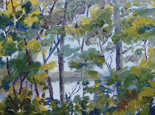
Plein Air at Torreya State Park, Bristol, Florida

 |
 |
 |
A few weeks ago I bought myself a toy, a “Guerrilla Painter” thumb-box, which is a small wooden box that opens into a plein air panel holder and palette and brush and paint holder. The box fits into a small carry case and has a hole in the bottom for your thumb so you can hold it like a painter’s palette. It comes with one 6×8 gesso’d hardboard panel, and I also bought 10 resin-impregnated 6×8 cards to paint on. I primed the cards even though you don’t have to, so I would be painting on a familiar white surface.
I thought a camping trip to a local state park might be the perfect opportunity to try out my “thumb-box”. A friend had made reservations at the best primitive campsite Torreya State Park has to offer, and Friday afternoon found us backpacking the short one-mile trail to set up camp. I also had packed my full plein air set just in case i didn’t like the Guerrilla Painter, so I carried it in on the next trip when we went back to the truck to get water. My full set has arm straps and a campstool attached, but no hip belt, so you carry the whole thing on your shoulders. It became very heavy on my shoulders, so getting a hip belt is now a high priority!
I had never camped with painting being the sole purpose to the trip. My friend took off for a hike each day, and I was left to paint to my heart’s delight. I tested the Guerrilla Painter, using a limited palette, only 4 colors and white. At right are the three 6×8 pieces I did. I used less paint than I would have on a textured canvas. I learn something on every painting I do. The first day I was determined not to use green straight out of the tube, even though I was surrounded by green in the forest. So I mixed some greens using of course blue and yellow, but I also put blue next to yellow in many places, to give the illusion of green. On my third painting, I painted the grasses near the edge of the campsite sometimes using red instead of green. That interested me — I may do a series.
There was one challenge I did not resolve, when painting with the Guerrilla Painter. I use my left hand to hold my rag or paper towel, to clean my brush, but holding the Thumb-Box with my left thumb meant that I had to hold my rag between my index and middle fingers, wiping my brush without being able to see it underneath the box.
The second day I opted to paint using my standard plein air easel and full paint set, since I had gone to the trouble of packing it in. I usually end up using a limited palette anyway — it helps to tie the painting together, because the same colors get used in many different places. Below are the two 8×10’s I did with my regular set-up. This time I mixed a lot of different greens, but attempted to keep most of the foliage details a little vague. I felt if I was distinct with the tree trunks and branches, they would explain the foliage.
 |
 |
Figure Work After Months of Landscapes
Fellow plein air painter Judy Dewar initiated her new studio by inviting a few artists over to work from a live model. It was a pleasure working beside Judy, Beckie Perrott, and Marian Pacsuto. I initially intended to paint for the whole session, but a repair contractor was supposed to come to my house, so I needed to be ready to leave on short notice. I took drawing supplies, thinking I would draw until the contractor called, meet him and let him in and come back to Judy’s studio to paint for the rest of the session. The contractor had not called by lunchtime, so I never got out my paints. I enjoyed the 2- and 5-minute warm-ups, using charcoal on good manilla newsprint and on gray student-quality paper before moving on to a 20-minute session using my favorite drawing media – graphite and white nupastel. I drew on tan-tinted Mi-Tientes paper, which has a nice squared texture. For my last piece, over the course of two 30-minute sessions, I used some oil pastels which I had never used before. I had a student-quality set of oil pastel crayons that I’d had for years and years, and a dime-store set of oil pencils for the finer work, both of which I brushed with turpentine after laying in the colors. I gave that final drawing to the model. Below are my warm-ups and my two final pieces. By clicking on them you will get a larger view.
Most of my paintings and images are available for purchase. Contact me if you are interested. — Joan Vienot
 |
 |
 |
 |
 |
 |
||
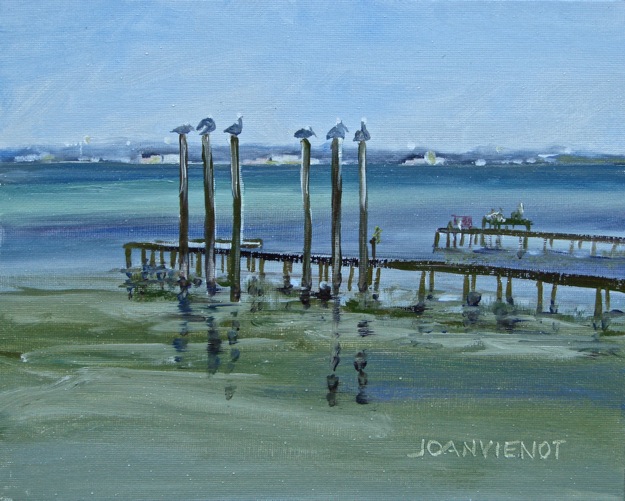
Plein Air Near Crab Island in Destin, Florida
 |
This week the Emerald Coast Plein Air Painters met to paint at Clement Taylor Park in Destin, Florida. Every week, One member emails everyone with the location of the next session, where we each paint and then meet after 2 or 3 hours for a critique followed by lunch. Last time we met here, I painted the foliage and reflecting pond by the side of the park. I blogged about it: https://joanvienotart.wpengine.com/landscape/simplification-plein-air-2-5811.

Today I walked down to the waters edge where I was entertained by the array of pelicans on 6 pilings, one perched on top of each. A nervous blue heron was less than 15’ from me while I stood on the park dock. Families were starting to roll their carts of fishing gear and coolers out onto the dock. The colors in the water were intriguing me, but I couldn’t decide what part of the wide-angle view of long neighboring docks I wanted to paint. So I decided to paint two paintings, which can be hung side-by-side.
A man stopped to watch me paint when I was first starting, and we talked for a minute. Like me, he had studied art to be an art teacher, and was looking forward to his soon-coming retirement when he could return to his art.
I admired his 2-year-old daughter’s Flavor-Ice popsicle, and he had her go get me one. Yum – one of my favorite treats! Grape! He later emailed me a photo he had taken of me, above right.
Brighter Color in Plein Air
 Last week I was late getting to the weekly plein air session. Each week the Emerald Coast Plein Air Painters receive an email telling us where and when we will be meting to paint that Wednesday morning, and what time we will be meeting for critique afterwards. We usually paint for 2 or 3 hours, depending on what time we get there. I had a few tasks I had to attend to, so I was late arriving, and rushed to get started, failing to sketch my painting before starting, and only half finished and generally dissatisfied when it was time to break for critique and lunch. We had met in the Village of Baytowne at Sandestin, and I had chosen to paint a part of the carousel near the central pond. I picked the rooster of the carousel because it was bright and shiny and sassy. When I returned to my studio, I started over and re-painted it, above left.
 This week we met at Grayt Grounds of Monet Monet, a coffee shop with wonderful gardens in back, styled after the gardens and home of Monet in Giverny, France. There were at least 16 happy painters, working on everything from the statuary and other yard art to the flora to the building itself, and one painter even painted another painter.
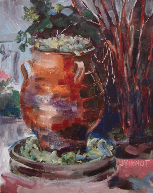
I think the instruction of Julie Gilbert Pollard in the workshop I attended a few weeks ago helped me with the use of brighter colors in my paintings these two weeks. Certainly in the painting I did yesterday, I purposefully used dark valued intense colors where I wanted dark values, instead of mixing dull grayed darks. As a result, the whole painting has a much more intense tone. My shorter, blocky brushstrokes also represent a significant change, but I think they make the terra cotta fountain look metallic. I will try to remember to use that type of brushstroke next time I am painting metal.
Water , Water, Everywhere – Julie Gilbert Pollard Workshop
 |
 |
| Last week I learned that water can see. Who knew?! That was just one of the hundreds of tips Julie Gilbert Pollard gave in her workshop in Panama City Beach, Florida, “Wet and Wild: Painting Vibrant Water Scenes in Brilliant Color”. This tip came on the first day, when we were working on reflections. In other words, Julie said, “Water reflects as if you were looking at the scene from its vantage point.” To illustrate, if a dead tree is angled out over the water sideways to the viewer, the reflection is a reverse mirror image, the same size and directly underneath the tree, in reverse angle. But if the tree is angled towards the viewer, the tree above the water will appear shorter due to foreshortening, but the reflection will be much longer in proportion, because the water is “seeing” the tree from underneath.
So I look at reflections differently now. I look at color and shapes differently too. Everything is more colorful since that workshop, and I am seeing much better. I find this is always the case after any period of immersion in art, that I see better and am more aware of colors and shapes. One of the other participants in the workshop said that one of the few things you get better at as you age, is art. I laughed, but I understand that statement. We worked in the classroom, from sample photographs Julie provided which illustrated the concepts and techniques she was teaching. She used the first four chapters of her Adventurous Oils, a Workbook Companion to Brilliant Color as well as several hand-outs. It was a treat being taught by someone who understands how artists learn, who was able to paint and talk at the same time (no small feat, integrating both the left and right brain at the same time!), and who was able to provide constructive assistance as we worked on our various pieces. And the participants were a happy bunch, the paint-mixing and experimentation punctuated with their softly-spoken stories to their table-mate and their laughter. My own table-mate, Faye Gibson, owner of Meacham Howell Design, also was using oil paint; the rest were painting with watercolor. Since the instructor was giving demonstrations in both watercolor and in oil painting, I brought in a 6-color Walmart watercolor set and made a watercolor painting and then painted an oil painting the second day when we were studying waves, shown at left. The watercolor painting was snatched up by a good friend of mine as soon as I posted it on Facebook. |
|


|
The fourth and fifth days we were supposed to finish the paintings we had started the first 3 days, but I had already finished mine and painted a second one each day too. Plein air painting has made me pretty quick. So the fourth day I cut a few flowers off the crepe myrtle bush in the parking lot, and put them in a pitcher of water on my desk, thinking I would learn to paint the pitcher full of water. But the flowers fascinated me, so I painted them primarily, with only a suggestion of the pitcher underneath. Our technique for the day was negative painting, where you paint the negative space surrounding the form. My efforts taught me the techniques, but made the painting very twiggy, so the following day I painted out most of the twigs and branches, and it became flowers again. |


 |
On the final day, the technique assignment was to paint a scene in pure color, using colors straight out of the tube, or pre-mixed, using colors for their inherent light-dark values instead of as color. I again painted with a palette knife, using the wave photos for reference. Anywhere there were dark values in the painting, I used ultramarine blue, violet, and reds, and cobalt green, lavender, and orange for the middle values, and orange and yellow for the lighter values, with white for the froth. The idea was that if you took away the color, the painting would read correctly as a black-white-gray value study. So I took a photograph of my painting, and then de-saturated it to remove the color, and was pleasantly surprised that indeed, it looks “right” as a value study. To top off the workshop, there was a drawing for one of the instructor’s paintings, and I won it! Icing on the cake! |
 Joan Vienot with Julie Gilbert Pollard Joan Vienot with Julie Gilbert PollardPhoto by Helen Ballance, Beach Art Group |
 |
 |
Emerald Coast Plein Air Painters at ArtsQuest
 |
 |
ArtsQuest Fine Art and Music Festival has come and gone, and in its wake, the familiar feeling of having passed through a wormhole in time and space, a sort of time warp, coming out on the other side with everything the same and yet very much changed.
Members of the sponsoring agency, the non-profit Cultural Arts Alliance of Walton County, are invited to exhibit 3 pieces of their artwork in the member tent, in exchange for 4 hours of volunteer work at the festival. For my volunteer work, I was asked to defend some No Parking cones and to move them out of the way when exhibiting artists needed to get through to set up their booths. It was the first time that I had seen booths being set up. My only exposure to setting up tents has been for overnight camping, and it is in light of that experience that I can pronounce tent-raising to be a close second to two-person canoeing for the fast track to divorce court, so I was fairly amazed at the calm and congeniality of the artists doing their nesting. The next day I helped set up the Emerald Coast Plein Air Painters tent and found it to be not at all unpleasant, so I think the key ingredient is having artists do the job.
The festival opened Friday afternoon. The experience was invaluable. With the tunes of Kelsey Anna and Matt miller and later Cody Copeland wafting over the grounds, I painted plein air near our booth the first afternoon, and again on the afternoon of the third day, the air filled by other musicians. The rest of the time I talked to the passers-by about the plein air art and artists and I explained what plein air painting is to everyone who would listen. Almost no one knew that plein air painting simply means painting in open air, on-site, looking at the scene you are painting.
We enjoyed great exposure at our booth, picking up some 30 email addresses to add to the 95 that already receive weekly notices of our next plein air painting location. One of the regular participants in our outings, Melody Bogle, had submitted her work and been juried into the festival, so she had her own booth. We all were overjoyed when the announcement came that she had won Best in Show for the 2013 Festival. With more than 100 artists juried into the festival, I felt like her win validated plein air painting to the show-goers.
I painted the painting at left on the first afternoon of the ArtsQuest Fine Art Festival. It shows the plein air tent and the row of tents that housed the CAA members’ exhibit in front of the concrete pond in Cerulean Park at Watercolor, Florida. I re-painted the lawn when I got back to my home studio, because the shadows made the pond look like it was higher than the tents. By removing the shadows and instead painting some downward-curving lawn contours, it was a quick fix to make the pond look lower than the tents. Perspective and postion are, after all, merely optical illusions. I compressed the scene to show only the tents, without any of the commercial buildings that were actually there fronting the streets of the beautiful village of Watercolor, Florida.
I own and manage a swimming pool service company as my “day-job”. One of my customers came by the plein air booth, and I enjoyed showing her my work. After the festival closed, she came to my home studio to see more of my work. As I develop my skills and learn the business of being an artist, I am recognizing that every experience is another notch in my belt, each in itself valuable for future actions and interactions. (Thank you for taking the time to visit with me, Becky Arnold. Did you realize you were contributing to my training?)
 At right is the completed version of the painting I posted last week, the brightly colored building in downtown Grayton Beach that houses Shorty’s Restaurant. After I got back to the studio, I realized that I had not painted the railings nearest me, or the flower pot that had attracted me to that point of view in the first place! To paint it plein air, I had positioned myself with my back to the sun with the unfortunate result that both my palette and my canvas were so brightly lit that I was “snow-blind” for most of the morning while I painted. It is truly a wonder that my colors turned out to be fairly close to correct! But that’s my excuse for not painting the railing and flowerpot until I got back to the studio.
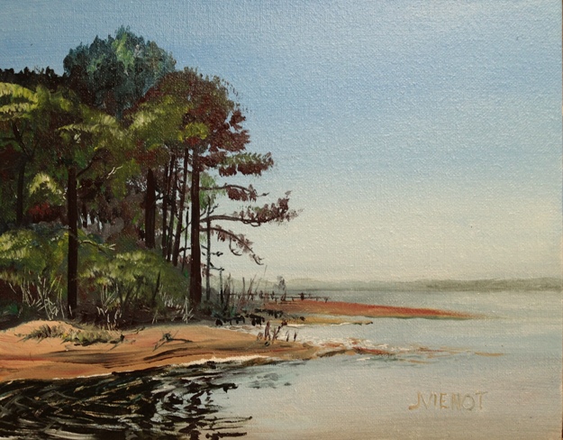
Below left is the piece I painted this week at the regular weekly Emerald Coast Plein Air Painters outing, at Nick’s Rstaurant on the Bay, west of Freeport, FL. I worked very hard on figuring out how to make convincing pine trees, most particularly the brush strokes and stamps to use to show the so-very-important silhouette edge, and also the layering of values to show the masses of the needles. In this part of my process, that is one of my goals, to be able to learn to quickly portray recognizable forms just by using a few simple brushstrokes. I was not as comfortable with my efforts with the rippling reflections in the water below the trees. I reworked them in the studio, and came up with a fair representation of the lattice-like pattern. I was not at all successful with the muted land-mass on the horizon, across the Bay. I painted it and scrubbed it out 3 times plein air, never able to achieve a straight and level line that I was happy with. The horizon you see now was painted this morning in the studio.
And below right is the beginning of a painting that I started the last afternoon of ArtsQuest. The family in the picture was watching me paint, and asked if I might be able to put them in it, since they had been watching the watercolor workshop while I was painting. They want to see it when I finish it, so now the pressure is on!! I had fun with this painting at ArtsQuest, letting a few of the people in my audience paint a spot of color here or there. It was interesting how without fail, they would at first decline, but once the brush was in their hand, they would start smiling, daubing a little color or texture here or there! I think they all will be making a trip to pick up art supplies this week!
 |
 |
I was pleased that another one of my photographs was published this week, to illustrate a story by my friend Leslie Kolovich, host of The Stand Up Paddle Radio Show, for her column in The Paddler ezine, a United Kingdom publication. The article can be found at http://www.issuu.com/thepaddler/docs/thepaddler_8.

Most of my paintings and images are available for purchase. Contact me if you are interested. — Joan Vienot
Plein Air with One Brush, #8 Bright
 I have hired Saramae Dalferes to help me take the fast track in my transition to becoming a full-time artist at least two days a week by the end of the year. Saramaeis a Nationally Certified Counselor, Mentor, and Personal Coach. I told Saramae this week that I was going to set up a challenge for myself at the weekly plein air outing of the Emerald Coast Plein Air Painters. My plan was to paint using only one single brush for all parts of the painting, so that I would paint faster and more loosely.
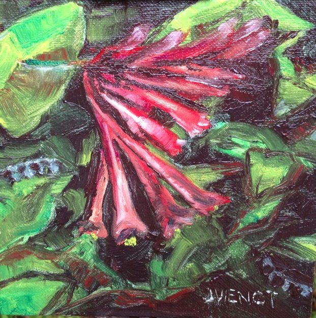
Once you tell your coach that you are going to do something, there is no going back. So today at the plein air outing, I chose a #8 bright, a brush which is approximately 1/2″ wide, with stiff bristles that are about 5/8″ long.
Our location was an exquisite house with beautiful gardens. After walking the grounds, I opted to paint the flower of a coral bean plant that I found in an ungroomed part of the backyard. I choose a smaller canvas panel, 6″ x 6″, unsure whether I would just be making a huge mess by using only one size brush. To my surprise, I finished the painting in just one hour. I had time to paint another!
For my second painting, I chose the house itself, which had a turret and a roofline with many planes. I struggled with the perspective of the structure. But while I was painting, I found I was less concerned with accurate perspective, and more concerned with the general “feel” of the place. I was moderately successful, especially considering that I was still using only the #8 Bright. The roof angle is a little confusing in my painting, and I did not correct it when I noticed, preferring to focus on color and light and shadow.
 At the critique afterwards, Sue Carol Knight Woodley mentioned that towards the end of her painting, she was thinking about the elements and principles of art, particularly the elements of line, form color, and texture. I’ve focussed on the elements (7 in my book: line, shape, size, position, color, texture, density) and principles of design (balance, rhythm, and harmony) when figure drawing, but I confess, much of my plein air effort is simply trying to figure out what colors to mix together to get the color I am seeing, and then trying to figure out what shapes to make with that color.
While painting the house, I came to have an even greater appreciation for the skill of artists such as Andrew Wyeth and Edward Hopper. I regret that the photograph at right does not show the dark blue-green of the roof shingles. The more I paint, the more I am noticing that the camera rarely captures color accurately.
Most of my paintings and images are available for purchase. Contact me if you are interested. — Joan Vienot
Plein Air Painting Progress Report: Leaps and Bounds!
 I am starting to see in color. That may sound strange, but the fact is that most of the time in my normal everyday activity, I hardly pay attention to color. When I was focusing on figure drawing, I occasionally used color, but for the most part I was focused on line, shape, and value, usually rendering the whole piece just using a black-white value scale. Now that I am painting again, I am noticing for example, when a white railing is picking up the blue of the sky, or how intense a green becomes when it is contrasted with red. I am finding that much of what I think I am seeing as different tones of a color are actually the same color which looks different depending on what color is next to it. I am particularly challenged by all the greens I see, when landscape painting. If I try to mix an exact shade of green, it often seems muddy compared to what I actually see. Who knew, that Einstein’s theory that everything is relative applies to painting as well as nuclear physics, that the better way to achieve a color is to find the color next to it which gives it the quality I want. Resisting the temptation to launch into that as a metaphor for life, I’ll instead move on to my adventures in plein air painting over the past week. Last week we painted at Nick’s Restaurant, and I bemoaned the fact that I know very little about boats. The next day I decided to take another run at the featured boat, using my photo references, and came up with the piece at top right. It was the little paprika-colored spots of rust washing out from the old nails in the hull, that gave the greens and turquoise the punch I wanted. So I wafted a little of that color into the foreground grasses too.

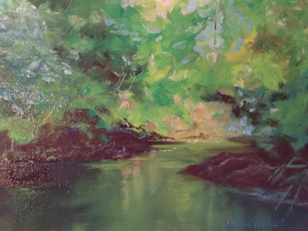
 This week is the largest of the spring-break tourist weeks in the beach resort communities of Panama City Beach, Seagrove Beach, and Destin, FL. So when the announcement came that the plein air painters would be meeting at the docks again in Destin, I knew the drive would take all the fun out of the adventure, so I opted to paint from my dock in my back yard. I had thought I would be painting my view of the creek leading into Tucker Bayou, but when I looked upstream, the color of the bayou grasses intrigued me. My initial 6″ x 6″ study, left, did nothing for me by way of planning my painting, but rather served more like a singer doing la-la-La-LA-La-la-la scales to warm up her voice before performing.
I needed a warm-up! The temperature was less than 40 and the wind was chilly. But it was a clear spring day with bright light. I roughed in the composition and then went to work on the trees at the edge of the Bayou. The spring gold-greens of the new leaves contrasted with the rich, dark pines and the shadows underneath. I resisted the impulse to paint the shadows a colorless dark value, which has the potential to suck the life out of a painting. Instead I darkened my green shadows with a touch of the same deep red I used to tint the pink flowering trees in my distant neighbor’s yard. I stuggled with the grasses, because the shiny highlights were picking up every color of the palette. Uncertain whether I was just making a mudpie, I plowed onward through the painting, until I was satisfied I had achieved an approximate similarity to the colors I was seeing. My two cats initially were scared by my unusual activity on the dock, but they grew braver throughout the 2 hours, wrapping their tails around my legs as I scratched some final textures and highlights into the grasses and the tree trunks. Upon completion, I stood my painting up against a piling and stepped back from it only to have a bitter wind gust blow it onto its face, requiring repair where it had landed on an edge of a dock board. Remembering the worm crawling across my finished painting two weeks ago, I decided that paintings are not really finished until restored from an inevitable mishap at the very end.

The day before yesterday I was excited to find a delivery frames on my package stand as I entered my driveway, so even though it was late, I spent the next couple of hours framing my earlier paintings done in November and December of last year, when I first resumed oil painting after a 30-year hiatus. Looking at them, I realized that I am growing by leaps and bounds. The rate of my improvement surprises me. I thought I would progress more slowly, and even be tempted to give up, because oil painting so intimidated me, no doubt from my tortured efforts during and shortly after college. I find I am enjoying the time limitation of plein air painting, which while still allowing for tortured effort, does not allow it to continue for very long, with only a two hour window before the light changes so much that further attempts at capturing an impression are not worthwhile.
I continue to play with my photography. I am learning about photo-editing, taking a class in Photoshop Elements from Jackie Ward at Northwest Florida State College, South Walton Center. She is teaching us what Photoshop can do. It’s difficult for me to remember. My poor brain may be overloaded, trying to run my business, my day-job, the one that pays the bills, while I try to learn more about photography and painting. I still enjoy the easy editing that can be done with Snapseed App on my iPhone. Yesterday I paddled my canoe on the Bayou with a dear friend, a fellow photographer. You can’t take a bad picture at sunset! Most of my editing of my iPhoneography consists of simply straightening the horizon line and perhaps a little cropping, but I had some fun dramatizing and saturating the photo below.

Most of my images are available for purchase. Contact me if you are interested. — Joan Vienot
The Ruins at Coba
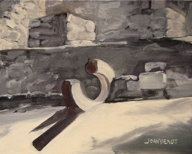
 I spent a week in Mexico in mid-December. Ruins from ancient civilizations fascinate me, and the ruins at Coba were no exception. A boy there drove our big tricycle-tour-carriage to one of the pyramids, Nohoch Mul, one of the few in Mexico that visitors are still allowed to climb. Nohoch Mul is the tallest pyramid in the Yucatan Peninsula, 138′. At the top, you can see out over the Mexican jungle to other points breaking the treeline in the distance, which I presume are other pyramids. There was a structure on the platform at the top, with a short doorway which was screened closed. The walls inside were black, like many fires had been burned inside. It felt spooky, and I wondered if sacrifices had been made there — maybe some spirits were still hanging around.
Our tricycle guide took us to some of the other structures, including a round temple-pyramid and a Mayan ballcourt. After we finished our tour, we realized there was another, smaller ball court, near the entrance to the area.
I found the ballcourts to be particularly fascinating. I could almost hear the cheering for the teams of players trying to pass a ball through the stone rings in the center of the sloped side-walls. The game was played recreationally, but also ceremonially when it is thought that the captain of the losing team gave up his head.
One of the rings was broken at the second ball court, and its jagged edges and sharp shadow shapes intrigued me.
As often happens when I am first starting a painting, the initial paint-drawing frustrated me and I almost quit. There was very little color to the ruins — just the black, white, and gray of the rocks and mortar. But I didn’t want to make it a black-and-white painting. Near-black, and gray can be made from many colors. I wanted the areas lit by the sun to be warm, and the shadows cooler, so I chose an orange tint for the sunny rocks, and I used cobalt violet mixed with orange for the shadowed areas. Where I needed it to be even cooler, I added a little viridian green. The broken stone ring was the obvious focal point, being so very different from the planes and shapes of the rest of the structure. To bring even more attention to it, I added a warmer gray to its shadows, with more orange. The shadows cast from the ring are in sharp contrast to the sunlit area, as opposed to the shadows from the trees overhead, which have soft edges.
Most of my images are available for purchase. Contact me if you are interested. — Joan Vienot