Posted on Leave a comment

Opening the Floodgates

A good friend of mine is preparing to backpack the Appalachian Trial.  Last month, over the long weekend after Thanksgiving, I accompanied her on her “shakedown” trip where she tested a lot of her new gear and her cooking methodology.  We camped on her mountain property near Mount Pisgah, near Brevard, NC, Jane in her fancy Hennessey Hammock, and me in my REI quarter-dome tent.  Having backpacked through the Smokies and in New Hampshire, I know that much of any backpacking experience is consumed with ordinary survival — food, clothing, and shelter — and this trip was no exception, with nighttime temperatures in the low 20’s (F).  Jane cooked on a lightweight backpacker’s alcohol-fueled stove, and I had my minimalist pan support with dry Esbit fuel, to rehydrate and heat our dehydrated food and make tea.  But we weren’t that far away from town, so even though we were “roughing it”, our evening meals were accompanied by good wine.  Each evening we would go for another walk, as if our mountain trail hikes had not provided enough exercise for the day, and then we would talk in between handfuls of “gorp” for dessert (good old raisins and peanuts) before crawling into our sleeping bags for the night.

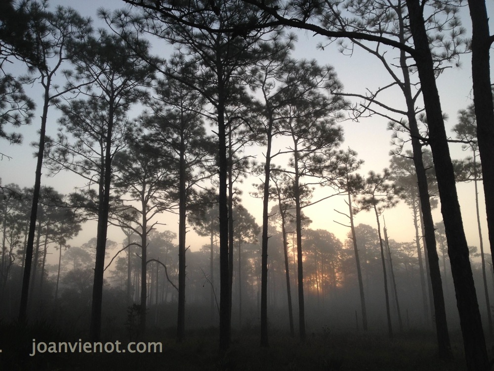
The mountain imagery was overwhelming.  Jane is a fine art photographer, so spending time with her doubled the opportunities for the mountain splendor to imprint on my soul.  If there is a simple purpose to producing one’s art or vision, it may simply be to point out the beauty/order/harmony we see and to share it with those who might not have noticed.  I learned a lot about the limitations and capabilities of my iPhone camera.

I came home with my head and heart overflowing with the mountain colors and shapes.  Having only recently begun my return to oil painting, I was surprised to find myself wide awake and compelled to paint at 4:00 the very next morning after we got back.  By compelled, I mean that there was no option not to paint — it felt like a dam would break if I didn’t get an image made.  This happened twice in that week following our adventure, forcing me to focus my sleepy eyes 2 hours earlier than my usual wake-up time.  I painted the 8×10″ canvas panel very quickly, finishing before showering and leaving to be on time for my day job.  Above are my paintings which of course contain the colors and memories of my experience more so than the photographic references below.

Most of my images are available for purchase.  Contact me if you are interested. — Joan Vienot

Photo reference

Photo reference


Posted on 2 Comments

Early Morning Light


Yesterday I went hiking shortly after sunrise with my friend Jane Burns, who is a fine art photographer.  The sun was rising between the foggy tree trunks, just above the brush, as we hiked the groomed trail through the state forest just north of Grayton Beach State Park.  Jane and I both pulled our cameras out of our packs, to capture the first light.  We continued to have jaw-dropping views at every turn of the trail.  It was the “golden hour” following sunrise, when shadows are long and the light is warm and diffused.  A light fog exaggerated the effect, rendering every scene an ethereal fairy-scape.  The first photo above was taken during those first minutes on the trail.
.

The light changed quickly as the sun came up, and the fog began lifting.  Wonderful atmospheric  effects played over the landscape as the cooler, shaded areas maintained a misty quality, and open areas became more clear.  Normally I carry my bigger camera, but since we were going to hike 8 or 9 miles, I opted to bring only my iPhone 5S.  Halfway into the hike, Jane showed me the High Definition function, where the camera shoots two versions, one normal, and one HDR.  The higher quality is obvious on some even when viewed on the camera’s small screen.

As the morning progressed, the fall light became crisper, and the colors became more vibrant.  Dew remained in the shady areas, and in one section, a carpet of bejeweled, glittering moss underfoot.  Both Jane and I tried to photograph the shimmering drops on the moss, but the camera didn’t pick them up.  A tightly focused video would have been beautiful.

I stopped taking so many pictures after the first hour or so.  The light was still beautiful, the sky a crystal clear blue and the colors so typical of autumn.  I still felt like I was walking through a scenic calendar.  But I was so very spoiled by the wealth of imagery during that first hour, the golden hour, that I just enjoyed the views for the rest of the hike.

Most of my images are available for purchase.  Contact me if you are interested. — Joan Vienot

.

Posted on Leave a comment

Overlap Between Media – Drawing and Painting

This week I started setting up my studio for painting.   It’s been a long time since I did any significant painting, especially in oils, which is what I intend to use, for the most part.  I have some ancient paints, which I think will be adequate while I re-acquaint myself with color mixing.

I well-remember the elements and principles of composition.  After all, I taught art in a high school for 3 years.  The introductory course focussed on the elements and principles of design:  line, shape, size, position, color, texture, and density, and harmony, balance, and rhythm.  But color can be immensely complex.  Within that single element are hues, values, intensities, shades, tints, compliments, keys, analagous, primary, secondary, warm, cool, transparent, opaque, permanent, tertiary, and my goodness, stop, I’m already intimidated!

I had done most of the corrections of my drawings in the main part of my house, and my studio was just recently renovated, so it was not set up at all.  I carried the studio furniture into the new space — easels, taborets, drafting tables, and desks.  It feels very strange in there with nothing on the walls yet, and the tables and easels are empty.

My only injury was a bad whack on the top of my head when the post of my big easel smacked into a dropped ceiling and stopped me in my tracks.  (Note to self.)

I still attended the weekly figure drawing session at Studio b.   Our model this week had been in Europe this past fall.  She told me she had shown my website posts all over Europe, which pleased me hugely.  I have no idea how many people actually read my posts, or how long they spend looking at my drawings.  My webmaster is counting it all, but I haven’t asked him what the numbers are.  At this point, I am just happy to share the process.  Below are two warm-up drawings with multiple poses, and two longer poses.

 Click on any image for a larger view.


Most of my images are available for purchase.  Contact me if you are interested. — Joan Vienot

Posted on 3 Comments

Figure Drawing by the Pool, Another Studio b. Experience

You would think that when you go to the same activity, week in and week out, that it would become predictable, and perhaps even boring.

Not so with figure drawing, especially at Studio b. We had the same exceptional model for the 2nd week, who clearly was invested in our work, being aware of how her poses might come across, and considering the mood they might evoke.  Studio b. owner  Colleen Duffley said the model was even practicing a few poses before we got there, and during breaks, she asked the artists what sort of pose they would like next.  Of course for me, every pose is a challenge, so I am just happy to be there and almost any pose is good!  Generally, if a pose is not well-lit or is uninteresting from one vantage point, there is enough room to move to another location where I can see better or the composition is better.

For our final pose of the evening, the model got into the water of the pool.  Lit by the underwater lights, the portion of her figure beneath the water was a chalky blue-green, and extremely distorted.  The part of the figure above the water was almost a silhouette, it was so dark.  This is the first time I have drawn a figure in water, so I really had to study it.  The water’s distortion greatly shortened and widened the part of the figure closest to the surface of the water from my vantage.  Each artist had a different distortion. What struck me the most were the amazing colors, so although I rarely draw in color, this pose begged for it.

Heather Clements produced an amazing pencil drawing from the 50 minute pose — hopefully she will include it in her blog.  Also it can be seen on Studio b.’s facebook page.

Below are two other poses from this model this week, which I drew with graphite and Nupastel on Stonehenge paper, one paper gray and the other faun.

Most of my images are available for purchase.  Contact me if you are interested. — Joan Vienot

Posted on Leave a comment

The Illusion of Depth

This week Studio b. instructor Heather Clements gave us the exercise of creating illusion of depth.  She asked us to exaggerate it,  to make the foreground appear much closer than the parts of the model that were further away.  Perspective of course is the most obvious method of creating the illusion of depth on a two-dimensional plane.  The parts of the subject that are closer are much larger in proportion to the parts that are farther away.  In figure drawing, perspective already is exaggerated, because the model is in close proximity to the artist.
The highest contrast of values, and if working in color, the brightest colors, also tend to advance toward the viewer, while midtones and duller colors tend to recede.  Purposefully muting the lights and darks will cause that part of the subject to appear farther away, and purposefully heightening the black-white value contrast and brightening the colors of the near portions will advance the closer part of the subject.
The degree of development also creates the illusion of depth.  Highly developed areas advance, whereas silhouetted shapes with perhaps hazy edges, recede.

This is the second week Heather mentioned Mach bands, an optical illusion causing forward edges to appear lighter against darker values behind.  This optical illusion occurs even though the local value does not change — our eyes do it for us.  If the artist will exaggerate Mach bands, that too will help give the illusion of depth.

The examples in this post exaggerate depth.