Posted on Leave a comment

Painting Plein Air at Nick’s

Oil Painting of Boats at Nicks Restaurant
My view of the boats at Nicks

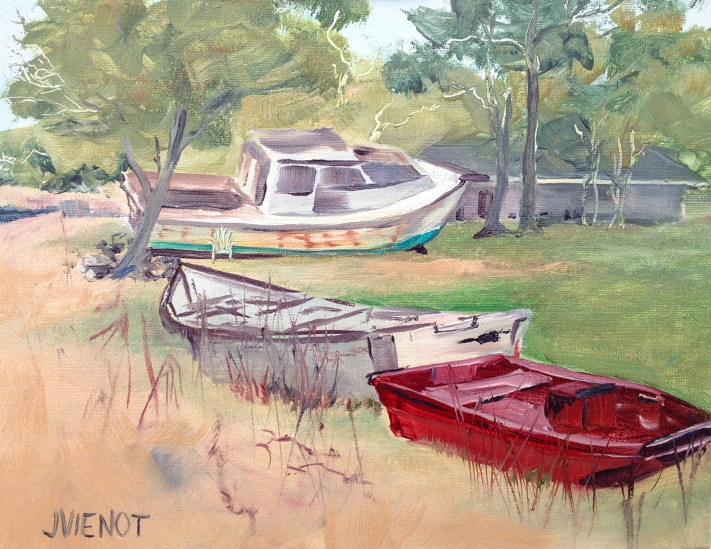
Today the Emerald Coast Plein Air Painters painted at Nick’s Restaurant on the north side of the Choctawhatchee Bay.  When I first arrived, one other painter was already setting up.  I walked around the derelict boats and dinghies decorating the grounds, following the Bay beach to the inlet and then up around the aged structure of the restaurant itself, shooting photos with my iPhone as I went.  A painting could be made from everywhere I looked.  I settled on the old boats lined up in the front yard. By the time I had gotten my easel set-up and made a preliminary pencil-on-paper sketch to try to lay-out my composition, about 10 to 12 more artists had arrived.

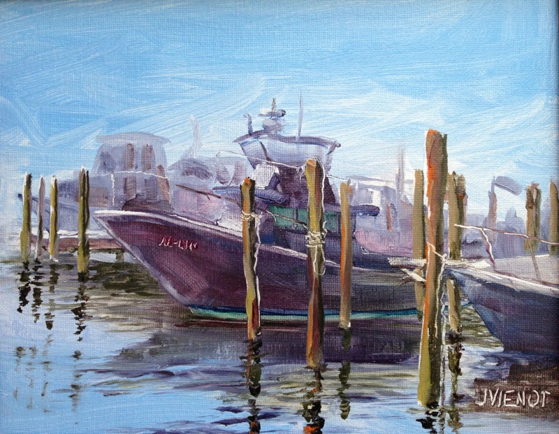
Most boats around here are white, but the boat in the foreground was red, and that color was the element that interested me.  I painted nearly every other part of the picture first, saving the red boat for last.  But as I worked, I cursed my choice of subject matter, having once again chosen to paint boats, which I know almost nothing about.  My biggest struggle was with the shape of the boat in the background.  The cabin morphed into an odd shaped roof over what I presume might have been sleeping quarters, but which now sported a gaping hole, a mate to the hole in the deck at the back of the boat.  Its one redeeming feature, besides its mass, was the turquoise color of the bottom.

Boats at Nick's

A tiny sliver of the Bay on the far left, and a nondescript structure in the background were the only hints at the location, but anyone who has eaten at Nick’s will recognize the boats.  The sandy beach was dotted with little grasses and vines, and I took liberty with that part of the painting, bringing in a few taller grasses, to break up the large area of plain beach, and to repeat a few reds.

When we lined up our paintings for the critique before lunch, I again was amazed and overwhelmed by the talent in the group.  One of the artists made a comment that caught my curiosity.  He was expressing frustration about a car pulling up and blocking his view, after he had already mixed all his colors and was ready to paint.  I have never approached my painting that way, instead mixing my colors as I go.  I may have to watch him paint sometime, to see how that works.

Most of my images are available for purchase.  Contact me if you are interested. — Joan Vienot

Posted on Leave a comment

Plein Air Light

Oil Painting of Reflecting Pool at Eden Gardens State Park
Reflecting Pool at Eden Gardens State Park

Joining the Emerald Coast Plein Air Painters at their weekly painting location was a short trip today.  We met at Eden Gardens State Park in Point Washington, Florida, just a half a mile from my home.   The azaleas are in full bloom right now, brilliant clusters of alizarin, rose madder, coral, and white, in a sea of green and yellow leafy trees.  Gray Spanish moss hangs from 500-year-old giant live oak trees, with resurrection-fern-covered branches so long and heavy they curl back around and down, even all the way down to the ground in places.  Magnolias, tupelos, aromatic cedars, long-leaf pines, and so many flowering plants, especially camellias, roses, and the butterfly garden flowers are punctuated by statuary, the whole of it complimenting and ready to replace the present seasonal palette of the azaleas.  Koi play between the overflowing bowls and spray feature in the large reflecting pond facing the restored antebellum mansion in the center of the grounds.

I had arrived at 9:00, which was very nearly 8:00 since we had just changed to daylight savings time this past weekend.  The early light created high contrast, with bright sunlight highlighting the east sides of the trees, the other sides colored in muted grays in the long shadows.  I painted until 11:30, but when I stepped back away from my painting to see what I had done, I saw how much the light had changed over the 2½ hours.  Gone were the muted grays, and in their place were the dark greens of live oak leaves, and the shadow underneath them had taken on a much cooler cast than the warmth I had seen in the early light.  I decided to leave the painting that way, a testament to it being painted plein air.

My Vantage Point

I walked around the park to see what the other artists were doing, and to see if they would be joining us for a critique.  When I got back to my painting which I had left fastened onto the easel support but lying on the ground, I couldn’t believe my eyes — there was a thin vertical streak going right through the middle of the azaleas, the reflecting pond, and my carefully blended grass.  I could not imagine when I had brushed against it, and with what.  Looking more closely, I realized the streak was getting longer, right before my very eyes.  There, close to the bottom of the canvas panel, was a very small worm, happily crawling through the wet oil-painted grass!  What to do?  I had already cleaned and put away all of my brushes and paints.  So I picked up a long-leaf pine needle and flicked the worm off, and then used the pine needle to drag the paint crosswise back across his trail.  I actually was surprised at how successful I was.  Within just minutes, no one could tell a worm had ever been there.
Many of the artists opted to return to work on their paintings after we finished the critique.  I made a mental note to plan on painting longer the next time I paint.  It might mean that my blog will have to wait, but it seems like I really am just getting warmed up when the session is over.  It would be to my advantage to start another painting immediately, while my color-mixing skills are at their peak, and after my eye is seeing the shapes and colors correctly.

Most of my images are available for purchase.  Contact me if you are interested. — Joan Vienot


Posted on Leave a comment

Story by Lori Ceier, on www.waltonoutdoors.com

Oil Painting of The Al-Lin in Destin Harbor

Bringing our surroundings to life a natural process for South Walton artist Joan Vienot

Lori Ceier, Walton Outdoors

http://www.waltonoutdoors.com/bringing-our-surroundings-to-life-a-natural-for-south-walton-artist-joan-vienot/


Joan Vienot paints plein air along the Destin Harbor. Lori Ceier/Walton Outdoors

Point Washington resident Joan Vienot is on the path to fulfilling a lifelong desire of becoming a professional artist. After 45 years in the aquatic industry and only occasionally investing time, Vienot is now dedicating two days a week to creating fine art.

Growing up in the small town of Brighton, Colorado, Vienot always enjoyed drawing and painting, and knew at a very young age it was something she wanted to pursue.

“The first publication of my art was when I was seven years old. My second-grade teacher asked the class to illustrate and write stories about astronaut John Glenn circling the earth. Many of my classmates’ stories were printed in the local newspaper, but mine was the only drawing published. I was so embarrassed that my story didn’t merit publication, not realizing how special it was for my drawing to be recognized,” said Vienot.

.

.

.

Recent work from journey to North Carolina. Photo courtesy JoanVienot.com.

Vienot’s passion for creating has now fully evolved into lush, colorful interpretations of our surroundings. Landscapes, figure drawings, still life and photography are just a few of the mediums Vienot has facilitated to create remarkable works of art.

Be on the lookout for Vienot’s work in local galleries in the near future. Meanwhile, you just might find her plein air painting one of our scenic landscapes in and around Walton County.

Vienot has a BA in Fine Art from the University of Northern Colorado. In addition to teaching art to high school students, she is involved as a volunteer for the arts in Walton County, serving on the board of directors for the Cultural Arts Alliance and co-chairing the A+Art Committee for CAA, which showcases member artists’ work at the South Walton Center of Northwest Florida State College.

To learn more about Joan Vienot and her work, go to joanvienot.com.

.

.

~~~~~~~~~~~~~~~~~~~~~

.

.

Posted on Leave a comment

Rules For Being a Professional Artist

..

.

Mark Gould’s

10 Rules for Being a Professional Artist

…………

1. Creative efforts take priority over other activities

whenever possible.

2. Simplify all aspects of life in order to think and act

creatively.

3. Ensure the creative process is always challenging

and enjoyable; always balance a risk of failure

with the potential for success in order to keep

efforts honest and engaging.

4. Be the eternal student, always willing to learn.

5. Welcome other opinions—good, bad or indifferent

—but never relinquish final judgment to another.

6. Seek out people who are positive in their approach

to the creative process and welcome their

constructive critique. Avoid negative people and

their attitudes, even when personal sacrifice is

required.

7. Think before committing time, money or other

resources to any future aspect of the creative

endeavor. Be certain that both feeling and logic

regarding the decision are sound.

8. Release to the public only those works that are

fully “competent and satisfactory,” those that are

properly executed with a high degree of creativity.

9. Never become problematic for any gallery or

collector. Be sincere and forthright in all gallery

dealings. Require absolute honesty in return.

10. Be truthful and self-aware in regard to your

creative efforts. Only then can artistic vision be

trusted and improved.

www.artistsnetwork.com

My coach suggested that I look up the 10 Rules for Being a Professional Artist by Mark Gould, published by the Artists’ Network.  She regularly suggests reading a particular book or this reference or that article, to help me to think outside of  my immediate box.  It’s not easy, this business of changing my life.  Epiphanies are happening right and left, as I discover yet more boxes I’ve been living in, which define and limit me.  A very difficult realization happened just yesterday, and that is that for more than 50 years (yes, telling my age), I’ve had my mother’s voice echoing in my head, telling me to finish my chores before I start drawing again.  Since I was for the most part an obedient littl girl, this Rule evolved into an unproductive lifestyle, artistically.  I do chores very well, and I am very good at finding new chores that need to be done.  But I have to be honest.  Certain tasks and chores are useful for maintaining a grounded life — one must pay the bills, after all, and basic housekeeping is a must.  But my idea of doing-the-chores spread into my method of running my non-art business, and essentially took over my life.  In recent years I have carved out some time and space for doing art, but yesterday I realized that I have to create a completely new psychological construct, one in which it is not just permissible, but required, to do art before all my chores are completed, perhaps to do all the art I can before doing any of my chores.  There probably is no danger in the latter ever actually happening, because the chores-first pattern is so deeply embedded.  But to break the habit, I will  need to try to go overboard the other direction.  Since my goal is to become a full-time artist at least two days a week by the end of this year, then that still allows a lot of time for chores, including running my non-art business.

I  am adhering to none of Mark Gould’s Ten Rules.  Some I might possibly be making some progress towards.  But others don’t make sense to me, or I downright disagree with, as I try to hide from the light they are shining on my life.  Certainly, I often have broken Rule #8 within my blog, showing the public many incompetent or unsatisfactory works, as befits my purpose in writing this blog, which is to share the artistic process, including the stops and starts and do-overs.  Sharing my less-than-totally-satisfactory works has made me less self-conscious.  It also has made me much less of a perfectionist, a crippling condition which can prevent an artist from ever showing their work.  But I understand Rule #8.  Though very public, a blog is not actually a “release” of art as would be an exhibit, where I would expect the viewers to come dressed in something other than their pajamas, my usual casual attire when I am drafting and publishing a new post.

I probably should write my own Ten Rules for Being a Professional Artist, and see how they evolve as I become one.

I don’t want to publish a post without an image attached, so here’s my image for today, a big overflowing bowl in the reflecting pool at Eden State Gardens in Point Washington, Florida, shot with my iPhone.  I loved the greens.  I loved the movement of the water.  I loved the reflections.


Most of my images are available for purchase.  Contact me if you are interested. — Joan Vienot

Posted on 3 Comments

An Ideal Day

Oil Painting of Pelican on Providenciales
 .

I have set a goal this year, to make a transition in my life, to live at least two days a week as an artist by the end of this year.  It may happen lot sooner than that.  It all started when I decided to hold myself accountable for not yet having made the leap.  Frankly, I’ve been fearful that I would not be able to support myself with my art, a legitimate concern up until this point, since I have been sporadic in my production of art.  To support my fear, I have used every excuse not to be more prolific, or in many cases, to go days without sketching or painting.  My most frequent excuse is that I do not have time.  Guess what — I do have time — I’ve been less than truthful with myself.  I simply have chosen to use my time for other purposes, instead of for producing art.

I hired a coach, to give me suggestions and feedback for making progress towards my goal.  One of the things she asked me, was what an ideal day would be like for me. I described waking up rested, taking some time for meditation and then working out or paddling or doing some other fitness-oriented activity, followed by a visit to a gallery or some other “artist-date”, and then painting all afternoon, probably plein air painting, followed by a cultural event in the evening, perhaps a play or dance theater or a musical performance.  But then I thought to myself, about a week later, that if I had described that as my ideal day, then why had I not ever had an ideal day, and I realized then and there that I was lying to myself, because I have had unscheduled days before, but have not ever done all the things that would make up an ideal day.

So when one of my best friends called last week and asked another friend and me over for breakfast on Sunday, and I declined because I had other tentative plans, I instead invited her over to my art studio on Saturday because I intended to paint.  She is a writer, so I asked her to bring her paper so she could write while I painted.  She offered to bring breakfast.  Meanwhile, Saturday brought incredibly bad weather with it, and another friend decided to cancel a trip to see a client, and instead came over to my house to wait out the rain and to work on a drawing she was making.  So the morning found the three of us in my studio, painting and talking and solving the world’s problems.  I made a small painting of some young bananas growing on a tree that I had photographed on North Caicos a few weeks ago.  At left is the sequence of development.

I cannot describe the creative spirit that filled the studio while we talked and worked.  I was in awe of the circumstances that brought us all together, and the energy of the dynamics.  Both friends left around midday, and I took another half-hour or so to finish my painting, before going upstairs to get my house ready for the evening activity.  I had invited 6 friends to participate in “The Art of Seeing” class which Ponce de Leon, FL, artist Mary Moses teaches through her gallery, HRMagoo.  I still needed to trim the legs on 3 of my stools so everyone would be comfortable at my art table, and I needed to go to the deli to pick up the supper wraps I would be serving.

Mary brought a friend with her, guitarist/artist/singer/songwriter Sharon Johnson, who played her guitar and sang while the rest of us learned the Art of Seeing.  Mary demonstrated, toning a plywood board with charcoal and then showing us how she picked out shapes and faces from the patterns in the wood grain, and then developed them.  We all dove in, everyone in the group helping each other “find” shapes in their panels, with a good amount of laughter, all inspired, often awed, always positive, and occasionally raunchy, and all in all, a lot of fun.  The time flew, and we all had a great time.

I think I probably could continue to work on my panel, but I am surprised and happy with what I did so I may just call it finished as is.  It is not at all like any art I have ever made before, and it is uniquely my own, in that I drew the shapes and faces that for the most part I alone saw, and in my own way, without pre-planning the composition.  I found a number of faces on my panel, including a few aliens and a horse and two elephants and a covey of birds.  I assign significance and meaning to it which no doubt would alarm my some of my friends and family and perhaps cause them to look askance at me, so I’ll leave that unexplained for now, and settle for letting you do the interpreting and drawing your own meaning from it.  It is below left.

I would say that this day qualified as an ideal day.

I painted the pelican, below right, a couple of days later, using a reference photo from my vacation on Providenciales in January.

Most of my images are available for purchase.  Contact me if you are interested. — Joan Vienot

Posted on Leave a comment

Drawing Texture

If you’ve been keeping up with my posts, you know that I am teaching a “Back-to-the-Basics” drawing class for the Cultural Arts Alliance of Walton County.  We had a lot of fun this week, experimenting with various drawing media which “wash out” or “bleed” when wet.  We used watercolor pencils, Flair pens and Vis-a-Vis pens, Graphtint, Derwent sketching pencils, and Aquarelle china-marking pencils.  I gave everyone a small piece of 140-lb hot press watercolor paper, so they could practice with the flat, smoothness of hot press.  Most were familiar only with the textured cold press or rough watercolor paper.  An example using a Flair pen is at right.  The color is not lightfast, so if it were framed, the best thing to do would be to use UV protective glass.

We reviewed last week’s lesson of 3 types of lighting — silhouette, high contrast, and full-values, and I showed the drawing at left to demonstrate full values with core shadow, cast shadow, reflected light, light reflected into the shadow, and rim light at the very edge of the silhouetted part of the shape.  I gave everyone a ping-pong ball, and suggested they practice drawing it over and over, with light coming from a different direction each time.  I know that practice will result in development of  a great deal of skill in shading.

The primary subject of the lesson for the day was Texture.

The next image, at right, is a detail off from a drawing I did that shows different textures in the landscape, and I also pointed out that I had dented the paper with a stylus to make lines that stayed white when I shaded across the reverse embossing, for some of the tree trunks and branches.

Pictured below the farmland detail is is a charcoal drawing on Kraft paper, of a huge chunk of charred wood, a texture study I did in college.  I did a series of drawings from that charred wood piece, each evolving into something unique, and the next drawing is a part of that series.  The textured parts in this drawing took on a more flowing appearance, like hair.  The next piece is a stump out on the Intracoastal Waterway, although you would

not necessarily be able to identify that — it was a fun texture study, and you can see that not all of the textures are drawn — where it is smooth, I left the interior space undeveloped.

In the brown drawing of 3 heads, I used an eraser to streak the drawing and create an interesting stylized texture.  The subject actually was a smooth mannequin head for displaying hats.

The drawing of the tree shows how the needles are spiky because they are drawn with short, hard strokes, and the tree trunk bark is textured in the lit areas but nearly black on the shadow side.  Many of the branches are actually drawn in silhouette or high contrast.  This is very different from the texture I used in the drawing of the teddy bear, which is smooth and soft.  I wanted it to look cuddly.  if I had drawn it with short, straight, hard strokes, it would not have looked as soft and cuddly.

We practiced drawing textures of real objects, using pieces of coral, twigs, a piece of a root, a weathered piece of wood, a seashell, and feathers.  We can practice with anything, and we usually find that once we get started, it’s not hard to do.  It takes some effort in the beginning, and then once we get the hang of it, we wonder why it seemed difficult.  It’s essential to learn how to NOT draw every single bit of the texture, but rather, for the sake of interest, to leave some of it simply implied.  Sometimes texture can be indicated just by the external contour.

The last four pictures below are covers of magazines, to illustrate different ways of treating texture.  The first one is particularly interesting to me, in that the hair is hardly drawn at all, but just enough of it is drawn that it implies the texture very well.


Below:  More examples of different textures

Posted on Leave a comment

Types of Lighting

I am teaching a “Back-to-the-Basics” drawing class for the Cultural Arts Alliance of Walton County.  This week we talked about three different types of lighting:  silhouette, high contrast, and full-values.  For a silhouette to be effective, it is essential that the subject be recognizable by its outer contours, since there is no interior development.  Below are some examples of sillouette.  Please forgive the quality of the photographs — they are meant for illustration only.

In high contrast, interior development is in only two values.  This allows for a more ambiguous outer contour because the development inside the form identifies the subject.  Below is a drawing done in high contrast.

Full-value development is the type of treatment we are most familiar with, where we can easily identify the subject because the interior development is in a full range of values, like the drawings below:

Many artists will use all three of these methods of describing shape, within the same drawing or painting.  Silhouettes require less attention, and if executed in middle values, can provide wonderful background imagery, effectively breaking up negative space and often repeating forms found in the foreground, as in paintings of flowers for example.  Even when the lighting is shown in full values, often the lighting will simplify into high contrast or silhouette, especially towards the edges of the composition.

Silhouettes can be extremely powerful.  Some of the happiest ooo’s and ahhh’s will be heard when you show a painting of a brightly colored sunset with silhouettes in the foreground.


Posted on Leave a comment

The Value of Beginner Classes

Like many artists and photographers, much of my creative development has been through sheer determination and white knuckles.  Workshops, classes, courses, and graduate- and post-graduate studies certainly have provided me with a solid grounding in the fundamentals.  But image-making as a whole, whether as craft or as fine art,  is largely learned by just doing it, finding your own comfort zone for composition, color, light, texture, balance, and rhythm.  In the doing, you develop confidence and authority.  Still, there is a lot to be said for reviewing the basics.  Sometimes in reviewing, you are introduced to something entirely new.  Or perhaps it is something you’ve been taught before that you forgot, or that you never understood before.  At the very least, you are a different person today than you were last year, so you see things differently.

Too often, an artist will become very good at their craft, able to produce amazing images, only to find themselves challenged by not being able to execute a detail, or not knowing how to structure an element.  I can’t tell you how many artists have told me that they cannot draw.  Drawing seems to me to be essential to the execution of anything visual.  It doesn’t have to be drawing with a pencil — it might be a drawing with a brush, with wet media.  Perhaps those artists have a limited definition of drawing.  Or perhaps they are more of the instinctive, intuitive school, where the image evolves almost like a performance, without the artist having a preconception.

A painting I did a couple of months ago, shown at right, might be considered a drawing as much as it is a painting.  I painted the canvas-board a dark blue-black color, let it dry, and then painted the tans and blue colors over it.  I created the trees by “drawing” them with a rubber stylus, wiping off the wet paint to expose the dark color underneath.  The related blog is at https://joanvienotart.wpengine.com/landscape/opening-floodgates-4964.

Several accomplished artists are in the Back-to-the Basics Drawing Class that I am teaching for the Cultural Arts Alliance this month.  At first, I was a little intimidated because I know their capabilities, but within just a few minutes of my start,  I found my footing and got on a roll.  Many years ago, I was awarded secondary school teacher certification when I received my Fine Art degree from the University of Northern Colorado.  I taught painting and drawing in a high school in Colorado for 3 years before I moved to Florida.  Since then I have just taught a few adult classes in watercolor painting, and a private drawing course to a student who needed a humanities credit to graduate from high school.  So the Back-to-the-Basics Drawing Class is requiring me to review the basics myself.

Teaching can be exhausting.  Supposedly a good teacher prepares for 2 hours for every one hour in the classroom.  An experienced teacher will be so well-prepared and so practiced that he or she can teach off-the-cuff.  But it’s been so long since I taught that I am having to review everything myself, as well as come up with visual examples of the concepts and techniques I am teaching. In the first class I reviewed elementary perspective (ugh!) for the first hour, and in the second hour I let the class draw, focusing on thumbnail sketches and line quality.  I provided some articles that were difficult to draw, requiring the artists to simplify.

I myself am taking a beginning photography class.  My point-and-shoot camera is so smart that the only decisions I have had to make are compositional decisions.  There is a lot that I do that I don’t have to think about because it is “instinctive”.  And there is the added benefit of using a digital camera with no expense associated with the number of photos I take, so that if necessary, I can take a zillion photos on the high probability that at least one will turn out good.  But I have been finding limitations to the “automatic” settings, so now I am learning about ISO, aperture, and shutter speed.  I have dusted off my tripod, which has hardly been used because it is difficult to deploy from a canoe or stand-up paddleboard, my usual vehicles for nature photography.  The class I am taking is at Northwest Florida State College, at the South Walton Center.  Like many colleges, they offer non-credit adult-education classes for a nominal fee.  My class is taught by Jackie Ward, a professional photographer (www.jacquelinewardimages.com).  This week’s homework was to produce a few images of the same subject, keeping all camera settings the same and varying only the aperture, without too much concern for the excellence of the composition.  I photographed the little metal birds that are fastened onto my porch railing.  The first image below, focusing on the third bird, was shot with a larger aperture, so it has less depth of field than the second, and more bokeh (new fancy photographer’s word, meaning blur).  The bokeh is most obvious in the background trees.  Now I have a new problem:  I don’t have as many options as I would like, so now I need a better camera!

ISO 100 f/3.2

ISO 100 f/8


Most of my images are available for purchase.  Contact me if you are interested. — Joan Vienot

Posted on Leave a comment

Back-to-the-Basics Drawing Course

Hollington Farmland


In February, 2013, I will be offering a “Back to the Basics” Drawing Course at the Bayou Arts Center, in Santa Rosa Beach, FL, for the Cultural Arts Alliance.  The course will be four two-hour classes, on Tuesdays from 1:00 to 3:00pm.  We will practice line quality, “seeing” shape and drawing what we see, and creating textures.  We will practice drawing as preliminary to other art, as well as drawing as the final masterpiece, and we will experiment with several kinds of media.

An otherwise fabulous work of art can be ruined by poor perspective.  So in the first of the four two-hour classes, we will review one-point and two-point perspective, which are useful tools for making representational objects look “right” in our attempt to create the illusion of 3 dimensions on a two-dimensional surface.  Knowledge of perspective will assist us in seeing correctly.

Above is a drawing I made several years ago, showing the weeds near to the viewer to be much larger, relative to the trees and the structures further back in the picture plane.  As objects recede, they should be drawn smaller and there is an orderly way to go about that, which is the tool called perspective.

Below I have posted a simple sketch showing some perspective problems.  You immediately get a sense that there’s something wrong with this picture, and you may or may not notice what it is exactly that bothers you, but you will recognize it and agree that the house on the right looks crooked, and the telephone poles seem too tall as they go over the horizon, and the fence underneath them doesn’t seem right, and the tractor looks too small.


Back-to-the Basics Drawing Course

Register at (850) 622-5970.  The fee is $100 for CAA members, slightly more for non-members.  Below is the suggested supply list.

  • Ebony pencils — jet black, extra smooth (Prismacolor) or similar very soft, black graphite pencil (6B or 8B)
  • A water-soluble pencil, i.e., Derwent Sketching pencil – dark wash, 8B,  or Derwent Graphtint pencil – nice colors are steel blue(06), port (01), shadow blue (05)

  • A water-soluble pen, dark (Vis-a-Vis, or Flair) — blue, black, or brown
  • A white eraser (White Pearl)
  • 12″ ruler — 18″ is even better
  • Watercolor brushes — nothing fancy, anything will do, but if you have one, a #4 rigger/liner/script and #6 pointed round
  • Small water container (Dixie cup is fine)
  • Soft cotton rag for smudging
  • Old sketchbook for note-sketches and for practicing at home
  • Assortment of papers — white, cream, mid-tone, and colors, different textures, nothing terribly expensive, but better than newsprint,whatever you have on hand, and perhaps some watercolor paper or illustration board, 12 x 18 or larger
  • Plus anything else you might want to draw with or on
  • You may want a to bring your drawing board and table easel or stand-up easel, but we can work on the tabletops.
  • Optional supplies the instructor will bring for you to experiment with:
  • Charcoal pencil, paper-wrapped — soft or extra soft (Berol)
  • Woodless pencil, 6B (Grafstone), or graphite sticks
  • Cretacolor Woodless watercolor pencils (Aqua Monolith)
  • Nupastel, white, and some dark colors
  • Stabilo Aquarelle Black 8046 or Red 8040 or Brown 8045
  • Practice paper (cheap, not colorfast):   Smooth newsprint, Textured newsprint, Gray bogus paper

The instructor gets supplies from www.dickblick.com, and standard delivery is usually about 10 days.  But please do not spend a fortune — let’s use the supplies you already have!