Posted on Leave a comment

Drawing a Clothed Model

Figure drawing artists usually work exclusively from nude models.  But this week at Studio b., I had the good fortune of being the only artist.  So I had my choice.  Interestingly, the model had brought tennis gear, and was planning to use it in during the warm-up drawings — he thought we might like the added purposeful action.  So I asked him to wear the tennis clothes and keep the racket nearby for the entire session.

It’s so much easier drawing a clothed model.  I can draw the clothing with an extra wrinkle here or there and no one is the wiser.  You can’t do that with a nude figure without it becoming grotesque.

The model sat for me for 30 minutes for the drawing at left, and we took a short break, and then he sat for me for another 15 minutes.  I like this drawing.  I drew the white with Nupastel and the dark values with graphite, on gray Stonehenge.

The drawings below are two of the warm-up gestures, the second one obviously a longer pose than the first, and the third is the top part of the last drawing of the evening.

Most of my images are available for purchase.  Contact me if you are interested. — Joan Vienot

Posted on 2 Comments

Simplifying in Figure Drawing

Soft pastel on manilla

We drew a female model at Studio b. this week at the regular weekly figure drawing session.  She’s been there before.  She is challenging to draw well because she is so fit and toned.

Depending on the pose, sometimes it seems like the model has 6 or 7 legs and arms and at least 40 fingers.  Drawn wrong, they become grotesque victims of some horrible farming accident.  But drawn correctly, they of course help to convey the totality of the expression of the pose.

Some artists never draw the hands or feet, thereby avoiding the issue altogether.

I know how to draw fingers and toes, but I don’t know how to draw them quickly.  So I couldn’t believe my good fortune when the model presented me with a pose that from my vantage point, barely showed just two fingers underneath her hair, and no toes, or even feet, for that matter.  What luxury, to spend the entire half hour on the stretch of the figure!  I have posted it below at right.  Click here for very large view.

Graphite and nupastel on Stonehenge

Our warm-up drawings were 1-minute and 5-minute poses.  For all the craftsmanship in a finished drawing, the hurried execution of a warm-up gesture can have more appeal because it captures the artist’s immediate impression without a lot of correction.  Simplification is  requisite — there is no time for details.  Above left is one of my warm-up gestures from this session.

The problem with warm-up gestures is that they are usually drawn on inexpensive paper that will fade or yellow or even fall apart over time, so they are not collectible unless you spend a little money on archival framing, with ultraviolet resistant glass.  I have redrawn gesture drawings on better quality paper, but it is difficult to duplicate because the rushed immediacy is impossible to recreate.  Since we often draw 15 or 20 warm-up drawings before settling into longer poses, the use of cheap paper is a matter of economics.  The manilla paper and the gray bogus paper I use for gesture drawings are less than 15¢ a sheet, while  Canson Edition paper is $2.19 a sheet, and Canson Rives is closer to $4.07 a sheet.  Even Stonehenge is $1.65 a sheet, so you can see that it could quickly take the artist to the poorhouse to use quality paper for warm-up drawings.

Most of my images are available for purchase.  Contact me if you are interested. — Joan Vienot

Posted on Leave a comment

Figure Drawing with Graphite-Wash

This past Wednesday during the figure drawing session at Studio b.,  I used conte and nupastel for my warm-up gestures, and graphite, CarbOthello pastels, watercolor pencils, and a graphite wash for my drawings.  I suppose if I stuck to one medium, I would develop more expertise in handling it, but I love making different kinds of marks using different media.

If I am purposefully drawing, then I will slow down and try to be a better craftsman, being more meticulous with whatever medium I have chosen, perhaps even making a few practice drawings of the subject or pose.  But figure drawing almost always demands a hurried pace.

June is the busiest month of the year for my pool service business, so this week I was just using the figure drawing session as a meditative exercise resulting in wonderful stress release.  For 2½ hours, I had no emergencies to respond to, no anxious customers, no mechanical failures to deal with.  Even as difficult as figure drawing is, the process brings on an exhilaration, a euphoria, a feeling of power and connectedness.  I am sure the challenge of the difficulty helps make it  so satisfying, the requirement of absolute concentration and focus.  But mostly it is the sheer joy of expression that I love, the creation of form and feeling through marks on a paper.

Most of my images are available for purchase.  Contact me if you are interested. — Joan Vienot

Posted on 2 Comments

Figure Drawing: Tension vs. Relaxation

Sometimes I am bone tired when I get to my regular weekly figure drawing session after a full day of work.  Last night was like that.  But it never fails, after the first half hour of drawing, I am energized again.  Is it me?  Is it being in the good company of other like-minded artists, like Betty Cork and Steve Wagner and Heather Clements?  Is it the amazing creative atmosphere of Colleen Duffley‘s  Studio b.?  All of the above, I suppose, plus a model who is invested in the process, who works hard for us, as all of our models do.

After the usual series of warm-up gestures from 30-seconds to a few minutes, figure drawing instructor Heather Clements suggested that we focus on where the figure was showing tension, and where it was showing relaxation, and to draw the two aspects differently, perhaps exaggerating the contrast between the two.  She suggested that the parts of the figure under tension might be drawn with straighter, shorter lines and more angular shapes, with more abrupt changes in quality and direction, while the more relaxed parts would be smoother, with longer lines and less angular shapes.  I can’t say that my drawings actually show that intention, but I was trying to be conscious of it as I drew.  As always when I am learning something new, I will have to sit down and do some practice drawings, thinking about it non-stop, in order for it to become habit.

I have posted some of my gestures and drawings from throughout the evening.  Nupastel and graphite are still my favorite media.  A close floodlight, positioned low, put strong highlights and dark cast-shadows on the model.

Posted on Leave a comment

A New Model at Studio b.

We had a new model at figure drawing at Studio b. this week.  Every model brings his or her own energy to the session, which adds to the excitement.  This model took a very wide variety of poses, some extremely energetic and ambitious, and others very natural and relaxed.  I enjoyed the variety and contrast.  I’ve begun taking a course on head studies and portraiture, so I tried to pay a little more attention to the facial features and attitude.  It never ceases to amaze me how I can make a passable effort until I focus and try to do a good job, and then it is as if I had never seen a pencil before, it turns out so badly.

Our instructor, Heather Clements, suggested we take a different approach to the initial gesture, and I will try to learn how to do that.  Her suggestion was to in effect draw a stick figure or a stick-skeleton, which can be roughed in fairly quickly to establish the overall directional line and then the individual limbs and sections of the body.  Once the “armature” is established, it is easier to compare relationships of one part to another, and then to make corrections.

As always with new models, I struggled trying to learn how to draw him.  You would not think there would be that much difference from one figure to the next, but there are worlds of difference.  We’ve been rotating models for a while a Studio b., so that we don’t return to a previous model for perhaps as long as 8 weeks, unless one has to fill in for another.  That has added to the challenge for me.  When I am struggling, I learn more.

Posted on Leave a comment

Head Studies and Portraits, continued…

Last week I had started a portrait in an open studio session I attended in order to get some time practicing for the Charlotte Arnold workshop I am taking on Tuesdays.  At right is the finished piece.  I am satisfied with it as a finished drawing, even though I didn’t capture the model’s exquisite beauty.  There was much about this drawing that felt very new while I was working it, the fine dreadlocks in particular.

This week our instructor asked us to pick a drawing from a book and try to draw it exactly the way the artist had, using the same media.  I picked a drawing by Nicholai Fechin.  I am not very comfortable with charcoal, his medium for this drawing — left to my own choice, I would have used a pencil.  The drawing I am posting, is my third try.  The original copy from the book is on the left, and my copy is on the right.

Posted on Leave a comment

Portraits: More Practice

One of the points of blogging about my art is to show my struggles, my occasional two-steps-backwards, as well as my one-step-forward.  So I bravely display my struggling efforts towards gaining some competence with portraiture.  I attended an open studio session today, to practice drawing a face.  The model stayed in the same pose throughout the 3-hour session, taking 5-minute breaks every half-hour or so.  I think that drawing “Plane Man” two days ago helped me to see form, highlights, and shadows.  I used the first half-hour to warm-up, using nupastels to make a full-color sketch.

Then I settled in and spent the next 3 segments using a soft graphite on Canson Rives paper that Charlotte gave me to try out.  I’ve used Canson Edition, and I liked Canson Rives even better.  Tooth is a texture in the paper that “grabs” onto the media, and makes it easy to make marks.  The tooth on the Rives paper was excellent, and one side had more texture than the other.  I nearly finished the drawing at left.  There are some obvious problems, places that actually make me wince as I review it, like the white line showing the leading edge of her neck, which grows strangely out of the reflected light under her chin.  I will have to work on that some more.  And I doubt anyone would recognize the model from my drawing, since I made her face, and especially her eyes, too narrow.  But I did do a fair job of suggesting her beautiful dreadlocks.

Unfinished, Nupastel and Graphtint

There was one last 30-minute segment left in the session, and I used that time to start a drawing of her profile, from just a few feet away.  I started with the white highlights, allowing the paper to show through for some of the midtones, and then I used a reddish-brown tinted graphite pencil to create the darker values.  But I didn’t even get to start on her hair before it was time to pack up.  If I finish this drawing, then I will decide whether to darken or wash out the graphtint for effect or to improve the representation.  Graphtint is a fun pencil, not as “washable” as a watercolor pencil, but able to be washed somewhat, to create a more watery effect which can be much softer than the pencil strokes alone.  It brightens the color when wet.  My apologies for the orange tone of the piece — it’s not orange at all, but rather a light brown.

Posted on Leave a comment

Making Mistakes Drawing a Clothed Model

We drew a clothed model at figure drawing at Studio b. this week.  It was challenging.  The striped shirt she wore created contours that helped describe her form, so the stripes had to be believable.  We had quick poses, none exceeding 30 minutes, and several were just 15 minutes.  I have posted a few of them.

The pose at left shows what happens when I fail to correctly proportion the figure in the initial gesture.  With the foreshortening I have shown by making the hips so much larger than the shoulders, the lower legs and feet should be positively huge.  Instead, I drew the lower legs and feet as if they belonged to Tinkerbell.  Mistakes in the initial gesture will remain for the entire drawing and ruin the finished piece.

Below are a couple of other drawings done the same night.  I like how they turned out, even though the distortions and inaccuracies are obvious.  The stool gave me some trouble.  I really don’t like stools — they are hard to draw.  I drew it without really looking at it, and the resulting mistakes can especially be seen in the conflicting and incorrect angles of the cross-bars between the stool legs.  So, either I can try to correct the errors, or just leave them and call them “artistic license”, ha ha!

Posted on 2 Comments

Figure Drawing with Props: Fear of Rejection

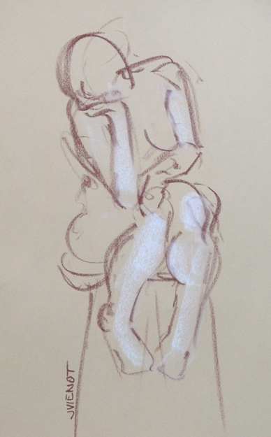
Sometimes a model will bring props, which can imbue something completely different in the drawing.  The model in my drawings shown here brought cuffs and a collar, which introduces a sexual component to the poses.  For me, the image in my mind’s eye changed from nude to naked, and the atmosphere felt a little dangerous, and I wondered whether I should be asking what the “safe” word was, just in case!

Then I got busy and started drawing.  I drew the seated pose on the left using Stabilo water-soluble pencils, putting just a touch of red in her hair and on her nipples to increase the sensationalism.  For the same reason, I chose to use red paper for the drawing on the right, which was made with white Nupastel and graphite.  The color red can heighten the viewer’s emotional or subconscious reaction.

These poses were made sexual by the props, and while drawing them I realized realized how very conservative I am with my art.  Art history was one of my areas of emphasis for my degree, so I have seen plenty of art.  I have seen outright obvious sexuality in art, both in classical work and contemporary.  I always considered myself to be fairly accepting and open-minded towards other artists’ work, but when it came to me myself drawing a subject a little bit outside the boundaries of my own vanilla experience, I had to face my fear of rejection.  After all, Victorian propriety is ingrained in our culture.

While some artists intend to offend, I mean no offense with my drawings.   But I know that figure drawing as a genre does not have universal appeal.   Some segments of our society are very sensitive about the human figure.  Some cultures are averse to making representational images of people, feeling that it steals the soul.  Others may view the human body as something shameful, instead of a thing of beauty.  I have worked around swimming pools my entire life, so I am fairly comfortable being around people with very little clothing on, or none.  The human form interests me as nothing else does.  I would never be able to spend this much time drawing tree after tree after tree, for example — I would die of boredom.  The figure remains ever interesting to me.

But I remember when I was a young adult, proudly showing off one of my drawings that was accepted into a juried art show at the university I was attending, and having a family member remark that it was “obscene, that I should be ashamed.”  I was first of all aghast at the bad manners, but secondly, I felt pity for my critic, because that particular drawing had no gender or sexuality at all, and the figure was neither clothed nor unclothed.  My teacher told me it was selected by the juror because of  the sheer force of expression, and not for any technical merit.   Nevertheless, for that family member, it evoked shame.

One of my friends often says “Observe and detach”, and I think that’s good advice when seeing something that is outside of our immediate construct, when our tendency is to judge it for being different, or to judge ourselves for paying any attention to it.
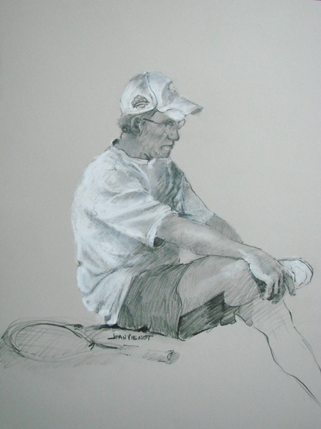
Posted on 1 Comment

Figure Drawing on Colored Paper

This week we again had a new model for figure drawing at Studio b. The young woman had a number of interesting tattoos, but tattoos are one of those things that you see right at the beginning, and then while you are drawing, you forget about them, and then maybe you will see them again at the end.   I’ve had this happen with with whole body parts before.  All of a sudden I realize there’s another leg  — how many legs does this model have?  So I missed drawing most of her interesting tattoos.

A few months ago I bought an assortment of colored Canson Mi-Teintes papers, and I had not used the brighter colors, so I brought them to figure drawing to try out this week.

I had fun even though the bright colors were a bit outside of my comfort zone.  I particularly enjoyed working on the red paper.  I used Nupastel, letting the red show through for some of the middle values.  I opted not to do anything with the background, leaving the figure floating, unanchored.

At left is one of my warm-up gestures.  Our instructor, Heather Clements, gave a very good demonstration about gesture drawing, and setting up the figure on the paper.  This example is nothing like what she taught us, but I just thought it was interesting.

The studio was a-buzz with creativity, with all the drawing upstairs while Colleen Duffley worked downstairs, uploading the New Years camera-phone competition.  Earlier this week Studio b. hosted a presentation by one of the Escape to Create artists, Judith Levy.