Posted on 3 Comments

Learning to See Better through Plein Air Painting

2014-0508 Thumbnail Sketch, Boat in Drydock2014-0513 Value Sketch, Fishing BoatsDon Demers, one of my workshop instructors last week, tongue in cheek, said “Plein air painting creates bad drivers.”  He explained the hazard, that as a practicing plein air painter, one could be driving along and become mesmerized, staring at the shape or color of something, perhaps even something so interesting as the shadow of an underpass.  We all laughed of course, but I recognize the truth of his statement.  After practicing plein air painting for 8 days, I can’t look anywhere now without noticing wonderful value contrasts, delicious color intensities, and patterns of light leading my eye through compositions waiting to be painted.

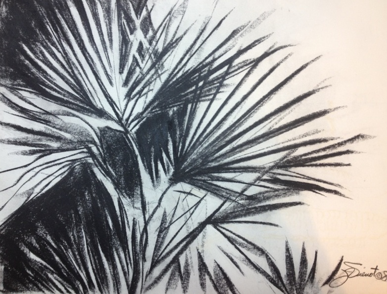
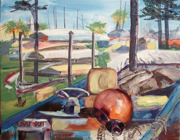
The first workshop I attended was by invitation.  Twelve painters were selected to be in the “pilot” course for the Apalachicola School of Art Plein Air Academy.  Master plein air artist Don Demers is designing the curriculum, and Joe Taylor of the Apalachicola School of Art is planning the logistics.  Together they will come up with a course to be offered as professional development for the advanced plein air painter.  Don spent a good bit of time talking with each of us, as well as offering constructive tips with our paintings.  Of most practical value to me was his suggestion to set intention before starting a painting, and then to stick to that intention.  He suggested we draw “thumbnail sketches” of our intended paintings first, studying the value relationships and evaluating whether the composition would work as a whole, before we spent 3 hours painting it.  Some of my sketches progressed into paintings, some were mere studies of shapes or ideas discarded as perhaps too complicated or logistically difficult (the one above left required me to stand in an ant pile; the one above right was too complicated for my limited knowledge of fishing boats).

I learned something about photography after doing one such value study, and that is that my iPhone camera does not see the light the way I do.  In fact my camera hardly picked up the power of the light at all.  Here’s a comparison:

2014-0509 Value Sketch, Docked Sailboat iPhoto of Sailboat I Sketched

I completed two paintings and a couple of studies in the Plein Air Academy workshop.  Integrating what I am learning is always difficult — there has to be a period of intense, grinding focus, because painting is for the most part so visceral, and newly learned information so very intellectual.  I found myself completely exhausted by the end of the first several days.  I must have had every muscle in my body tensed as I tried to incorporate what I was learning.  I literally came home, ate supper, and went straight to bed, for the first 3 days.

Here are a few of my paintings from the Apalachicola School of Art Plein Air Academy workshop.

2014-0511 Typical page of Notes Typical page of notes 2014-0506 Port St. Joe Marina 2014-0508 Mooring Buoy
2014-0507 Value Sketch, Marsh 2014-0507 Color sketch for Marsh 2014-0507 Marsh

Over the next few days I attended the Forgotten Coast En Plein Air event workshop with Greg LaRock and Ken Dewaard.  I wish I could remember everything they said.  It was fun to watch the different approaches of two accomplished artists.  Both were very strong on compositional tips.  LaRock often mentioned ways to lead the viewer’s eye through the painting, and Dewaard pointed out subtle color changes to look for, like the change in the tint of shadows depending on how much of the sky color they might be acquiring, or how much of the color of the ground.  Hopefully I absorbed a lot of it, even though I can’t recite it.  Below are the paintings I produced during their workshop.  In the first one, my challenge was to make the pile of rubble, mostly chunks of concrete, look interesting, like a rocky shoreline.  The paintings of the boats  and of the shirts for sale both challenged me to simplify.

2014-0511 Value Sketch, Rocky Shoreline 2014-0511 Port St. Joe Rock-Lined Harbor 2014-0512 Carrabelle Launch
2014-0513 Value Sketch, Shirts For Sale 2014-0513 T-Shirts for Sale, Apalachicola

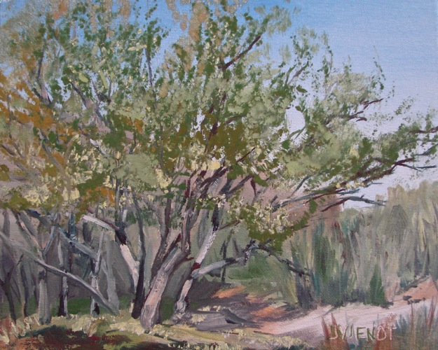
I actually had energy to paint a few small studies outside of class, the last several days, below.  Apologies for shooting the photos slightly crooked!

2014-05 Morning Light, Two-Mile Channel
Available for purchase. Click the painting for a link to order it!
Oil painting of evening light on Two-Mile Channel, Apalachicola, FL Oil painting of full moon rising over Two-Mile Channel, Apalachicola, FL

NOTE: light added to 2nd painting above, at  https://joanvienotart.wpengine.com/?p=7003

And now back to my day-job!  But the shadows of those underpasses are starting to look mighty interesting!!

Posted on 1 Comment

Studying from Morgan Samuel Price

Oil painting on canvas panel

2014-0323 Apalach Afternoon Behind the Island
The view from where I stayed

2014-0324 Coombs Inn
Coombs Inn and the Church

2014-0325 Scrub Oak Grove
Scrub Oak Grove, St. George Island

2014-0326 Apalachicola Marina
At the Marina Under the Bridge

2014-0327 Scipio Creek
Scipio Creek

2014-0328 Rainy Day at 'Up the Creek'
“N 2 Deep”

Last week I attended a plein air painting workshop in Apalachicola, Florida, taught by Morgan Samuel Price. The location of this fishing village is just two hours from my home, an easy drive but far enough away that I chose to stay in a rental property rather than commute. I learned so much I hardly know where to begin.  It will probably take me years to assimilate it. The difficult thing about an intense learning situation, is that much of it is communicated abstractly in words and absorbed into the left brain, while painting is performed on the right side of the brain. Fortunately, Morgan demonstrated during and after each lecture, to help us make right-brain sense of the concepts she was teaching. And she didn’t seem to mind repeating answers while each of us gained just enough understanding to ask the same question the previous student had just asked. “Morgan, what colors are you using now?” “Ultramarine blue, cadmium red light, and hansa yellow,” Morgan would answer. And the next student would ask, “Morgan, what colors did you mix to get this color?” And Morgan would patiently answer, “Ultramarine blue, cadmium red light, and hansa yellow.” To be fair, though, the different colors we were asking about were entirely different colors — it’s just that Morgan is a wizard at color mixing, and can make any color on the palette out of ultramarine blue, cadmium red light, and hansa yellow.

The first day, Morgan taught us about various materials and how to hold the brush for different angles of brushstrokes, and she taught us about color value, intensity, and temperature. She taught us more about those topicss every single day. She also taught us about  color in context, about composition, about creating the illusion of receding space, how light falls on horizontal surfaces vs vertical surfaces, how the eye moves through a painting, and even how to doodle on a scratchpad that sits by the telephone. She taught us about clarity of value and precision of shape. She taught with ease and good humor.  And she patiently answered again, “Ultramarine blue, cadmium red light, and hansa yellow.”

We had some good sunshine the weekend before the class, but our only sunny day during the class was the first day, Monday. After watching Morgan paint a simple alleyway with so many luscious values and such obvious perspective, making it look oh-so-easy, she turned us loose to paint in the afternoon. I choose the bright yellow siding of the Inn where everyone else was staying, and tried to capture the perspective of the sidewalk receding toward the church in the background. Even in my frustration (left brain / right brain confusion), I already had begun to learn. It is in the struggle that I find I truly learn, whether the painting shows that learning or not.  There is some confusion between the palm tree and the porch roof which makes the porch roof look like it is angled wrong — it’s not.  But as we joked in class, sometimes we need arrows and words printed on our painting to explain different elements.  My painting of the Inn could use several arrows.

The next day we drove to St. George Island, and I painted a grove of scrub oaks which had a play of light on the tree trunks that interested me.  I struggled with that light, but Morgan said to be definite with it — so I put down my tentative little brush and made some bold swaths of light, giving it much more of the feel that I wanted.

On Wednesday, two of the other students and I got lost from the rest of the class.  We painted near the base of the bridge to SGI, at a marina.  I painted on 16×20 canvas panel instead of my usual 8×10. I enjoyed using bigger brushes, but found myself being very stingy in mixing my colors, never mixing enough paint.  It’s difficult to paint with no paint on your brush.

Thursday found us at Scipio Creek, at another marina at the north edge of Apalachicola.  The pelicans and seagulls put on a continuous show for us while we caught the hazy pinks and lavenders in the middle ground and the muted grays in the distance, in contrast with the richer colors and more contrasting values in the foreground.

And then, sadly, it was Friday.  I painted beneath the overhanging deck of ‘Up the Creek’ Restaurant, with a vicious thunderstorm popping lightning all around me.  Nearby strikes three times chased me back further underneath to the center of the marine storage area under the building, which I imagined was safer.  All of the colors of my scene were washed out, at times it being so dark there was no color at all.  The last thing I painted were the reedy grasses and trees in the background, when suddenly I realized it was time to critique, so I packed up and hurried back.  I will dim the intensity of color on that foliage to make it recede more — it’s a little too bright, like the sun is shining on it, which it wasn’t.

A plug for my excellent host, the owner of the property where I stayed, Robert Lindsley:  Visit the Robert Lindsley Studio and Gallery at 15 Avenue E near the waterfront in Apalachicola.  And to the VRBO agent, my new friend Mike Klema — just search “VRBO Apalachicola” for Vacation Rentals By Owner, and Mike’s units will come up.  He was very accommodating, and I loved my place behind the island, right on US 98!  I had the thrill of seeing both the sunrises and the sunsets, as well as the parade of fishing boats every morning, and the abundant species of birds.  I’ve posted below a few photographs of my week, which all in all I enjoyed very much.

Sunrise
Sunrise

Sunset
Sunset

Low tide
Low tide

Atmospheric scenery
Atmospheric scenery

Fishing boat
Fishing boat

Eagle below my house

Demo in the alley
Demo in the alley

Class and demo on the beach

Morgan critiquing
Morgan critiquing

iPhonography Bicycle

iPhonography Grasses
Posted on Leave a comment

Painting Plein Air with an Extra-Long Filbert Brush

Extra long filbert
Extra-long Filbert
2013-1204 Dune Walkover
2013-1204 Dune Grasses
2013-1204 Bright Light on the Gulf

This blog post could be subtitled, “Where did November go?”

Soon after my show, “The Present Moment”, opened at Grayt Grounds of Monet Monet, I received an email asking if I would paint, plein air style, a view from the balcony, for some second-homeowners to hang in their “first” home in Tennessee.  I met with them, to visit and to look at their view of the coastal dune lake, Redfish Lake, and the Gulf of Mexico.  They gave me a few favorite photos, with morning light.  A day later, they sent me a photo of wind-driven clouds that they liked, and I started to work on the 24×36 gallery-wrapped canvas, with a 16×20 practice piece on the side.  The day before, I had painted with the local plein air group under the very clouds my clients had photographed.  So the scene was familiar enough to me that I was able to work from the photos and still have the feeling of being there.  I have nearly finished it and have posted photos below showing both the practice piece and the actual larger commissioned piece.  I have a few tweaks yet to do, especially perhaps darkening the tile roof on the gazebo.

Yesterday our plein air group met at Henderson Beach State Park, in Destin, Florida.  I painted with an extra-long filbert, size 7, made by Winsor & Newton.  The filbert, which I have sketched at left, is about 1/2″ wide, but the bristles are 2″ long.  I had bought it about 6 months ago, just to try out, but had never used it.  Last weekend I watched a painting demonstration on DVD by Frank Serrano.  I was inspired to try painting an entire painting using only one brush, and I thought, why not the extra-long filbert!.  So when our plein air group met at Henderson Beach State Park, in Destin, Florida, this week, I chose a scene which could easily be simplified, so that learning the brush would be my only challenge.  I grew to like the brush as I painted with it.  The extra long filbert holds more paint than an ordinary brush.  Because the bristles are longer and thus not as stiff,  it required me to lay color onto the canvas instead of scrubbing it as I sometimes do with stiffer brushes.  It was perfect for the texture of the fall-colored grasses on the dunes.

The day was gray, without direct sunlight, and the mist during the drive had dried up by the time I had set up my easel on the boardwalk to the Gulf.  A light breeze cooled it to a balmy 72°.  I painted fairly quickly, the scene complicated only by the structure of the dune walkover.  I had to use a small rigger to paint the walkover, but I used the extra-long filbert everywhere else.  The values and colors were muted by the indistinct light.  Because I had arrived about 40 minutes late, I worried that I would run out of time.  But I felt the 8×10 painting was finished after only about an hour, so I tried another, smaller one, 6×6, and wrapped it up fairly quickly too.  I started a third painting, 8×10, and gave myself the challenge of looking directly at the highlighted Gulf, sparkling white where the sun was peeking out of the darkening sky.  It turned out quite a bit more dramatic than the first two, because of the heightened values.  At right are the three paintings.  Silver plein air frames show them off nicely.  I have priced them for sale but may keep all three for my own collection.

If anyone did not get a chance to see “The Present Moment”, many of the pieces will remain at Grayt Grounds of Monet Monet, and some will be lining the stairwell on the way up to Bob and Cheri Peebles’ real estate offices on the second floor of the building, at Beach To Bay Realty.

Below is the not-quite-finished commissioned piece I was writing about, and below it, the practice piece where I worked out solutions to the problems I encountered along the way.

Oil painting of the view from a balcony at Sanctuary By The Sea, Santa Rosa Beach, Florida: Redfish Lake and the Gulf of Mexico 24 x 36, commissioned oil painting, view of Redfish Lake and the Gulf of Mexico from Sanctuary By the Sea
Practice piece for commissioned oil painting of the view from a balcony at Sanctuary By The Sea, Santa Rosa Beach, Florida: Redfish Lake and the Gulf of Mexico 16 x 20, practice for commissioned piece above

Posted on Leave a comment

Making Sense in Plein Air

Oil painting of parked boats at a yacht club

FWB Yacht ClubUgh!  Boats again!  Last week we met at a yacht club, and as much as I love sailing, and water sports of any kind actually, I certainly struggle when we paint boats.  Parked in the middle of a giant circle drive were every kind imaginable of dinghies, sunfish, motorboats, rowboats, sailboats, you name it, in various stages of neglect and disrepair, to one side of the more manicured grounds and view of the docked yachts.  I chose to paint the clutter.  I wisely drew the shapes first, spending some time in what I imagined to be organization of geometric shapes, but that preparation did not keep me from getting lost in my own composition, numerous times.  I was barely halfway done when fellow painter Sandra strolled past with her completed painting, and I asked her if she was going to do another, and she said, “Joan, it’s 11:00, it’s time for critique!”

It’s always a thrill to see what the other painters have managed to do during the same time period.  We all are having essentially the same experience in the same location, but looking at everything from another point of view and with varying media and skill levels, so rarely are any two pictures similar.  I can safely say that no one did anything as hodgepodge as my composition.  I still am trying to make sense of it, even after coming home and finishing it in my studio.  I think the shapes all give the right idea, but I’m not sure if anyone would guess that this actually is not my first painting ever.

Oil painting of parked boats at a yacht club


Posted on Leave a comment

Plein Air Painting Progress Report: Leaps and Bounds!

Oil Painting of Old Boat "Pompano", Nick's Restaurant, Basin Bayou, FL
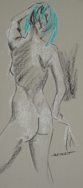
I am starting to see in color.  That may sound strange, but the fact is that most of the time in my normal everyday activity, I hardly pay attention to color.  When I was focusing on figure drawing, I occasionally used color, but for the most part I was focused on line, shape, and value, usually rendering the whole piece just using a black-white value scale. Now that I am painting again, I am noticing for example, when a white railing is picking up the blue of the sky, or how intense a green becomes when it is contrasted with red.  I am finding that much of what I think I am seeing as different tones of a color are actually the same color which looks different depending on what color is next to it.  I am particularly challenged by all the greens I see, when landscape painting.  If I try to mix an exact shade of green, it often seems muddy compared to what I actually see.  Who knew, that Einstein’s theory that everything is relative applies to painting as well as nuclear physics, that the better way to achieve a color is to find the color next to it which gives it the quality I want.  Resisting the temptation to launch into that as a metaphor for life, I’ll instead move on to my adventures in plein air painting over the past week.  Last week we painted at Nick’s Restaurant, and I bemoaned the fact that I know very little about boats.  The next day I decided to take another run at the featured boat, using my photo references, and came up with the piece at top right.  It was the little paprika-colored spots of rust washing out from the old nails in the hull, that gave the greens and turquoise the punch I wanted.  So I wafted a little of that color into the foreground grasses too.

Oil painting study, Bayou Grass, Point Washington, FLThis week is the largest of the spring-break tourist weeks in the beach resort communities of Panama City Beach, Seagrove Beach, and Destin, FL.  So when the announcement came that the plein air painters would be meeting at the docks again in Destin, I knew the drive would take all the fun out of the adventure, so I opted to paint from my dock in my back yard.  I had thought I would be painting my view of the creek leading into Tucker Bayou, but when I looked upstream, the color of the bayou grasses intrigued me.  My initial 6″ x 6″ study, left, did nothing for me by way of planning my painting, but rather served more like a singer doing la-la-La-LA-La-la-la scales to warm up her voice before performing.

I needed a warm-up!  The temperature was less than 40 and the wind was chilly.  But it was a clear spring day with bright light.  I roughed in the composition and then went to work on the trees at the edge of the Bayou.  The spring gold-greens of the new leaves contrasted with the rich, dark pines and the shadows underneath.  I resisted the impulse to paint the shadows a colorless dark value, which has the potential to suck the life out of a painting.  Instead I darkened my green shadows with a touch of the same deep red I used to tint the pink flowering trees in my distant neighbor’s yard.  I stuggled with the grasses, because the shiny highlights were picking up every color of the palette.  Uncertain whether I was just making a mudpie, I plowed onward through the painting, until I was satisfied I had achieved an approximate similarity to the colors I was seeing.  My two cats initially were scared by my unusual activity on the dock, but they grew braver throughout the 2 hours, wrapping their tails around my legs as I scratched some final textures and highlights into the grasses and the tree trunks.  Upon completion, I stood my painting up against a piling and stepped back from it only to have a bitter wind gust blow it onto its face, requiring repair where it had landed on an edge of a dock board.  Remembering the worm crawling across my finished painting two weeks ago, I decided that paintings are not really finished until restored from an inevitable mishap at the very end.

Oil Painting of Bayou Grass, Point Washington, FL

The day before yesterday I was excited to find a delivery frames on my package stand as I entered my driveway, so even though it was late, I spent the next couple of hours framing my earlier paintings done in November and December of last year, when I first resumed oil painting after a 30-year hiatus.  Looking at them, I realized that I am growing by leaps and bounds.  The rate of my improvement surprises me.  I thought I would progress more slowly, and even be tempted to give up, because oil painting so intimidated me, no doubt from my tortured efforts during and shortly after college.  I find I am enjoying the time limitation of plein air painting, which while still allowing for tortured effort, does not allow it to continue for very long, with only a two hour window before the light changes so much that further attempts at capturing an impression are not worthwhile.

I continue to play with my photography.  I am learning about photo-editing, taking a class in Photoshop Elements from Jackie Ward at Northwest Florida State College, South Walton Center.  She is teaching us what Photoshop can do.  It’s difficult for me to remember.  My poor brain may be overloaded, trying to run my business, my day-job, the one that pays the bills, while I try to learn more about photography and painting.  I still enjoy the easy editing that can be done with Snapseed App on my iPhone.  Yesterday I paddled my canoe on the Bayou with a dear friend, a fellow photographer.  You can’t take a bad picture at sunset!  Most of my editing of my iPhoneography consists of simply straightening the horizon line and perhaps a little cropping, but I had some fun dramatizing and saturating the photo below.

Photograph, Tucker Bayou, Point Washington, FL, Joan Vienot

Most of my images are available for purchase.  Contact me if you are interested. — Joan Vienot

Posted on Leave a comment

Types of Lighting

I am teaching a “Back-to-the-Basics” drawing class for the Cultural Arts Alliance of Walton County.  This week we talked about three different types of lighting:  silhouette, high contrast, and full-values.  For a silhouette to be effective, it is essential that the subject be recognizable by its outer contours, since there is no interior development.  Below are some examples of sillouette.  Please forgive the quality of the photographs — they are meant for illustration only.

In high contrast, interior development is in only two values.  This allows for a more ambiguous outer contour because the development inside the form identifies the subject.  Below is a drawing done in high contrast.

Full-value development is the type of treatment we are most familiar with, where we can easily identify the subject because the interior development is in a full range of values, like the drawings below:

Many artists will use all three of these methods of describing shape, within the same drawing or painting.  Silhouettes require less attention, and if executed in middle values, can provide wonderful background imagery, effectively breaking up negative space and often repeating forms found in the foreground, as in paintings of flowers for example.  Even when the lighting is shown in full values, often the lighting will simplify into high contrast or silhouette, especially towards the edges of the composition.

Silhouettes can be extremely powerful.  Some of the happiest ooo’s and ahhh’s will be heard when you show a painting of a brightly colored sunset with silhouettes in the foreground.


Posted on Leave a comment

Photography Image Manipulation

Most of my photography is composed in the viewfinder or on the LCD before I ever even shoot the picture, by where I position myself and how I frame the picture.  Since most of my work is nature photography, rarely do I ever do much more in post processing than just crop and increase the brightness a little or saturate the colors just a bit.  I am cautious not to alter the lighting or the color in an image very much for fear of making it look “wrong”.  I don’t want the viewer to immediately describe the photograph as “Photoshopped.”

But there are many photography applications which anyone can use, and they are fun to play with.  I use two on my iPhone, for fun and experimentation.  One is called Value Viewer, and it is a useful tool for seeing a value study of a composition before shooting it or painting it.  It also enables a lot of manipulation to create images that are strikingly different from the original.  The image below, left, is a dramatic piece in 3 values.  Beside it is the original rather non-descript photo of some random grasses beside the Bay.  Unfortunately, for some viewing this post on their smart-phones, one of the images may be appearing sideways, which makes it difficult to compare the two.  I don’t know how to correct that for phone viewing.

Final Image

Original Image

The image below left is enhanced using the iPhone app called Snapseed.  The original shot is on the right.  I sharpened it as far as the app would take it, and also increased the “drama” a little, to produce the image on the left.

In my last blog entry,  I griped about people “borrowing” some of my images from facebook and uploading them as their own, so you will see that I am experimenting with watermarking my finished pieces that are posted here on my art blog.  Should someone wish to purchase the image, the original of course does not have the watermark.  I am using the iPhone app Impression for simple watermarking.

Final Image

Original Image


Posted on 2 Comments

After a Month Away, Returning to Figure Drawing

It was exhilarating, returning to figure drawing after more than a month.  Colleen Duffley, owner of Studio b, has been in Italy and other exotic places fulfilling her professional photography obligations.

I too have been elsewhere, as my last blog post indicated, including two weeks in British Columbia.  So getting out the chalk and paper and easel and coming back to the Studio was like the proverbial oasis in the desert!

I wasn’t too rusty, considering how long it had been, because I had been keeping up with my daily doodling, but more than that, I think what helped me stay in tune was my continuous practice of photography, which is a great tool for maintaining my “eye” and my feeling for composition.

The model this week had amazing turquoise hair,  and it demanded to be noticed.  As it happens, I have a number of sticks of Nupastel of that exact color, which I had bought expecting eventually to use in background imagery with the colors of the Gulf of Mexico here in Northwest Florida where I live.  The Gulf is an impossible blue-green, which looks unbelievable whenever I have used that color in my art, but which is absolutely correct for the color of the model’s hair.

Most of my images are available for purchase.  Contact me if you are interested. — Joan Vienot

Posted on Leave a comment

iPhoneography – Everyone Can Do It

A professional photographer composes and controls his or her image.  The styling, positioning, and lighting are planned to the nth degree.  But today, almost everyone can be a photographer, capturing those elusive moments in time without necessarily planning any part of of the photo.

If you have a cell phone today, then chances are it has a camera.  I’d like to encourage you to use it, and not merely to record events as cameras traditionally have been used, but also to start documenting visual imagery that you find interesting.  There is probably no better way to become more aware of our visual world than by capturing bits and pieces of it, and nothing is more immediate than a camera image.  Much of what becomes your camera sense simply starts out as what you feel comfortable with, whether capturing elements of design – line, shape, size, position, color, texture, density – or elements of composition – balance, rhythm, and harmony.  As for me, my sense of composition is somewhat instinctive, not something I can put words to, so that my photographic decisions are mostly about positioning myself so that light hits the subject in an interesting way.  Certainly, I know about the rule of thirds, and a few other compositional tricks, but in a complex composition such as the one pictured here, the rules of what not to do probably outweigh the rules of what to do.

To enhance the dramatic lighting and create a vintage effect, I used an app called Hipstamatic, with my favorite lens, Roboto Glitter, on Float film.  The result is a mostly dark image with overexposed whites tending towards yellow, anda few turquoise highlights.  The border is black.  In an image with more light, the edges of this film would look spotty, sort of mildewed.

I watermarked this image with my website name, in the lower right corner, and probably should do that more often, particularly when I post something on social media.  Facebook makes it very easy for someone to download an image onto his own computer, and then re-upload it, which then drops the attribution to the original photographer.  If people simply “share” the image, the photographer’s name remains on the image information, but if downloaded and re-uploaded, the attribution is lost.  This particularly offends me when someone uses one of my images on their own website.  I post a lot of paddling photography, and tag many standup paddleboarders, so they might have their website developer use one of my images of them racing or doing some activity on a paddleboard.  I don’t think people realize that images are copyrighted from the moment they are made, and that you cannot use an image without permission.  If asked, I always have given permission for my photography to be used on someone’s website, but I ask the person to give me written credit.  I have given only two of my best friends cart blanche permission to use my images with or without attribution.

A good photographer makes a shot look spontaneous and easy, but even if posted on social media, that doesn’t mean the image is public and free for the taking.

Posted on 1 Comment

Figure Drawing: The Power of the Group, Chakra Work, Music and Communication

“Reclining Arched Back” is available from my site! Click the painting for information on adding it to your collection.
“Standing” is available in my store. Click the painting and to purchase for your collection now!

Last week I didn’t draw, except for my practice at home.  Instead I watched and listened to a lot of live music at the 30A Songwriters Festival, which I blogged about in my last post.  And last Friday I attended a yoga presentation on the Root Chakra, the first in a 7-week series, a subject which is all new to me.  Then on Tuesday a friend and I got together and brought each other up to date, all good.  And Wednesday, a whole bunch of artists I hadn’t seen for a while were at figure drawing, at the regular weekly session at Studio b., which was exhilarating.

So whether a positive result of my fledgling efforts to allow more energy to flow through the Root Chakra, or good old-fashioned open communication with a dear friend, or listening to so much good music, I felt very confident in my artistic expression this week.  I found myself very quickly lost in the process of executing each pose.  When I lose myself is when I enjoy it the most and feel the most successful at capturing what to me is the basic emotive and visual essence of the pose, whether I am focused on the light, or mass, or shapes, texture, or line.

Our model struggled with the standing pose at top left.  Supporting herself on one leg with a locked knee, she wasn’t able to hold it for as long as she had intended.  Nevertheless, even with the pose a little shorter than expected, I felt completely comfortable with the end result, leaving portions of the drawing a little sketchy.  In fact I think I am enjoying that more and more, developing only the more important area of each pose, although I need to be careful not to always leave the feet undeveloped, because that might be suspected laziness.  Feet are difficult to draw.

The drawing at upper right is the only drawing I was unsure about, when I was finished, because her right elbow creates a triangular shape above the woman’s throat.  Effective composition  requires the artist to be judicious, to leave out visual description which merely confuses.  So I worked on this drawing when I got home, removing the elbow shape entirely, and then drawing it back in.  Sometimes it is that little quirk of confusion that requires the viewer to puzzle for a moment, and engage a bit more, holding his attention for a bit longer.  And in this day and age of instant communication, holding someone’s attention is like gold to an artist.

Speaking of attention, to those of you who wade through my blogs each week, from the bottom of my heart, thank you!  You don’t even have to say anything, though I love it if you do — I feed off your collective support.  May we all give support to each other for our efforts at creative expression, whatever the avenue!

Most of my images are available for purchase.  Contact me if you are interested. — Joan Vienot