Posted on Leave a comment

Changing Perspective in Figure Drawing

Our model this week at Studio b.‘s regular weekly figure drawing session stood on a ladder during the warm-up drawings and the shorter warm-up poses, and she also posed up on a table.  Usually our model is on a short platform or even on the floor, so this change in perspective was a rare treat.  I enjoyed the challenge of drawing from a lower vantage point.  Every shape was different from how we normally see our model.  To add to the challenge, we positioned a floodlight to light her from below.

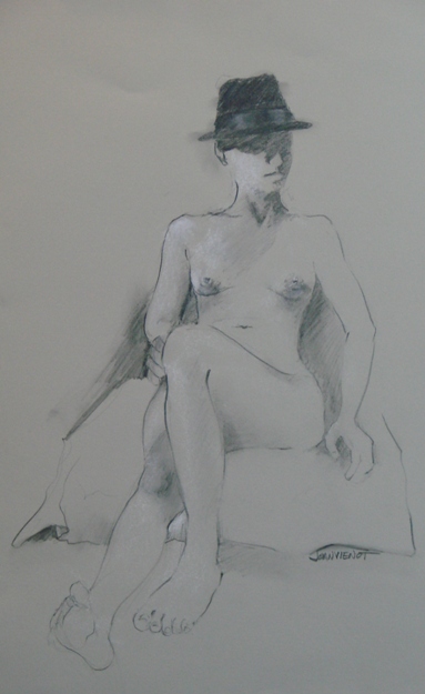
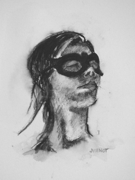
The model brought a hat, a mask, and a necklace to give us some accents.

I used some different media to loosen up from the intense figure drawing workshop Heather Clements taught last Saturday at Studio b.  I had not sketched since Saturday, and I felt like I had really tightened up, hence my decision to use less familiar media, to force myself to “let go”.  Interesztingly, I think my most successful piece of the evening was one of these looser pieces, using water-soluble Aquarelle pencil on hot press watercolor paper, the study of the model wearing the mask, above left.  It is small, only 4½” x 6″.

I throw away almost all of my warm-up drawings.  Colleen Duffley, owner of Studio b., suggested saving more gestures, explaining to me that some people have more appreciation for anonymous gestures than for finished drawings of a model they don’t know.  This poses a dilemma.  I do so many warm-up drawings, or gestures, that I always use an inferior grade of paper, for the sake of economy.  Newsprint and manilla paper costs just pennies, as opposed to good paper which can run from $1.65 to $3.50 per sheet, and upwards.  So the few times that a warm-up drawing turns out to be a keeper, its value is compromised because of the poor quality of paper.  It can be redrawn on archival paper, but that is a challenging task because the immediacy of expression, the passion, will be difficult to recreate.  So I decided to bring a tablet of 18 x 24 Canson Cream that I had bought a good 6 months ago, and I did all of my warm-up drawings on good paper.  I missed the rough texture, or “tooth” of the manilla and gray bogus papers I usually warm up on — the tablet of good paper is very smooth.

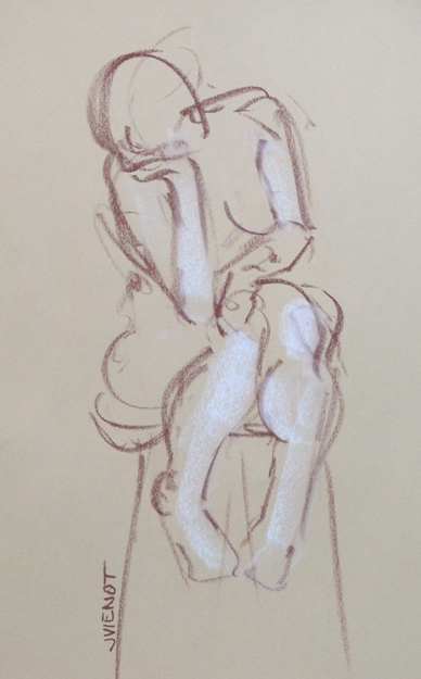
Below left is one of my warm-up drawings, a 5 minute pose, and the other two are longer poses on Stonehenge and Rives.

Most of my images are available for purchase.  Contact me if you are interested. — Joan Vienot

Posted on Leave a comment

Props and Themes in Figure Drawing

Our model for Figure Drawing at Studio b. this week brought a black hat that I just loved.  She used it in almost all of the warm-up poses, but then for the longer poses,  she switched to a sequence without the hat.  Fist she posed just standing in the pool, then wetting her hair under one of the pool fountains, and then she posed seated and fixing her hair.

After our break, a few raindrops speckled the courtyard so we moved indoors to one of the galleries for the final poses.

I asked the model to put the hat on for one of the last poses.  It is more interesting to me if there is an element of the drawing that contrasts with the figure.  That element might be an added compositional effect such as the actual setting or environment, or just background shapes, but it could simply be the texture of the model’s hair, or a shadow pattern, or a necklace, or a hairband, or some other inconsequential accessory.  In this case, the hat the model brought was solid black, with a shiny band, and it became a dominant force, giving the pose some pizzazz.

It’s always interesting to see who shows up at Studio b.’s figure drawing sessions.  This week, model and designer India Hicks drew with us.

Studio b. owner Colleen Duffley regularly schedules interesting people to discuss and show their work to the community, and that is how India happened to be in town and to come to figure drawing.  She fussed at her drawings just like the rest of us did, but  I am always amazed at people like her who say they haven’t done any figure drawing in 20 years, and then proceed to whip off some drawings like they never stopped!

I’m going to keep an eye out for her son’s art too.  Though still in junior high, his drawings show great promise.

Most of my images are available for purchase.  Contact me if you are interested. — Joan Vienot

Posted on 3 Comments

Figure Drawing by the Pool, Another Studio b. Experience

You would think that when you go to the same activity, week in and week out, that it would become predictable, and perhaps even boring.

Not so with figure drawing, especially at Studio b. We had the same exceptional model for the 2nd week, who clearly was invested in our work, being aware of how her poses might come across, and considering the mood they might evoke.  Studio b. owner  Colleen Duffley said the model was even practicing a few poses before we got there, and during breaks, she asked the artists what sort of pose they would like next.  Of course for me, every pose is a challenge, so I am just happy to be there and almost any pose is good!  Generally, if a pose is not well-lit or is uninteresting from one vantage point, there is enough room to move to another location where I can see better or the composition is better.

For our final pose of the evening, the model got into the water of the pool.  Lit by the underwater lights, the portion of her figure beneath the water was a chalky blue-green, and extremely distorted.  The part of the figure above the water was almost a silhouette, it was so dark.  This is the first time I have drawn a figure in water, so I really had to study it.  The water’s distortion greatly shortened and widened the part of the figure closest to the surface of the water from my vantage.  Each artist had a different distortion. What struck me the most were the amazing colors, so although I rarely draw in color, this pose begged for it.

Heather Clements produced an amazing pencil drawing from the 50 minute pose — hopefully she will include it in her blog.  Also it can be seen on Studio b.’s facebook page.

Below are two other poses from this model this week, which I drew with graphite and Nupastel on Stonehenge paper, one paper gray and the other faun.

Most of my images are available for purchase.  Contact me if you are interested. — Joan Vienot

Posted on Leave a comment

Plein Air Figure Drawing

At our  Figure Drawing session at Studio b., Thursday this week, we drew in the open air, in the courtyard by the pool.  Studio b. is a wonderful venue for events of all sorts, including many a reception for any number of creative pursuits.  The activity often spills over into the courtyard where the pool and the pool fountain form a serene backdrop to whatever is going on.  A board on two ropes hangs as a swing  in front of the pool, a little catawampus, but serviceable.  The model posed near the old washtubs for our warm-up drawing, and then she posed leaning against one of the arbor pillars, and sitting on the swing, and then lying on a bench.  Four artists enjoyed the evening of shared community and artistic passion, while Colleen Duffley, owner of Studio b., and her assistant worked in the adjoining room.  I drew the following sketches there this week.

Most of my images are available for purchase.  Contact me if you are interested. — Joan Vienot

Posted on 2 Comments

Figure Drawing: Tension vs. Relaxation

Sometimes I am bone tired when I get to my regular weekly figure drawing session after a full day of work.  Last night was like that.  But it never fails, after the first half hour of drawing, I am energized again.  Is it me?  Is it being in the good company of other like-minded artists, like Betty Cork and Steve Wagner and Heather Clements?  Is it the amazing creative atmosphere of Colleen Duffley‘s  Studio b.?  All of the above, I suppose, plus a model who is invested in the process, who works hard for us, as all of our models do.

After the usual series of warm-up gestures from 30-seconds to a few minutes, figure drawing instructor Heather Clements suggested that we focus on where the figure was showing tension, and where it was showing relaxation, and to draw the two aspects differently, perhaps exaggerating the contrast between the two.  She suggested that the parts of the figure under tension might be drawn with straighter, shorter lines and more angular shapes, with more abrupt changes in quality and direction, while the more relaxed parts would be smoother, with longer lines and less angular shapes.  I can’t say that my drawings actually show that intention, but I was trying to be conscious of it as I drew.  As always when I am learning something new, I will have to sit down and do some practice drawings, thinking about it non-stop, in order for it to become habit.

I have posted some of my gestures and drawings from throughout the evening.  Nupastel and graphite are still my favorite media.  A close floodlight, positioned low, put strong highlights and dark cast-shadows on the model.

Posted on 1 Comment

Figure Drawing on Colored Paper

This week we again had a new model for figure drawing at Studio b. The young woman had a number of interesting tattoos, but tattoos are one of those things that you see right at the beginning, and then while you are drawing, you forget about them, and then maybe you will see them again at the end.   I’ve had this happen with with whole body parts before.  All of a sudden I realize there’s another leg  — how many legs does this model have?  So I missed drawing most of her interesting tattoos.

A few months ago I bought an assortment of colored Canson Mi-Teintes papers, and I had not used the brighter colors, so I brought them to figure drawing to try out this week.

I had fun even though the bright colors were a bit outside of my comfort zone.  I particularly enjoyed working on the red paper.  I used Nupastel, letting the red show through for some of the middle values.  I opted not to do anything with the background, leaving the figure floating, unanchored.

At left is one of my warm-up gestures.  Our instructor, Heather Clements, gave a very good demonstration about gesture drawing, and setting up the figure on the paper.  This example is nothing like what she taught us, but I just thought it was interesting.

The studio was a-buzz with creativity, with all the drawing upstairs while Colleen Duffley worked downstairs, uploading the New Years camera-phone competition.  Earlier this week Studio b. hosted a presentation by one of the Escape to Create artists, Judith Levy.

Posted on 2 Comments

Negative Space in Figure Drawing, with Heather Clements

Negative space is the space surrounding the “subject”.  Negative spaces which are bounded by the subject are called negative shapes.  The boundaries of negative shapes also can be the edge of the art piece, or the edge of another shape.  Heather showed examples of negative space, and we spent the entire 2½ hours finding and filling in negative space, from warm-ups through extended poses.  Well, there was one pose where I just couldn’t stand any more ignoring of the form, and I quickly drew a rough approximation of the light on the form, below right.  Otherwise, in each drawing, the positive shape was drawn, or rather, not drawn, as a silhouette.  Our model was very cooperative, positioning to create empty spaces in his pose.  When negative shapes are interesting, they can be very helpful in defining the form.  We recognize many things by the silhouette of the shape.  So even though the interior of the form was not developed, anyone looking at these drawings can tell that they are depictions of a male figure.

Sometimes our studio workspace is overflowing with people, but on this night I was the only student.  I am so grateful that Colleen Duffley, owner of Studio b., continues to provide this creative opportunity through thick and thin.  And Heather Clements, the instructor, talked to me as if I were a whole classroom of students.  She is such a professional.  She drew along with me, practicing the same exercises.  Later she showed me examples of Egon Schiele’s work, pointing out how he used negative space to make his figurative work even more interesting.   Such intense focus on negative space is sure to make me more aware of it in my compositions, even as I have been “seeing” more negative shapes in my ordinary daily activities today.

Interior form developed at right...
Posted on 1 Comment

Studio b. Is Showing Our Drawings!

Way before I ever imagined it happening, some of my figure drawings are hanging in a gallery.  Colleen Duffley has covered one of the walls in Studio b with drawings by the participants in the weekly figure drawing sessions.  The fact that our drawings are being shown at all is pretty exciting, not to mention the good fortune to be shown at Studio b, the premier fine art gallery and venue for creativity.  Italian artist Sergio Poddighe will  be showing his work in the main gallery starting with his opening reception on Saturday,  3/27/2010, from 6 to 8 PM.  Our figure work will be in the back gallery.  Our prices will be nominal, because our drawings are not matted or framed.

Male on One Elbow, With Sheet--conte and charcoal on   gray--18" x 22"This week instructor Heather Clements had us draw the folds and gathers of fabric partially covering the model.  A plain light-colored sheet gave us plenty to work with.  The drawing sessions have been well-attended the last few weeks, with 10 or 12 artists there.  As always, the energy was very high this week.

Each session becomes an experience:  the scratching sound of chalk and charcoal on paper, the instructor’s soft encouragement and tutoring of the  individual artists;  one of the artists singing a parody of a mournful selection in the background music, with everyone laughing afterwards.  And spoken aloud, the questions all artists struggle with (but usually don’t verbalize)… “How do you make a foot look like a foot?  Why does mine look like a flipper?”  And the groans of protest when the timer goes off, ending a particularly good pose.  And then the hurried removal of drawings from drawing boards and the setting up for a new drawing, quick, hurry, we’re starting another 8-minute pose…

None of my drawings were “keepers”, but I’m posting a few anyway.  I experimented, even using some color.  I rarely use color for color’s sake, preferring instead to draw monotone value studies using only one color or a neutral.  I may not turn out any masterpieces when I experiment, but I learn a lot, so I never count the effort a waste.

Male Standing, With Sheet--conte on manilla--18" x 24"

Male on Stool, With Sheet Male Leaning Back on Hands, With Sheet