Posted on Leave a comment

Back-to-the-Basics Drawing Course

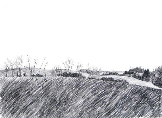
Hollington Farmland


In February, 2013, I will be offering a “Back to the Basics” Drawing Course at the Bayou Arts Center, in Santa Rosa Beach, FL, for the Cultural Arts Alliance.  The course will be four two-hour classes, on Tuesdays from 1:00 to 3:00pm.  We will practice line quality, “seeing” shape and drawing what we see, and creating textures.  We will practice drawing as preliminary to other art, as well as drawing as the final masterpiece, and we will experiment with several kinds of media.

An otherwise fabulous work of art can be ruined by poor perspective.  So in the first of the four two-hour classes, we will review one-point and two-point perspective, which are useful tools for making representational objects look “right” in our attempt to create the illusion of 3 dimensions on a two-dimensional surface.  Knowledge of perspective will assist us in seeing correctly.

Above is a drawing I made several years ago, showing the weeds near to the viewer to be much larger, relative to the trees and the structures further back in the picture plane.  As objects recede, they should be drawn smaller and there is an orderly way to go about that, which is the tool called perspective.

Below I have posted a simple sketch showing some perspective problems.  You immediately get a sense that there’s something wrong with this picture, and you may or may not notice what it is exactly that bothers you, but you will recognize it and agree that the house on the right looks crooked, and the telephone poles seem too tall as they go over the horizon, and the fence underneath them doesn’t seem right, and the tractor looks too small.


Back-to-the Basics Drawing Course

Register at (850) 622-5970.  The fee is $100 for CAA members, slightly more for non-members.  Below is the suggested supply list.

  • Ebony pencils — jet black, extra smooth (Prismacolor) or similar very soft, black graphite pencil (6B or 8B)
  • A water-soluble pencil, i.e., Derwent Sketching pencil – dark wash, 8B,  or Derwent Graphtint pencil – nice colors are steel blue(06), port (01), shadow blue (05)

  • A water-soluble pen, dark (Vis-a-Vis, or Flair) — blue, black, or brown
  • A white eraser (White Pearl)
  • 12″ ruler — 18″ is even better
  • Watercolor brushes — nothing fancy, anything will do, but if you have one, a #4 rigger/liner/script and #6 pointed round
  • Small water container (Dixie cup is fine)
  • Soft cotton rag for smudging
  • Old sketchbook for note-sketches and for practicing at home
  • Assortment of papers — white, cream, mid-tone, and colors, different textures, nothing terribly expensive, but better than newsprint,whatever you have on hand, and perhaps some watercolor paper or illustration board, 12 x 18 or larger
  • Plus anything else you might want to draw with or on
  • You may want a to bring your drawing board and table easel or stand-up easel, but we can work on the tabletops.
  • Optional supplies the instructor will bring for you to experiment with:
  • Charcoal pencil, paper-wrapped — soft or extra soft (Berol)
  • Woodless pencil, 6B (Grafstone), or graphite sticks
  • Cretacolor Woodless watercolor pencils (Aqua Monolith)
  • Nupastel, white, and some dark colors
  • Stabilo Aquarelle Black 8046 or Red 8040 or Brown 8045
  • Practice paper (cheap, not colorfast):   Smooth newsprint, Textured newsprint, Gray bogus paper

The instructor gets supplies from www.dickblick.com, and standard delivery is usually about 10 days.  But please do not spend a fortune — let’s use the supplies you already have!

Posted on Leave a comment

Changing Perspective in Figure Drawing

Our model this week at Studio b.‘s regular weekly figure drawing session stood on a ladder during the warm-up drawings and the shorter warm-up poses, and she also posed up on a table.  Usually our model is on a short platform or even on the floor, so this change in perspective was a rare treat.  I enjoyed the challenge of drawing from a lower vantage point.  Every shape was different from how we normally see our model.  To add to the challenge, we positioned a floodlight to light her from below.

The model brought a hat, a mask, and a necklace to give us some accents.

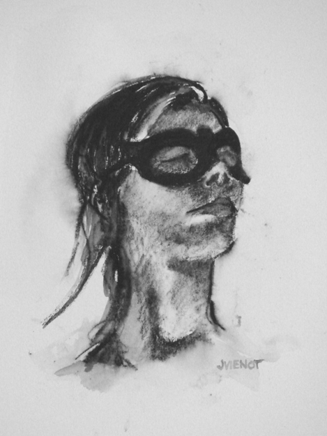
I used some different media to loosen up from the intense figure drawing workshop Heather Clements taught last Saturday at Studio b.  I had not sketched since Saturday, and I felt like I had really tightened up, hence my decision to use less familiar media, to force myself to “let go”.  Interesztingly, I think my most successful piece of the evening was one of these looser pieces, using water-soluble Aquarelle pencil on hot press watercolor paper, the study of the model wearing the mask, above left.  It is small, only 4½” x 6″.

I throw away almost all of my warm-up drawings.  Colleen Duffley, owner of Studio b., suggested saving more gestures, explaining to me that some people have more appreciation for anonymous gestures than for finished drawings of a model they don’t know.  This poses a dilemma.  I do so many warm-up drawings, or gestures, that I always use an inferior grade of paper, for the sake of economy.  Newsprint and manilla paper costs just pennies, as opposed to good paper which can run from $1.65 to $3.50 per sheet, and upwards.  So the few times that a warm-up drawing turns out to be a keeper, its value is compromised because of the poor quality of paper.  It can be redrawn on archival paper, but that is a challenging task because the immediacy of expression, the passion, will be difficult to recreate.  So I decided to bring a tablet of 18 x 24 Canson Cream that I had bought a good 6 months ago, and I did all of my warm-up drawings on good paper.  I missed the rough texture, or “tooth” of the manilla and gray bogus papers I usually warm up on — the tablet of good paper is very smooth.

Below left is one of my warm-up drawings, a 5 minute pose, and the other two are longer poses on Stonehenge and Rives.

Most of my images are available for purchase.  Contact me if you are interested. — Joan Vienot

Posted on Leave a comment

The Illusion of Depth

This week Studio b. instructor Heather Clements gave us the exercise of creating illusion of depth.  She asked us to exaggerate it,  to make the foreground appear much closer than the parts of the model that were further away.  Perspective of course is the most obvious method of creating the illusion of depth on a two-dimensional plane.  The parts of the subject that are closer are much larger in proportion to the parts that are farther away.  In figure drawing, perspective already is exaggerated, because the model is in close proximity to the artist.
The highest contrast of values, and if working in color, the brightest colors, also tend to advance toward the viewer, while midtones and duller colors tend to recede.  Purposefully muting the lights and darks will cause that part of the subject to appear farther away, and purposefully heightening the black-white value contrast and brightening the colors of the near portions will advance the closer part of the subject.
The degree of development also creates the illusion of depth.  Highly developed areas advance, whereas silhouetted shapes with perhaps hazy edges, recede.

This is the second week Heather mentioned Mach bands, an optical illusion causing forward edges to appear lighter against darker values behind.  This optical illusion occurs even though the local value does not change — our eyes do it for us.  If the artist will exaggerate Mach bands, that too will help give the illusion of depth.

The examples in this post exaggerate depth.