Posted on Leave a comment

Painting at Deer Lake State Park

Oil painting of the view of the dunescape from the boardwalk at Deer Lake State Park in Walton County, Santa Rosa Beach, Florida
Click the painting for purchase information.

Uncertain whether it would rain or not, I deployed my sun umbrella when I set up to paint with the Emerald Coast Plein Air Painters at our weekly outing, this week at Deer Lake State Park. The beach breeze promptly blew it over and inside-out despite my wraps of rope around the stem. I was a little craftier in in how I tied it down the second time. I had to head it into the wind a little, which meant it initially was useless but 45 minutes later, it shaded my palette and canvas perfectly. And it never rained while we painted.

Deer Lake State Park contains beautiful, unspoiled, pristine sand dunes. The very long boardwalk is elevated to provide superior views in all directions, protecting the habitat below from feet beating a trail to the beach. Clouds came and went, but that didn’t matter as I blocked in the skyline of dunes and water. However, when I looked for the light and shadow the next time the sun came out, I realized I had forgotten to put my whites on my palette. I looked for them in my collection of tubed paints – nope, not there. Apparently still sitting on my table in my studio. Now what? The other painters were all a good hike away from me, so I decided to paint without borrowing white for as long as I could. I had toned the bottom half of the canvas with beige acrylic before I started, so it wasn’t stark white. The dunes were very white though, where the bare canvas showed in between the painted bushes and grass. I decided that was a good thing. I decided that I might not need white, if I could be disciplined enough to not paint where the white needed to be.

Park visitors walked past me, on their way to the beach, but some stopped to watch. They complimented my work, and some talked to me. I enjoyed that. There are times when I am seriously challenged by my painting, when I might not be in the friendliest of moods, but today’s painting was fun and interesting. Working without white made me a bit nervous, but it also provided an excuse if the painting didn’t turn out good, so I think I may actually have been fairly relaxed.

The group met in the picnic shelter back at the parking lot, for our “soft” critique, and we then packed up and met at a local restaurant for lunch.

Another beautiful painting adventure!

Posted on 1 Comment

Water , Water, Everywhere – Julie Gilbert Pollard Workshop

Oil painting of reflecting water scene, in Julie Gilbert Pollard workshop - first try
Oil painting of reflecting water scene, in Julie Gilbert Pollard workshop - first try Oil painting of reflecting water scene, in Julie Gilbert Pollard workshop, second try
Last week I learned that water can see.  Who knew?!  That was just one of the hundreds of tips Julie Gilbert Pollard gave in her workshop in Panama City Beach, Florida, “Wet and Wild:  Painting Vibrant Water Scenes in Brilliant Color”.  This tip came on the first day, when we were working on reflections.  In other words, Julie said, “Water reflects as if you were looking at the scene from its vantage point.”  To illustrate, if a dead tree is angled out over the water sideways to the viewer, the reflection is a reverse mirror image, the same size and directly underneath the tree, in reverse angle.  But if the tree is angled towards the viewer, the tree above the water will appear shorter due to foreshortening, but the reflection will be much longer in proportion, because the water is “seeing” the tree from underneath.

So I look at reflections differently now.  I look at color and shapes differently too.  Everything is more colorful since that workshop, and I am seeing much better.  I find this is always the case after any period of immersion in art, that I see better and am more aware of colors and shapes.  One of the other participants in the workshop said that one of the few things you get better at as you age, is art.  I laughed, but I understand that statement.

We worked in the classroom, from sample photographs Julie provided which illustrated the concepts and techniques she was teaching.  She used the first four chapters of her Adventurous Oils, a Workbook Companion to Brilliant Color as well as several hand-outs.  It was a treat being taught by someone who understands how artists learn, who was able to paint and talk at the same time (no small feat, integrating both the left and right brain at the same time!), and who was able to provide constructive assistance as we worked on our various pieces.  And the participants were a happy bunch, the paint-mixing and experimentation punctuated with their softly-spoken stories to their table-mate and their laughter.  My own table-mate, Faye Gibson, owner of Meacham Howell Design, also was using oil paint;  the rest were painting with watercolor.  Since the instructor was giving demonstrations in both watercolor and in oil painting, I brought in a 6-color Walmart watercolor set and made a watercolor painting and then painted an oil painting the second day when we were studying waves, shown at left.  The watercolor painting was snatched up by a good friend of mine as soon as I posted it on Facebook.

Watercolor painting of wave, in Julie Gilbert Pollard workshop

Oil painting of wave, in Julie Gilbert Pollard workshop

Oil painting of a cascading waterfall, painted with palette knife, in Julie Gilbert Pollard workshopThe third day we studied cascading water.  Julie teaches cascading water as if it were a gathered skirt of a wedding dress, with the initial drop being the waist and flowing skirt, followed by a ruffle of white where it splashes down on the pond below, with a “train of lace” surrounding the splash on the flat pond.  I painted my first palette knife painting that day.  Clean-up is much easier at the end of a knife painting — all you have to clean is the knife!

The fourth and fifth days we were supposed to finish the paintings we had started the first 3 days, but I had already finished mine and painted a second one each day too.  Plein air painting has made me pretty quick.  So the fourth day I cut a few flowers off the crepe myrtle bush in the parking lot, and put them in a pitcher of water on my desk, thinking I would learn to paint the pitcher full of water.  But the flowers fascinated me, so I painted them primarily, with only a suggestion of the pitcher underneath.  Our technique for the day was negative painting, where you paint the negative space surrounding the form.  My efforts taught me the techniques, but made the painting very twiggy, so the following day I painted out most of the twigs and branches, and it became flowers again.

Oil painting of a wave, painted with bright colors as a value study of color, in Julie Gilbert Pollard workshop

Photograph of bright color painting, de-saturated to show values of pure colors

On the final day, the technique assignment was to paint a scene in pure color, using colors straight out of the tube, or pre-mixed, using colors for their inherent light-dark values instead of as color.  I again painted with a palette knife, using the wave photos for reference.  Anywhere there were dark values in the painting, I used ultramarine blue, violet, and reds, and cobalt green, lavender, and orange for the middle values, and orange and yellow for the lighter values, with white for the froth.  The idea was that if you took away the color, the painting would read correctly as a black-white-gray value study.  So I took a photograph of my painting, and then de-saturated it to remove the color, and was pleasantly surprised that indeed, it looks “right” as a value study.

To top off the workshop, there was a drawing for one of the instructor’s paintings, and I won it!  Icing on the cake!

Photo by Helen Balance, Beach Art Group 
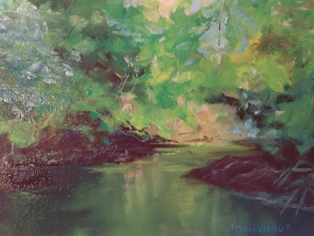
Joan Vienot with Julie Gilbert Pollard
Photo by Helen Ballance, Beach Art Group
Incomplete oil painting in progress, crepe myrtle, negative painting assignment, in Julie Gilbert Pollard workshop Oil painting of crepe myrtle flowers, in Julie Gilbert Pollard workshop

Posted on 2 Comments

Carving the Void: Negative Shapes

The model who posed for our figure drawing session at Studio b. last week returned this week.  For the past four months, we’ve had a different model nearly every session.  That has added to the challenge in that every week we have to become familiar with a different body type or different proportions.  Having the same model two weeks in a row was a luxury.

Our instructor, Heather Clements, provided a focus for us, suggesting that we run the drawing off the page, effectively cropping it in order to create negative shapes out of the negative space.  Often in the rush of trying to get the figure drawn as quickly as possible before the timed pose ends, the background, if treated at all, is merely an afterthought.  By drawing the figure so that parts of it intersect with the edge of the page, it no longer floats on the page, but instead becomes anchored.  The negative space, the space surrounding the figure, is then broken up so that it becomes negative shapes instead of just open space.  Negative shapes help the piece to read as a composition.  Art imitating life, carving the larger voids into smaller pieces makes it more manageable.

A good mat and frame can help with cropping, but it is better for the artist to have made those decisions instead of leaving it up to the framer.

The sketches included here are from this week’s session.

Most of my images are available for purchase.  Contact me if you are interested. — Joan Vienot

Posted on Leave a comment

Negative Space, continued

Warm-up Drawing

Warm-up Drawing

This week at Studio b., Heather Clements led us in continuing to explore negative space and negative shapes, which involves drawing the area around the figure, instead of drawing the figure.  We started this exercise last week.  I found it easier to focus on negative shapes this week, and began to play with the negative space a little in my later drawings, adding some color and other shapes.  I used charcoal pencil and then nupastel on the 1- and 2-minute warm-up drawings, and I used water-soluble ink pen and watercolor pencils on the longer poses.  I left the positive shapes stark white, waiting until I washed over the drawings at the end to perhaps add a little tone to the figure.

Even after practicing this exercise for only two weeks, I can see shapes better as abstractions.  An arm is not just an arm, for example, it is also the shape around it that defines it as an arm.

The drawings at lower right are the same pose.  I had time left over after I finished one, so I started the second one.

Posted on 2 Comments

Negative Space in Figure Drawing, with Heather Clements

Negative space is the space surrounding the “subject”.  Negative spaces which are bounded by the subject are called negative shapes.  The boundaries of negative shapes also can be the edge of the art piece, or the edge of another shape.  Heather showed examples of negative space, and we spent the entire 2½ hours finding and filling in negative space, from warm-ups through extended poses.  Well, there was one pose where I just couldn’t stand any more ignoring of the form, and I quickly drew a rough approximation of the light on the form, below right.  Otherwise, in each drawing, the positive shape was drawn, or rather, not drawn, as a silhouette.  Our model was very cooperative, positioning to create empty spaces in his pose.  When negative shapes are interesting, they can be very helpful in defining the form.  We recognize many things by the silhouette of the shape.  So even though the interior of the form was not developed, anyone looking at these drawings can tell that they are depictions of a male figure.

Sometimes our studio workspace is overflowing with people, but on this night I was the only student.  I am so grateful that Colleen Duffley, owner of Studio b., continues to provide this creative opportunity through thick and thin.  And Heather Clements, the instructor, talked to me as if I were a whole classroom of students.  She is such a professional.  She drew along with me, practicing the same exercises.  Later she showed me examples of Egon Schiele’s work, pointing out how he used negative space to make his figurative work even more interesting.   Such intense focus on negative space is sure to make me more aware of it in my compositions, even as I have been “seeing” more negative shapes in my ordinary daily activities today.

Interior form developed at right...