Posted on Leave a comment

Plein Air with Laurel Daniel – Blocking In

2014-0424 St. Andrews Beach, Jekyll Island
St. Andrews Beach, Jekyll Island

2014-0425 Muted Perspective, Unfinished
Gascoigne Bluff, St. Simons Island, unfinished

2014-0425 Slave Cabins, St. Simons Island
Restored Slave Houses, St. Simons Island, incomplete (Some heavy energy remaining here)

2014-0425 Sunrise Over the Marsh
Nupastel drawing of my marsh view at sunrise

2014-0426 Sea Island Marsh 1
Sea Island Marsh 1

2014-0426 Sea Island Marsh 2
Sea Island Marsh 2, incomplete

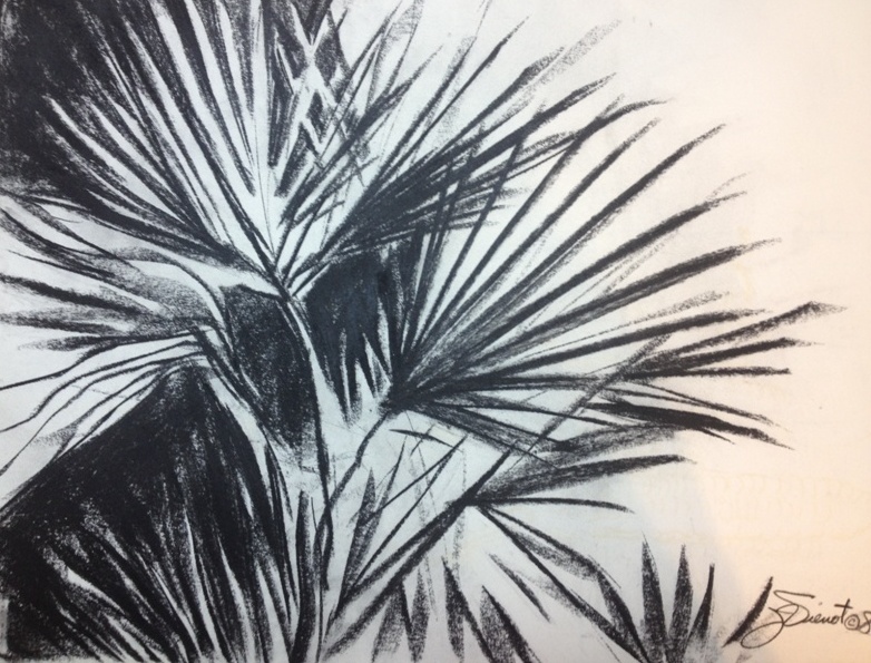
Coastal Georgia was a beautiful place to be, last week.  I drove from my home in Northwest Florida to St. Simons Island for a plein air painting working with Laurel Daniel, a fabulous artist whose work I have been watching for years, following her blog even before I ever decided to try plein air painting.  Laurel is a master at ‘definitive suggestion’ in her work, leaving out just enough of the smaller details which invites the viewer to participate.  I am a fan of this kind of work, because the longer the viewer will look at the piece, the more they will appreciate it, and not just see it and walk away.

Photo by Laurel Daniel
Joan Vienot at work (Photo by Laurel Daniel)

DSC04294
Photos of the marsh outside my hotel
DSC04278
DSC04274

Laurel worked hard for us, teaching us to show distance by muting intensity and tapering values to mid-range, but her primary focus was teaching us to block-in the basic shapes and values before getting down to the business of painting.  Each day she demo’d a different way of blocking-in, before painting luscious scenes “From Marsh to Seaside.”  Her three block-in methods include dry brush sketch in a dark neutral; mid-toning with a neutral and then wiping out lighter values and adding darks; and the most difficult, blocking in with true colors at correct value.  Laurel put the dark elements in the painting first, leaving the lighter values for later.   Her reasoning was to get down the shadow patterns first, so that we would be able to hold onto them throughout the painting, because the light and shadows change throughout the two hours you are painting.  In this location, the tide changed as well.  A marsh full of water might be nearly bone dry by the time you were finishing a painting, so what started out to be a pattern of light on water, could be dark mudflats by the time you finished.  Laurel blogged about her workshop at http://www.laureldaniel.blogspot.com/2014/05/marshside-palms-demo-georgia-workshop.html. We were treated to an opening of Laurel’s works at Anderson Fine Art Gallery on St. Simons Island on Friday evening, midway through the workshop.  There were a lot of red dots on the labels by the end of the evening, indicating “SOLD”.  I would have loved to have brought one home with me, but it already had a red dot on it, sold before I arrived.  I was happy to see works by other amazing artists in the other rooms of the gallery, including Morgan Samuel Price from whom I took a workshop in April. On the last day of the workshop, my muted phone started buzzing while I was shooting some progress photos of the instructor’s demo — it was Joe Taylor calling, the organizer of the Forgotten Coast en Plein Air.  I will be attending a workshop by Ken Dewaard and Greg LaRock after that event, so I thought it might be some details about that.  But no.  Joe started by asking me if I had received his email, and I drew a blank.  I went from confusion to shock, when he said he had emailed me to ask if I would like to be one of the students in a pilot workshop that is being designed as Advanced Plein Air for the Apalachicola School of Art.  I managed to compose myself enough to say Yes!  So I will be taking 2 workshops, back-to-back, next week.  When I set the intention of taking as many plein air workshops as I could afford this year, I didn’t know that I would be getting more workshops than I can afford!  (This one will be free!) I am delayed in getting this blog posted.  We had a flooding rainstorm that shut down the entire Florida Panhandle, closing roads and bringing everything to a standstill.  About 2 feet of rain fell in a 24-hour period.  I was fortunate that my home and business did not suffer any damages, other than a sign blown down.  Many others are not so fortunate.  The same storm spawned killer tornados in other states.  Nevertheless, it kept me from getting back into the studio to practice my new awareness gained from Lasurel Daniel’s workshop. Here’s a quick video of the bridge over the slow moving swamp I cross every day, a half-mile from my home. http://youtu.be/3cGH-p9XM00

Posted on Leave a comment

Types of Lighting

I am teaching a “Back-to-the-Basics” drawing class for the Cultural Arts Alliance of Walton County.  This week we talked about three different types of lighting:  silhouette, high contrast, and full-values.  For a silhouette to be effective, it is essential that the subject be recognizable by its outer contours, since there is no interior development.  Below are some examples of sillouette.  Please forgive the quality of the photographs — they are meant for illustration only.

In high contrast, interior development is in only two values.  This allows for a more ambiguous outer contour because the development inside the form identifies the subject.  Below is a drawing done in high contrast.

Full-value development is the type of treatment we are most familiar with, where we can easily identify the subject because the interior development is in a full range of values, like the drawings below:

Many artists will use all three of these methods of describing shape, within the same drawing or painting.  Silhouettes require less attention, and if executed in middle values, can provide wonderful background imagery, effectively breaking up negative space and often repeating forms found in the foreground, as in paintings of flowers for example.  Even when the lighting is shown in full values, often the lighting will simplify into high contrast or silhouette, especially towards the edges of the composition.

Silhouettes can be extremely powerful.  Some of the happiest ooo’s and ahhh’s will be heard when you show a painting of a brightly colored sunset with silhouettes in the foreground.


Posted on Leave a comment

Figure Drawing Starts With One Mark

I don’t have time for stage fright in figure drawing.  No performance anxiety allowed.  No worries about perfection.  No time to test the water, I have to just jump right in.  I start with warm-up sketches, timed one-minute gesture drawings.  I am drawing so fast and furiously that there is no time to be afraid.  I go through a lot of paper at the start of every session, knowing that every warm-up drawing will probably be thrown in the wastebasket when I get home.

It all starts with making the first mark on the paper, usually a broad gestural sweep showing the general directional line of the posed model’s position.  I like to use something soft, and light in value, a color which can be incorporated into my final drawing.  Soft chalk-like pastels are a little messy because they are so soft, so I use nupastel, which is a little harder, but not as hard as conte which is made of graphite mixed with clay.  I use conte sometimes, for my warm-ups, but with conte I am always risking permanent damage to my paper or my drawing by the unfortunate specks of hard material that are often in conte.  My favorite medium is very soft graphite, in a pencil.  But in my warm-up drawings, I sometimes never graduate from nupastel to graphite.  Instead the whole time is spent building shapes onto that first gestural directional line, correcting and re-correcting to get proportions and shapes more or less “right”.  The 5-minute warm-up drawing at right shows multiple corrections of the position of the left leg.

Below are my final 30-minute drawings for the evening.  I’m having fun drawing on paper that is lightly toned tan or gray, using white nupastel to make the highlighted areas stand out, and using graphite for the darks.  For the midtones I just let the paper show through.  I’ve been using my fingers to mush the media together in places, creating a softer texture.

We draw every Wednesday evening at Studio b. in Alys Beach.  Last night I had the pleasure of drawing beside accomplished artists Nancy Nichols Williams, David Orme-Johnson, Susan Alfieri, and Denielle Harmon.  I was exhausted, having taught all day at one of my other jobs, and then attending the opening of Donnelle Clark’s mixed media show in Rosemary Beach before coming to draw at Studio b.

Most of my images are available for purchase.  Contact me if you are interested. — Joan Vienot

Posted on Leave a comment

The Illusion of Depth

This week Studio b. instructor Heather Clements gave us the exercise of creating illusion of depth.  She asked us to exaggerate it,  to make the foreground appear much closer than the parts of the model that were further away.  Perspective of course is the most obvious method of creating the illusion of depth on a two-dimensional plane.  The parts of the subject that are closer are much larger in proportion to the parts that are farther away.  In figure drawing, perspective already is exaggerated, because the model is in close proximity to the artist.
The highest contrast of values, and if working in color, the brightest colors, also tend to advance toward the viewer, while midtones and duller colors tend to recede.  Purposefully muting the lights and darks will cause that part of the subject to appear farther away, and purposefully heightening the black-white value contrast and brightening the colors of the near portions will advance the closer part of the subject.
The degree of development also creates the illusion of depth.  Highly developed areas advance, whereas silhouetted shapes with perhaps hazy edges, recede.

This is the second week Heather mentioned Mach bands, an optical illusion causing forward edges to appear lighter against darker values behind.  This optical illusion occurs even though the local value does not change — our eyes do it for us.  If the artist will exaggerate Mach bands, that too will help give the illusion of depth.

The examples in this post exaggerate depth.